Alarm app
تفاصيل العمل
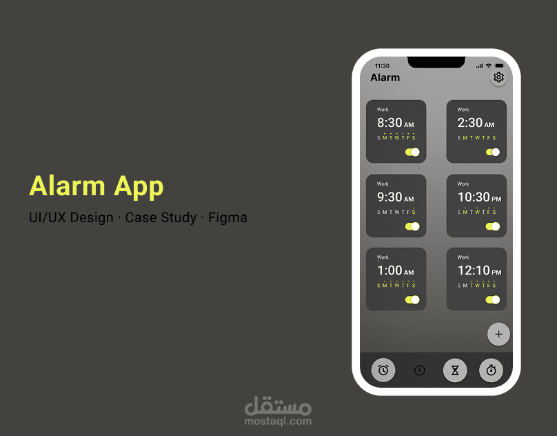
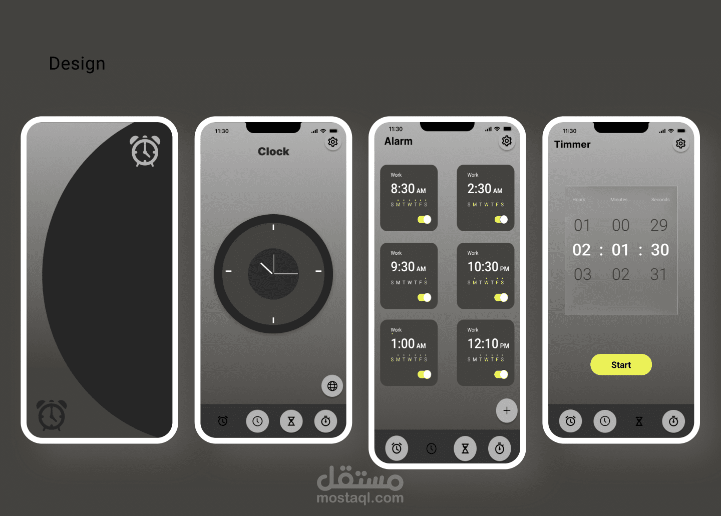
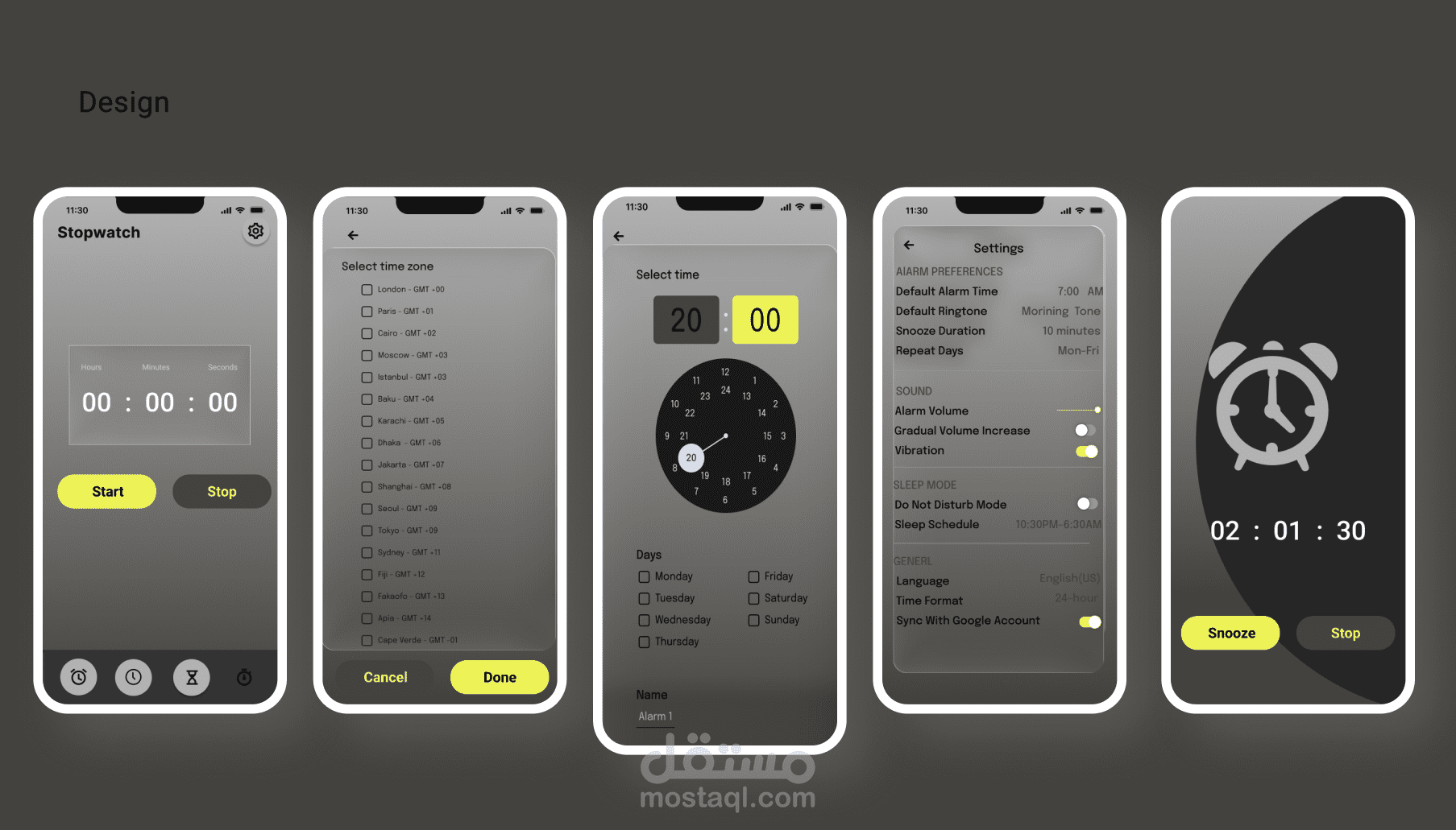
This project presents a modern redesign for a mobile alarm application, focused on simplicity, usability, and a clean dark interface that enhances readability in low-light environments.
Goal
To create an intuitive and minimal alarm interface that allows users to easily manage multiple alarms with clear visual hierarchy and smooth interaction.
Design Approach
Applied dark mode for comfortable night use.
Used bright accent colors (yellow) to highlight active states and improve visibility.
Simplified alarm cards for quick scanning of time and days.
Maintained consistent spacing, typography, and iconography for a cohesive layout.
Tools
Figma (UI Design & Prototyping)
Typography: Inter
Color Palette: Dark gray with yellow highlights
Outcome
A sleek, modern interface that enhances user experience through clarity, focus, and functional aesthetics making alarm management fast and enjoyable