Obito Studio Visual Identity
تفاصيل العمل


أوبيتو ستوديو – دليل الهوية البصرية
نظرة عامة:
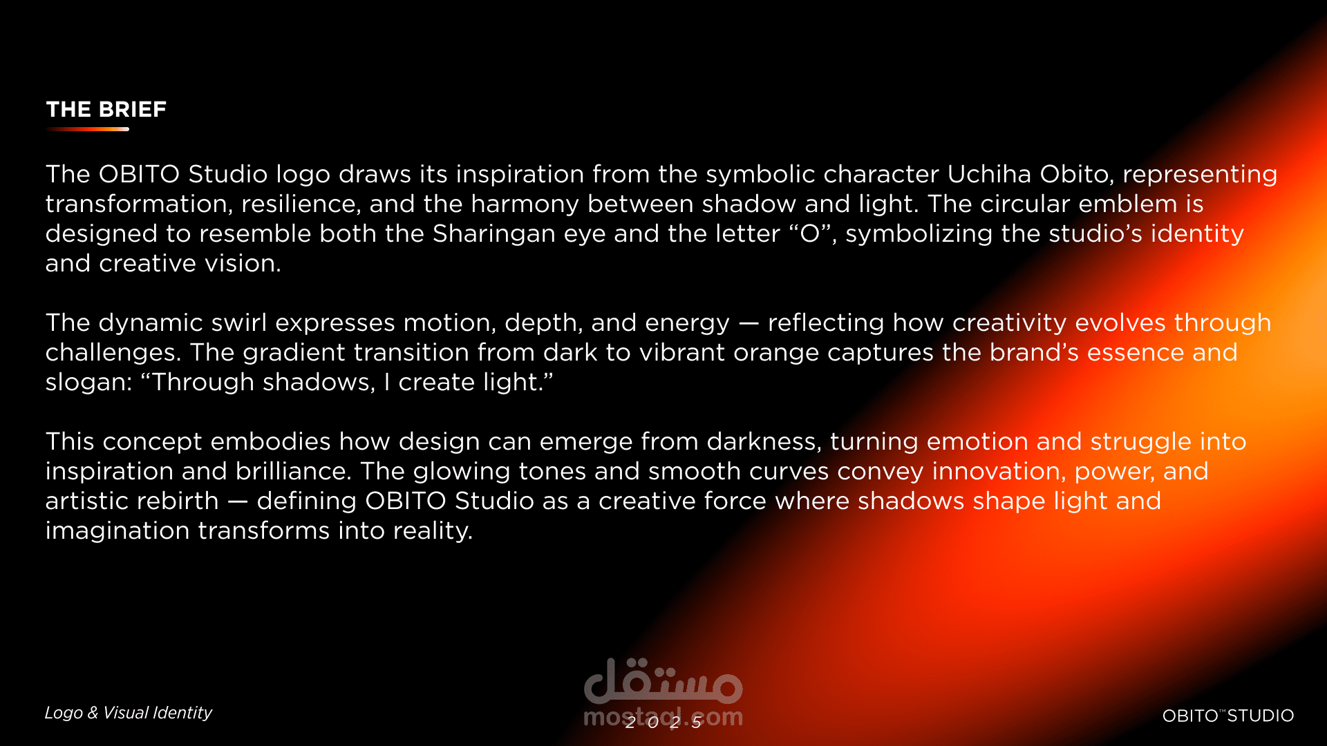
أوبيتو ستوديو هو براند تصميم إبداعي يجسّد التوازن بين الظلام والنور، المكان الذي تُولد فيه الخيالات من التناقض. فكرة الهوية مستوحاة من إيجاد الإلهام وسط الظلال، في إشارة إلى أن الإبداع يمكن أن ينشأ من أعماق المشاعر والزوايا الخفية.
الفكرة والفلسفة:
تعكس الهوية البصرية مزيجًا من الغموض والوضوح، ومن العاطفة والنظام. أسلوب العلامة بسيط لكنه قوي، يعبر عن شخصية جريئة ورؤية فنية تمثل أسلوب المصمم ورحلته الإبداعية.
مراحل التصميم:
تم بناء الهوية بالكامل باستخدام Photoshop وFigma بخطوات مدروسة بدأت من رسم الأفكار الأولى وتجميع الـMoodboard.
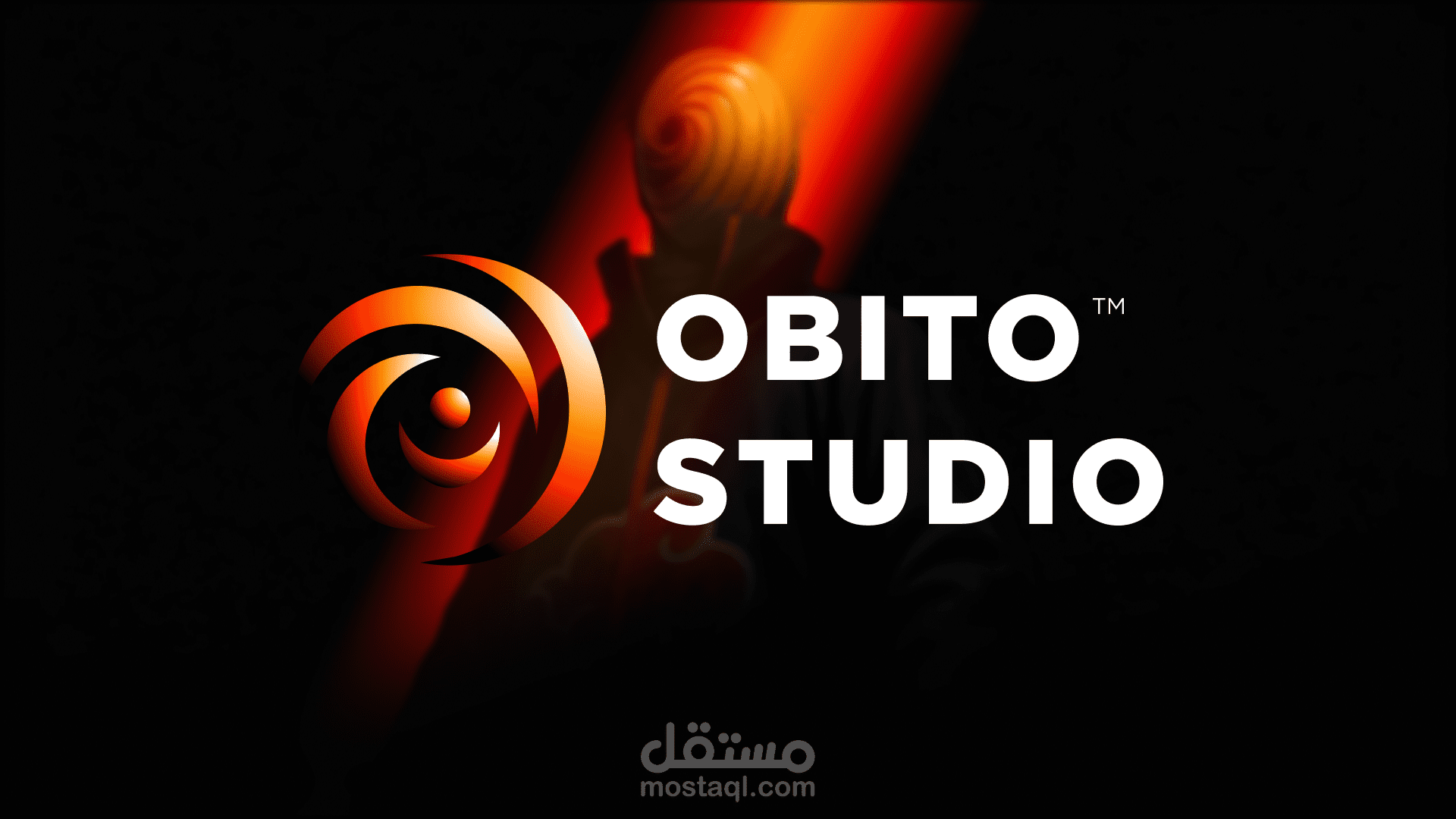
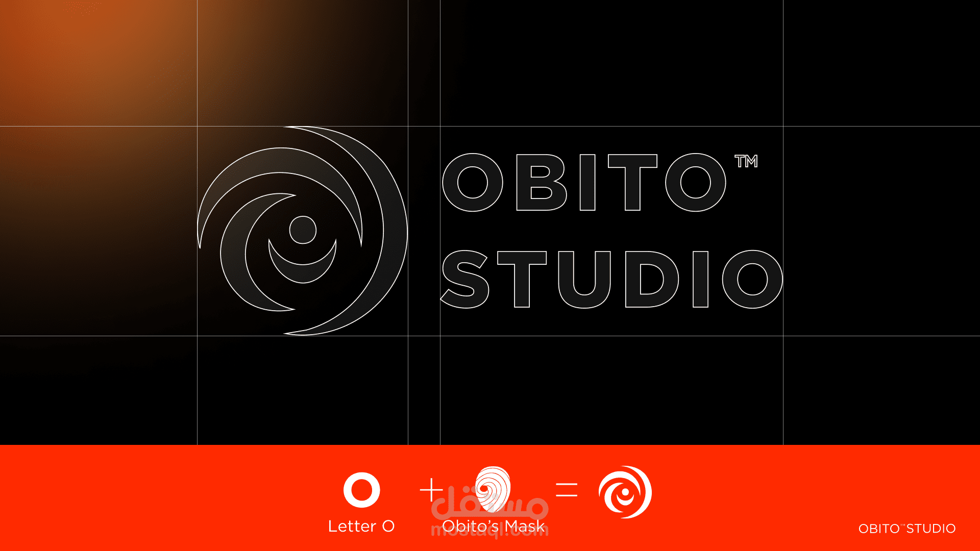
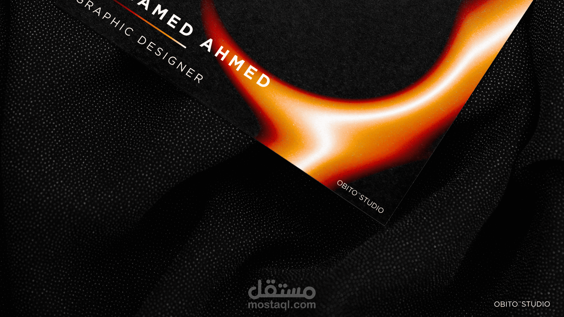
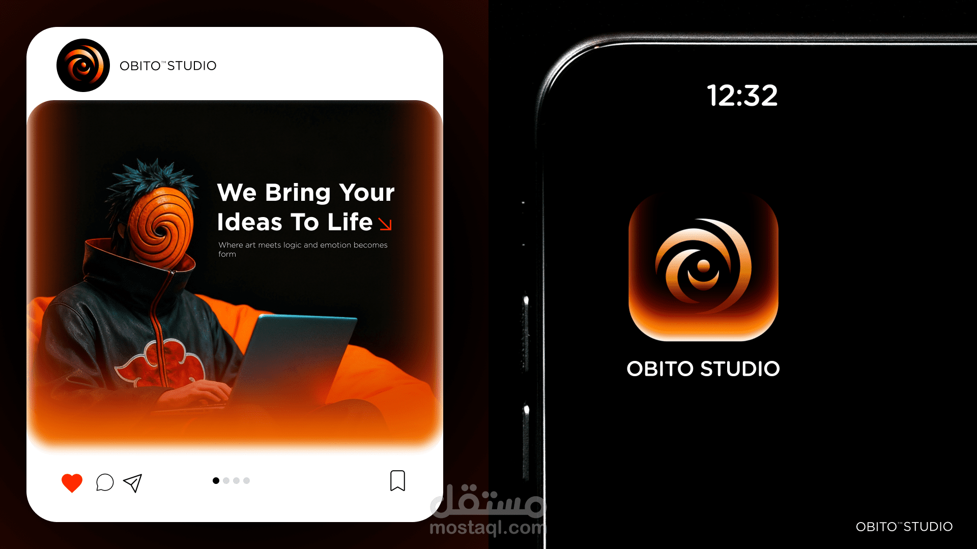
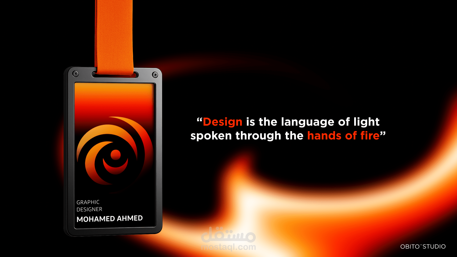
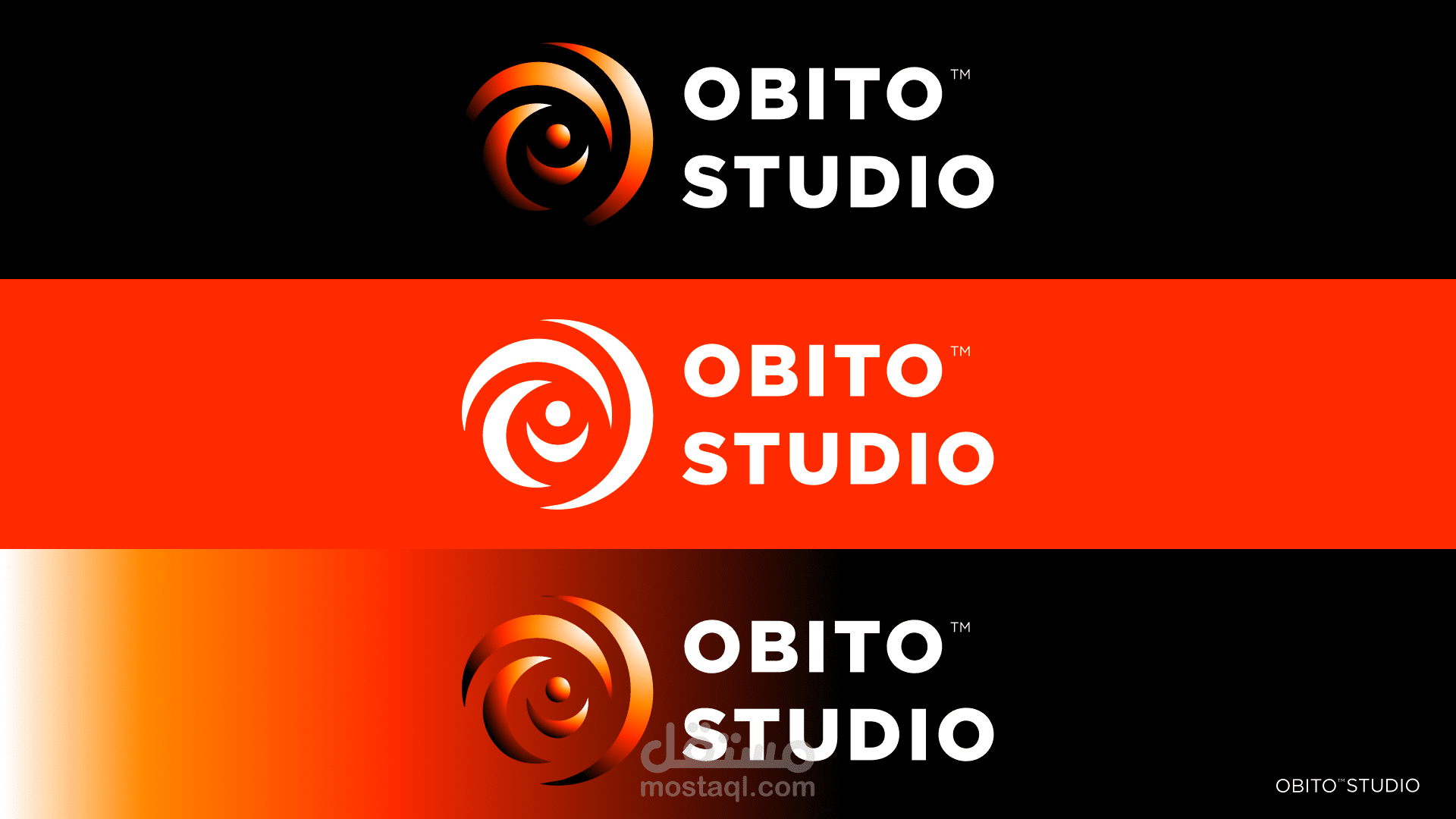
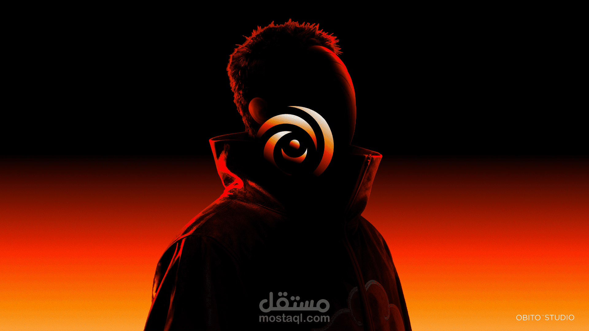
تصميم الشعار: مستوحى من اسم Obito ومعناه الرمزي، حيث يرمز الحرف "O" إلى عين الإبداع التي ترى الضوء من خلال الظلال.
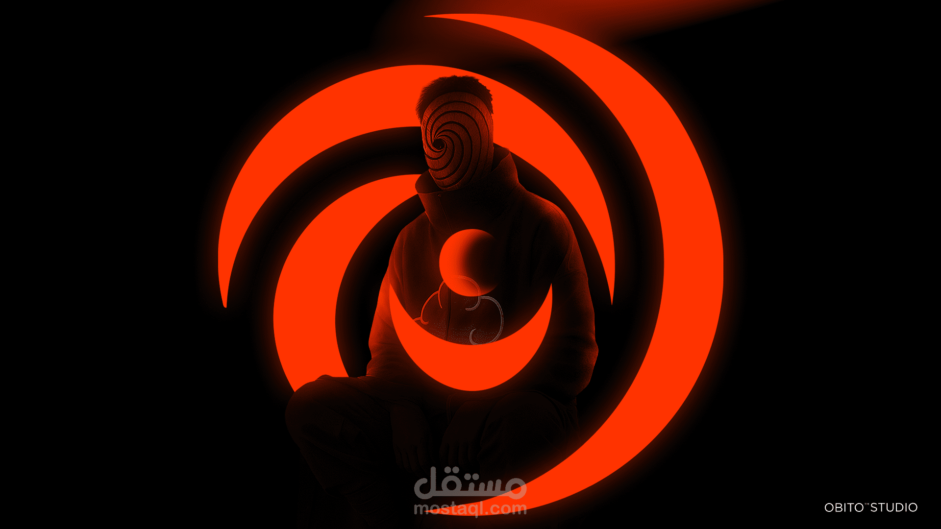
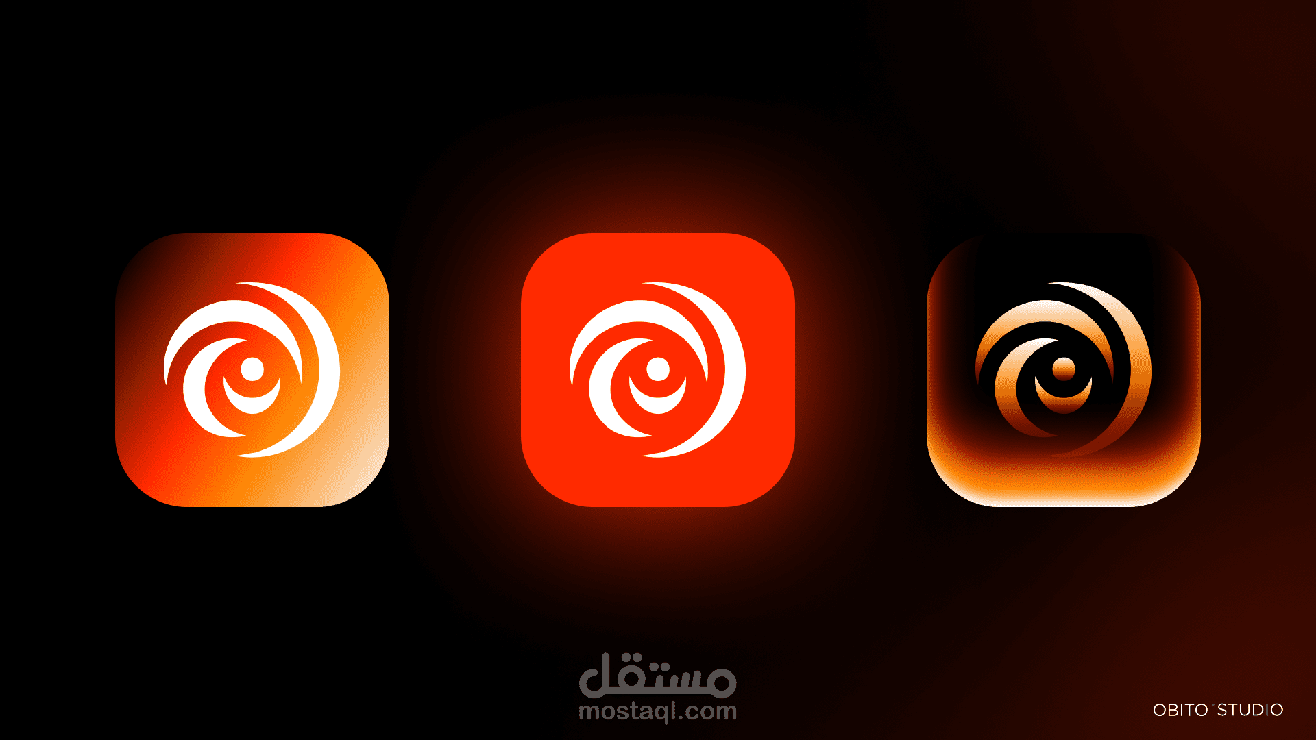
لوحة الألوان: مأخوذة من وهج النار وسرعة ضوءها، لتعكس الطاقة والشغف والتحول.
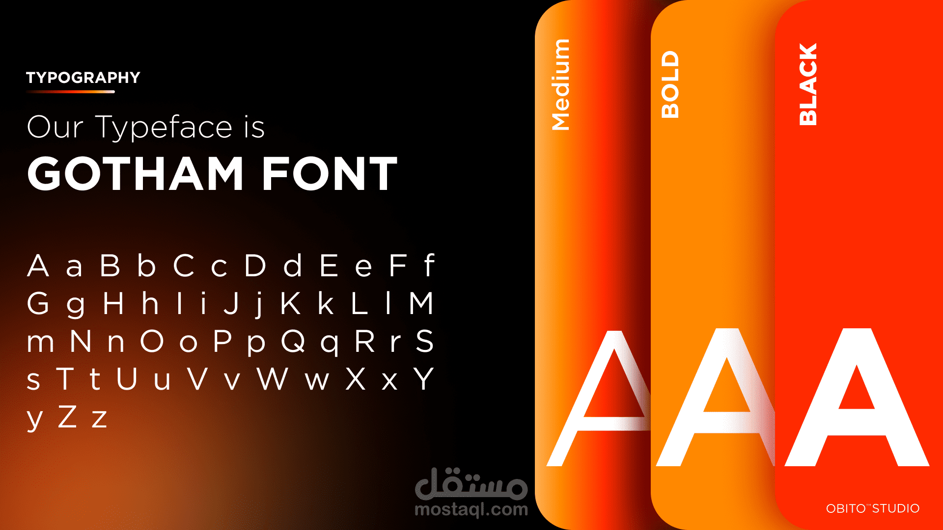
الخطوط: تم اختيار خطوط عصرية وهندسية لتعطي مظهرًا نظيفًا واحترافيًا يحقق التوازن البصري في كل تطبيقات البراند.
التخطيط والشبكة البصرية: تم تنفيذها في Figma لضمان الاتساق في جميع التصاميم الرقمية والمطبوعة.
طريقة التنفيذ:
تمت عملية الإخراج والتفاصيل النهائية في Adobe Photoshop مع التركيز على التكوين، الإضاءة، وجمال العرض.
يحتوي دليل الهوية على بناء الشعار، نظام الألوان، تسلسل الخطوط، واستخدام الهوية على المنصات المختلفة لضمان وحدة العلامة في كل الأماكن.
الأدوات المستخدمة:
️ Adobe Photoshop
Figma
النتيجة:
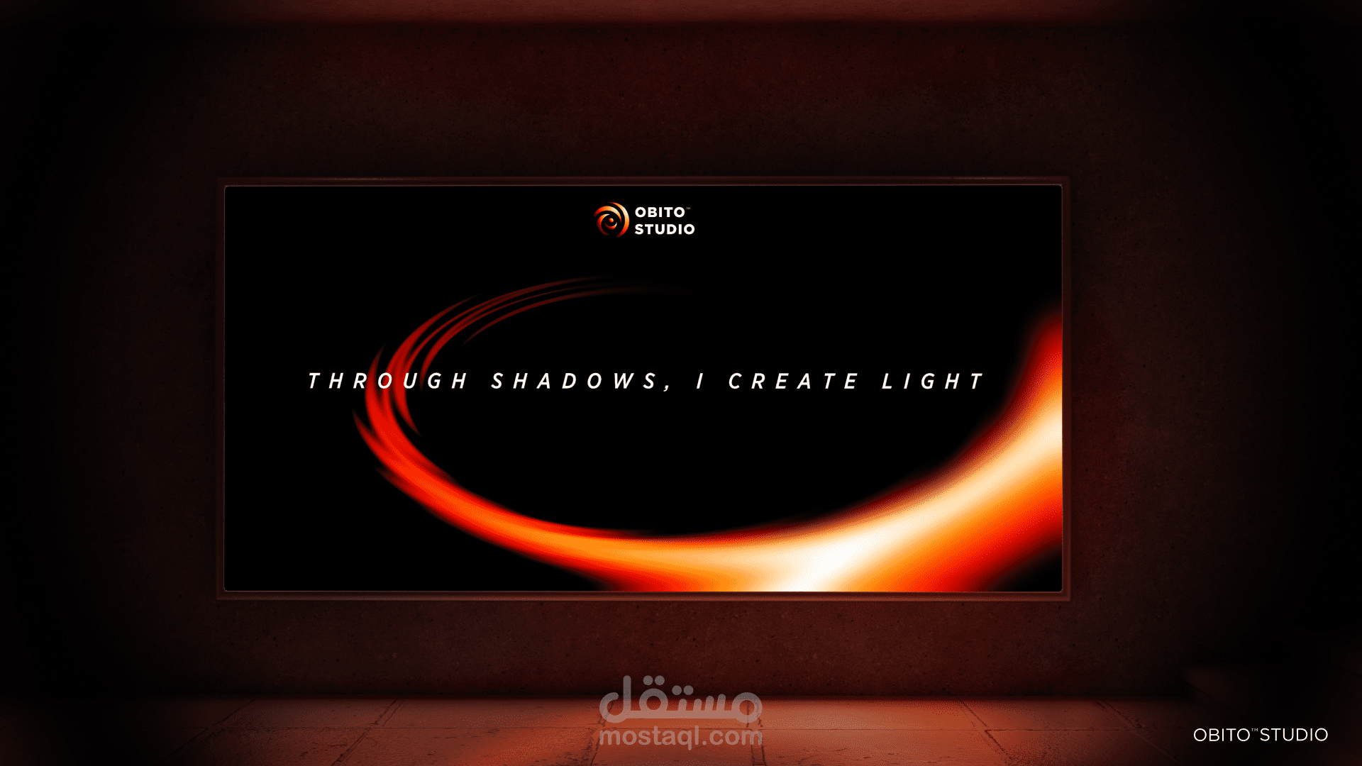
تعبر هوية Obito Studio عن جوهر الإبداع الذي يولد من التناقض —
«من خلال الظلال، أخلق النور».
Obito Studio – Brand Identity Guidelines
Overview:
Obito Studio is a creative design brand that embodies the fusion between darkness and light — where imagination is born through contrast. The brand’s concept originates from the idea of finding creativity within shadows, symbolizing how inspiration can emerge from deep emotions and hidden perspectives.
Concept & Philosophy:
The visual identity reflects balance — between mystery and clarity, emotion and structure. The brand’s tone is minimal yet powerful, expressing a bold and visionary character that represents the designer’s personal style and creative journey.
Design Process:
The entire identity was carefully built through a combination of Photoshop and Figma, starting with concept sketches and moodboard exploration.
Logo Design: inspired by the name Obito and its symbolic depth, the mark incorporates an abstract “O” that represents the eye of creativity — seeing light through shadows.
Color Palette: inspired by the glow and intensity of firelight, representing energy, passion, and transformation.
Typography: modern and geometric fonts were chosen to maintain a clean and professional feel, ensuring harmony across all brand materials.
Layout & Grid: designed in Figma to keep consistent structure and visual balance in digital and print applications.
Execution:
All brand elements were refined and finalized in Adobe Photoshop, focusing on composition, lighting, and presentation aesthetics.
The final brand guidelines include logo construction, color systems, typography hierarchy, and visual usage examples, ensuring a unified identity across all platforms.
Tools Used:
️ Adobe Photoshop
Figma
Outcome:
Obito Studio’s identity captures the essence of creativity born through contrast — “Through shadows, I create light.”