تحليل بيانات لمستشفي
تفاصيل العمل
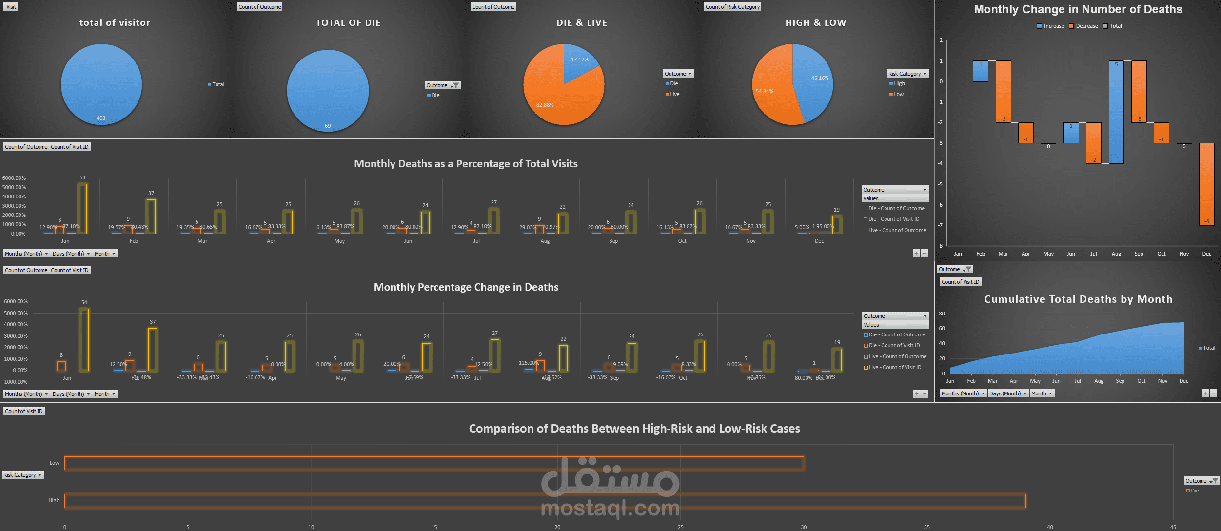
Developed a comprehensive Excel dashboard to analyze hospital data, focusing on patient visits, mortality rates, and risk categories. The dashboard includes multiple charts and visualizations to track monthly trends, compare high-risk versus low-risk cases, and highlight key insights.
Key Highlights:
Utilized advanced Excel tools such as pivot tables, pivot charts, and conditional formatting.
Provided clear visual comparisons between patient risk groups and monthly changes.
Delivered actionable insights on patterns and trends in hospital data.