Adidas Sales Dashboard | Interactive Sales Analysis Report
تفاصيل العمل
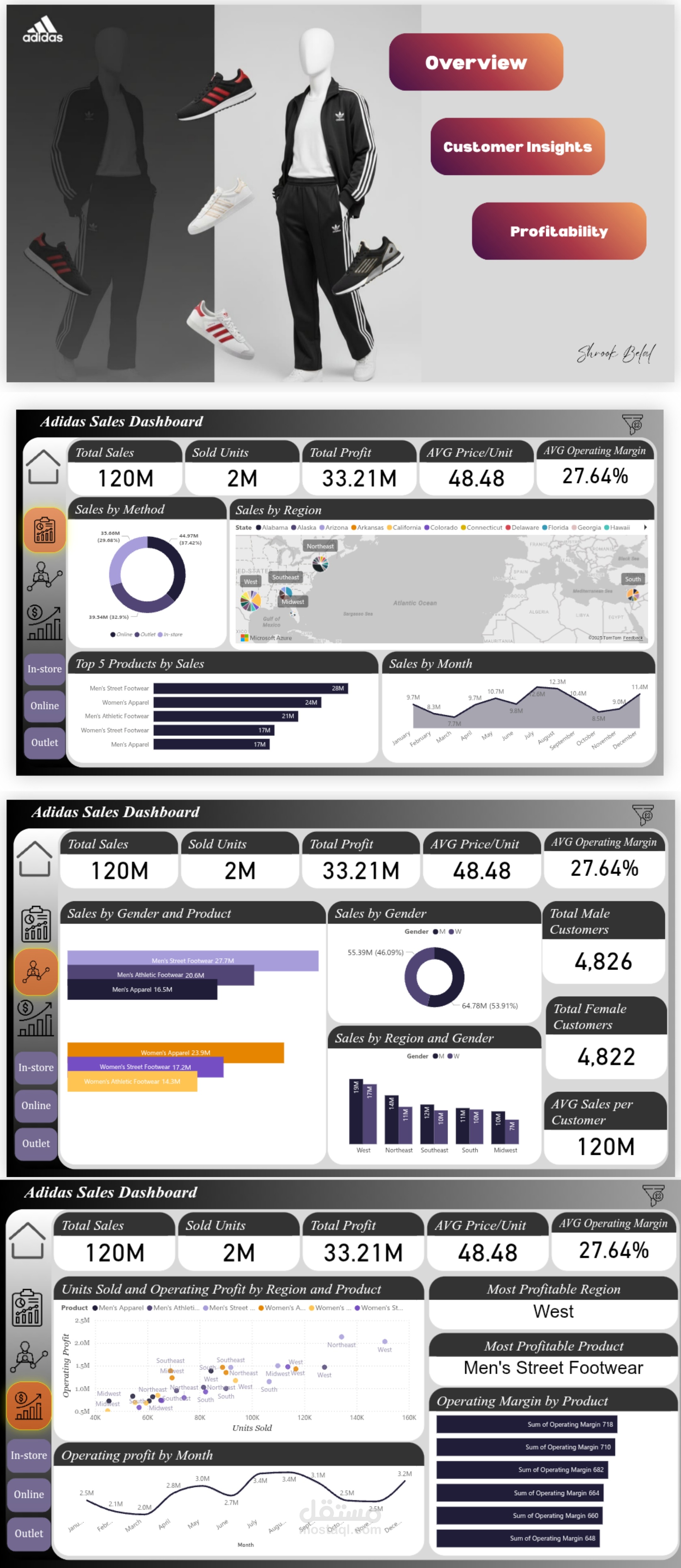
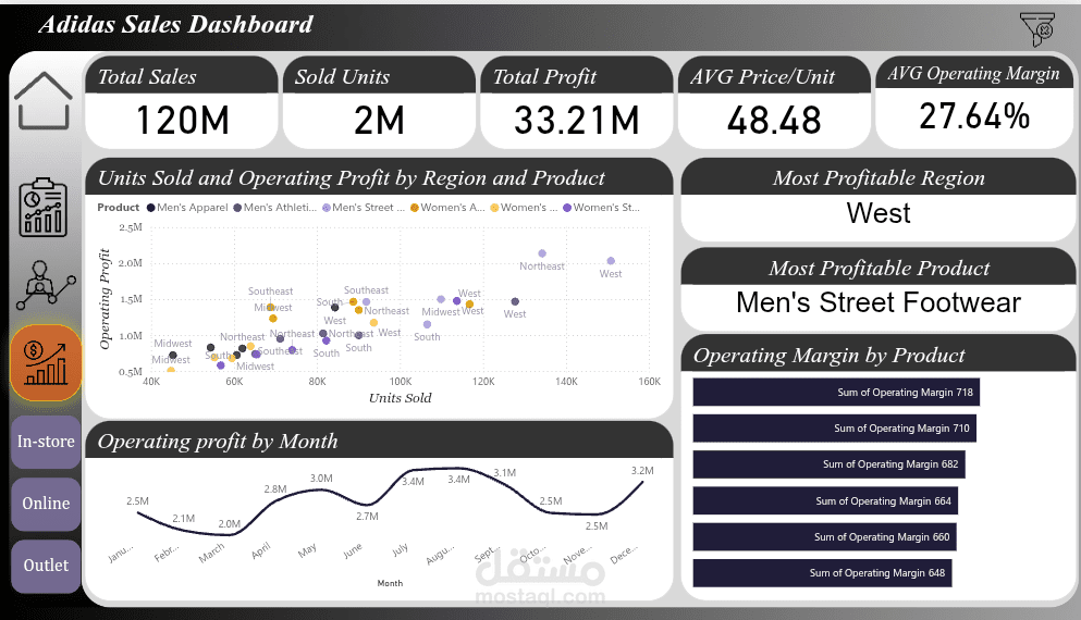
This project presents an interactive sales dashboard for Adidas, built to analyze sales performance, profitability, and customer insights.
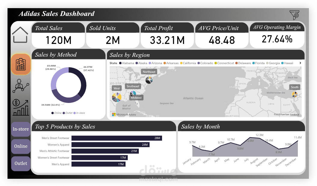
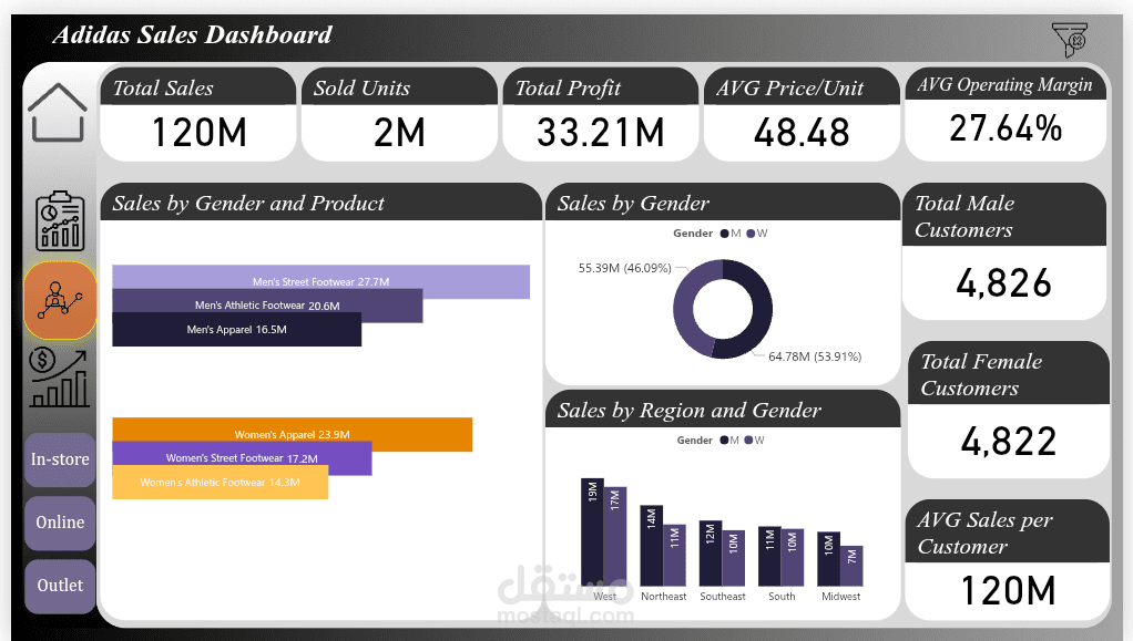
The dashboard visualizes key metrics such as Total Sales (120M), Total Profit (33.21M), Units Sold (2M), and Average Operating Margin (27.64%).
It includes multiple interactive sections:
Overview Page: Displays key KPIs and visual summaries.
Customer Insights: Analyzes sales by gender, region, and product category.
Profitability Page: Highlights most profitable regions, products, and monthly trends.
Tools & Features:
Data cleaning and analysis using My sql.
Data visualization and dashboard creation using power bi.
Interactive filters for region, product type, and sales channel (In-store / Online / Outlet).
Dynamic charts and maps showing performance trends and insights.
This dashboard helps business teams make data-driven decisions, identify best-performing products, and understand customer segments effectively.
You can access to it through this link