NEXORA - Brand Idenntity
تفاصيل العمل
The journey of creating the NEXORA logo began with a single question — how can technology feel human, yet remain powerful and intelligent?
We started by exploring what the name represents: connection, innovation, and digital progress.
It had to look futuristic, but also structured — something that could speak both to startups and enterprise clients.
So, the first step was research — studying tech brands, visual trends, and the geometry of digital movement.
From there, we began sketching.
Dozens of concepts explored the balance between stability and motion — between control and creativity.
We looked for a form that captures the idea of data flowing seamlessly, intelligence evolving, and systems working in harmony.
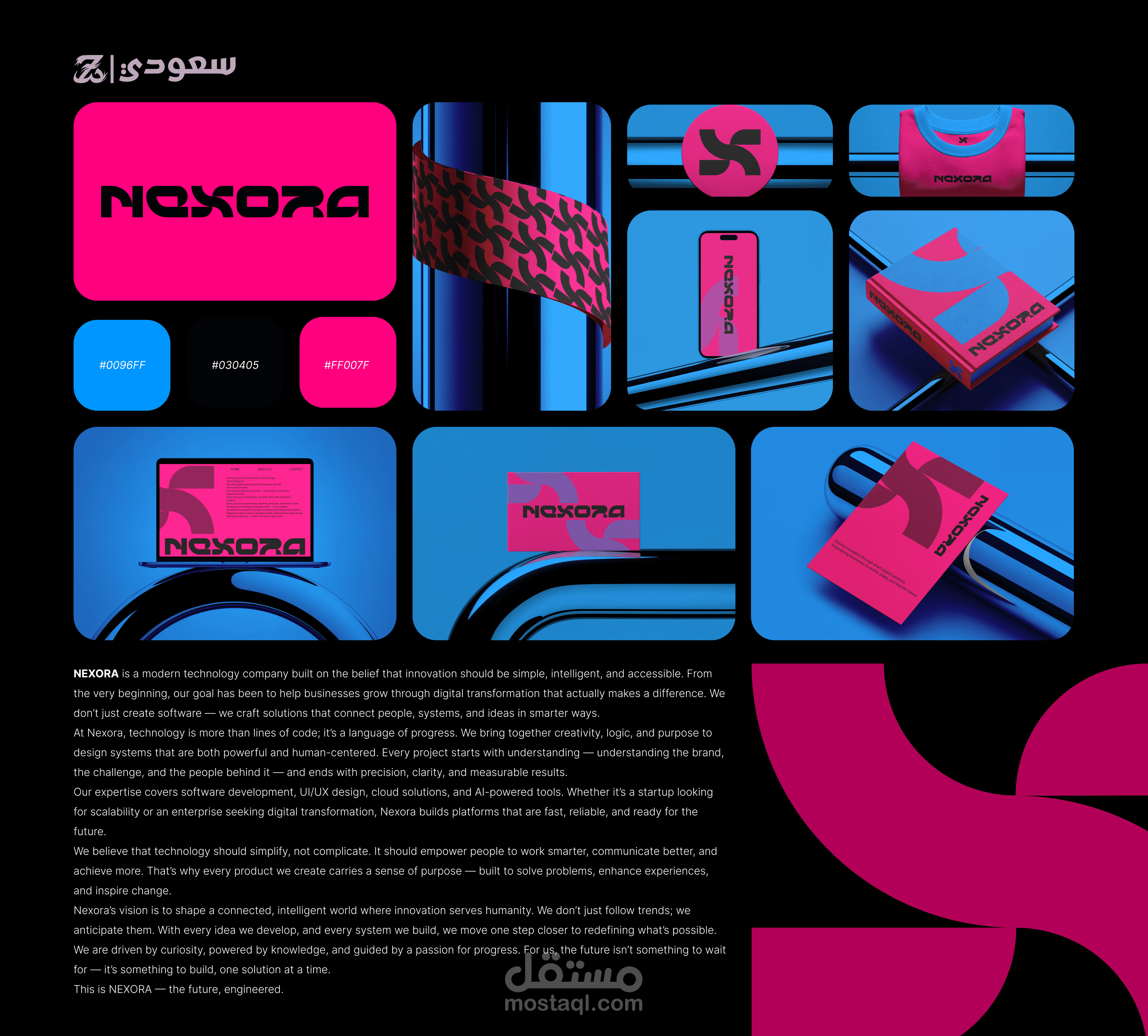
The logotype took shape around those principles — geometric, strong, and forward-moving.
Each letter was crafted with precision, designed to feel engineered yet dynamic.
The cuts, spacing, and rhythm of the typography reflect the flow of energy and innovation.
We wanted every detail to tell a story of speed, logic, and confidence.
The custom symbol came next — inspired by digital networks and interlinked intelligence.
It represents how Nexora connects people, technology, and vision into one ecosystem.
Color played a defining role in bringing the identity to life.
Electric Blue (#0096FF) reflects clarity and innovation.
Neon Pink (#FF007F) adds energy, creativity, and bold personality.
And Charcoal Black (#030405) grounds the entire system in strength and professionalism.
Once the logo and colors aligned, the visual language followed naturally.
Clean layouts, bold contrasts, and futuristic lighting helped express Nexora’s modern spirit.
The result is more than a logo — it’s a visual statement of progress.
NEXORA represents the meeting point of technology, intelligence, and imagination — built for the future, designed to move forward.