Coffee Brand Identity Design
تفاصيل العمل


"A complete and contemporary visual identity designed for a high-end coffee brand, crafted to reflect the authenticity and premium quality of the coffee beans. This project encompasses everything from the innovative logo design and detailed packaging to the proposed uniform design.
Design Highlights:
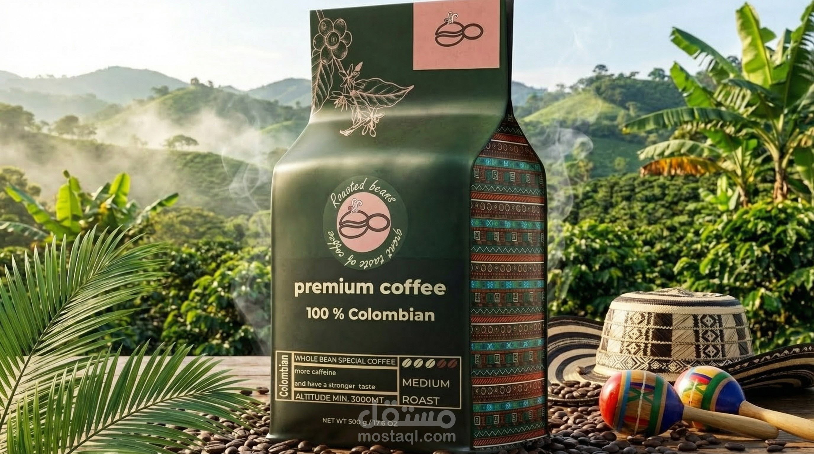
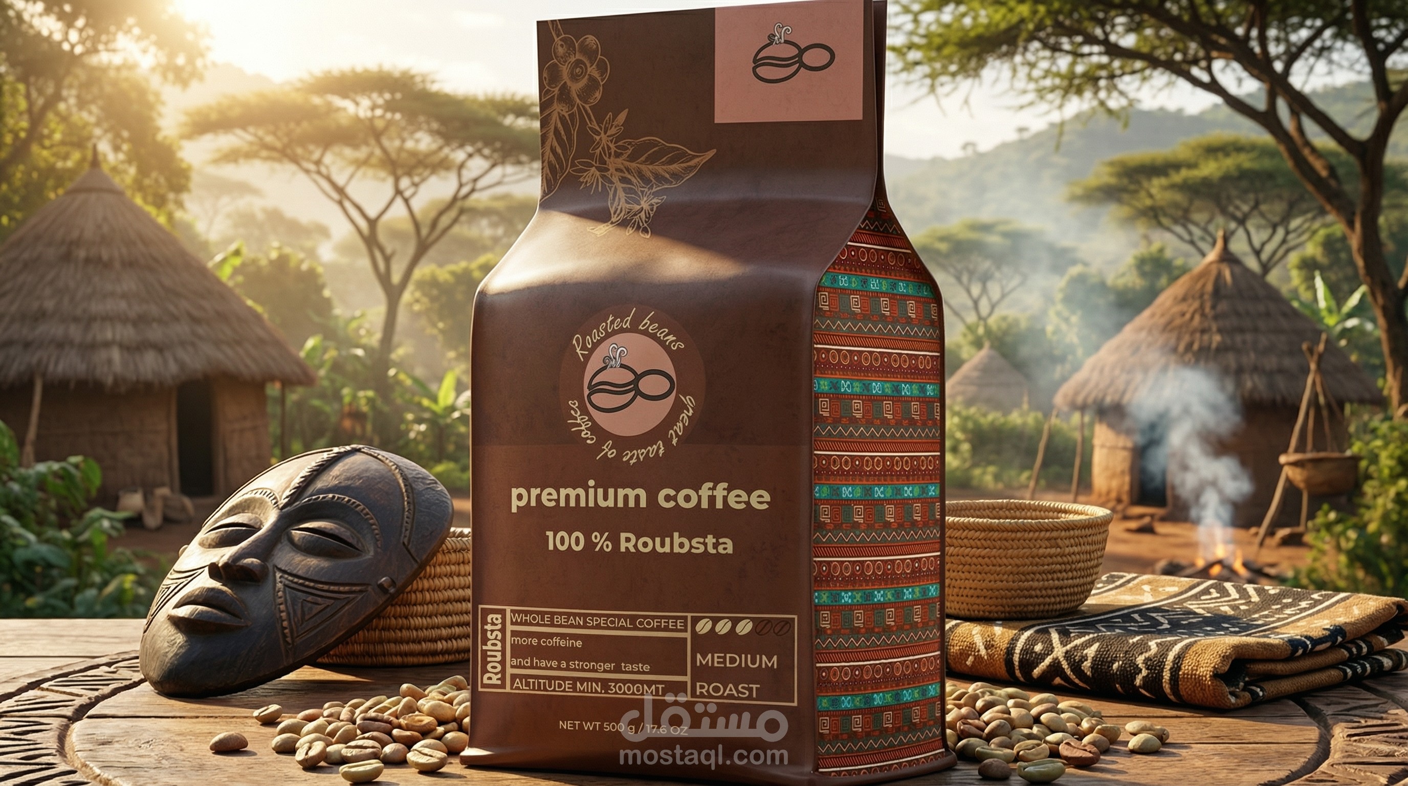
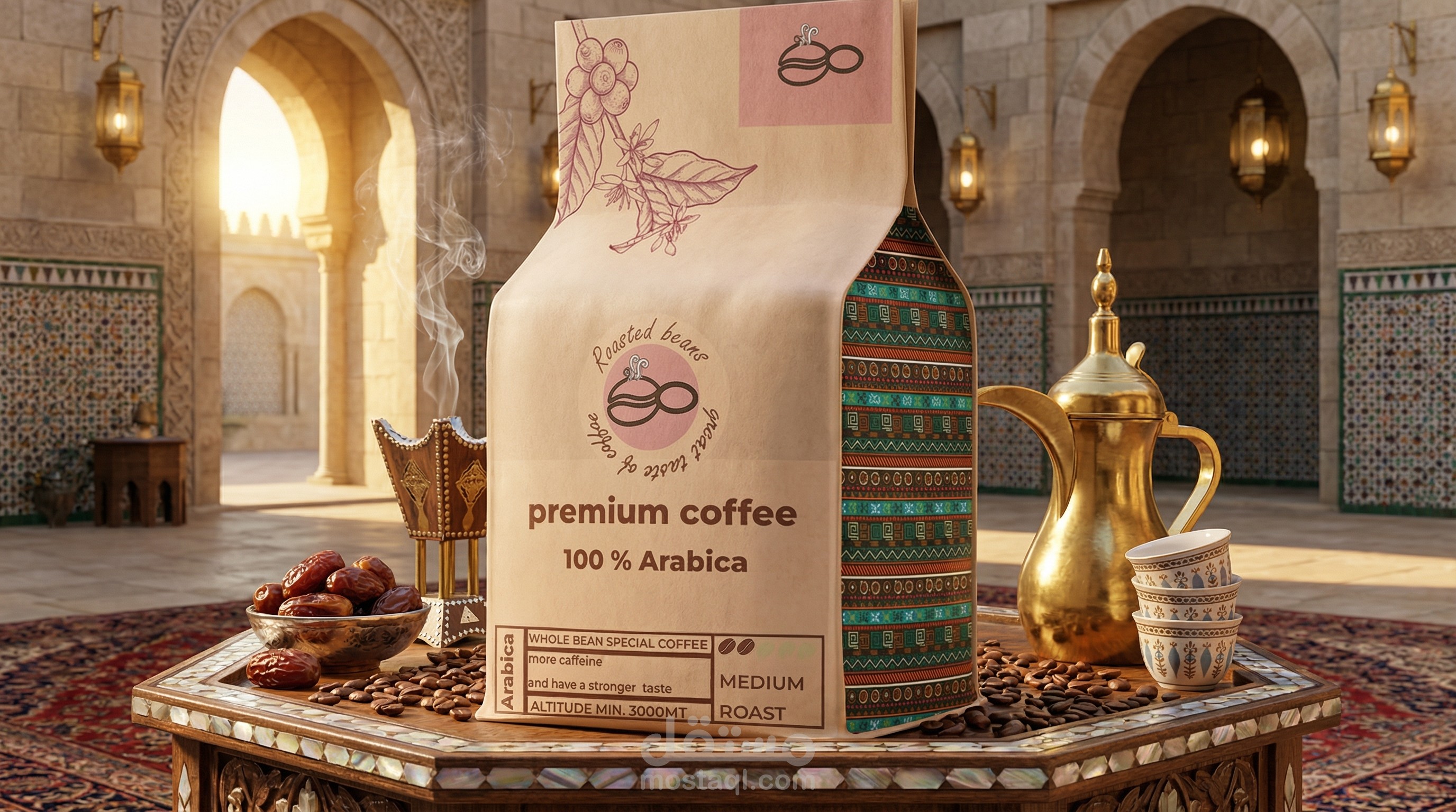
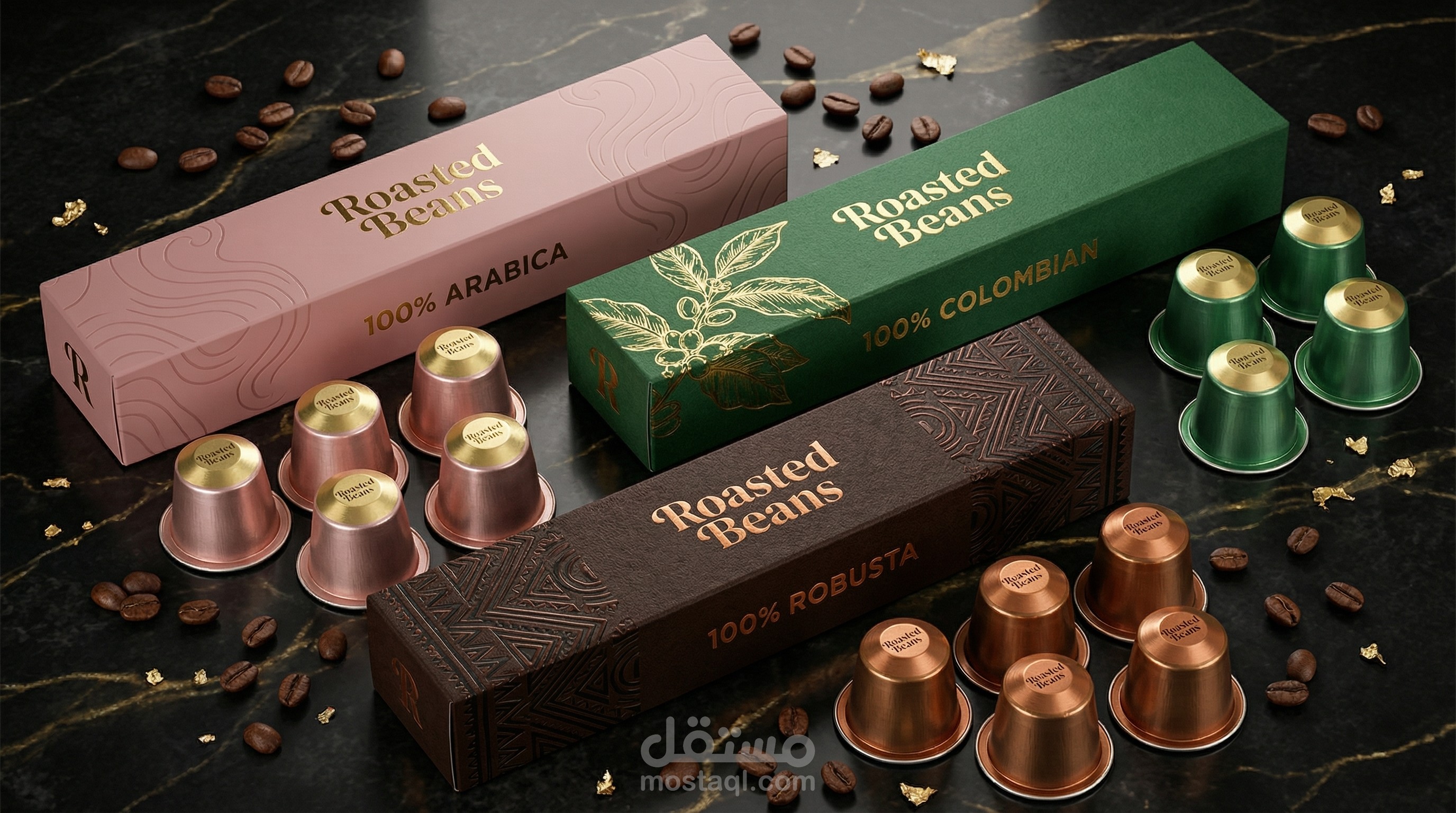
Packaging (The Pouches): The design utilizes the practical and visually appealing 'Stand-Up Pouch' format.
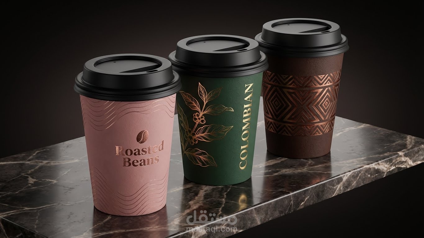
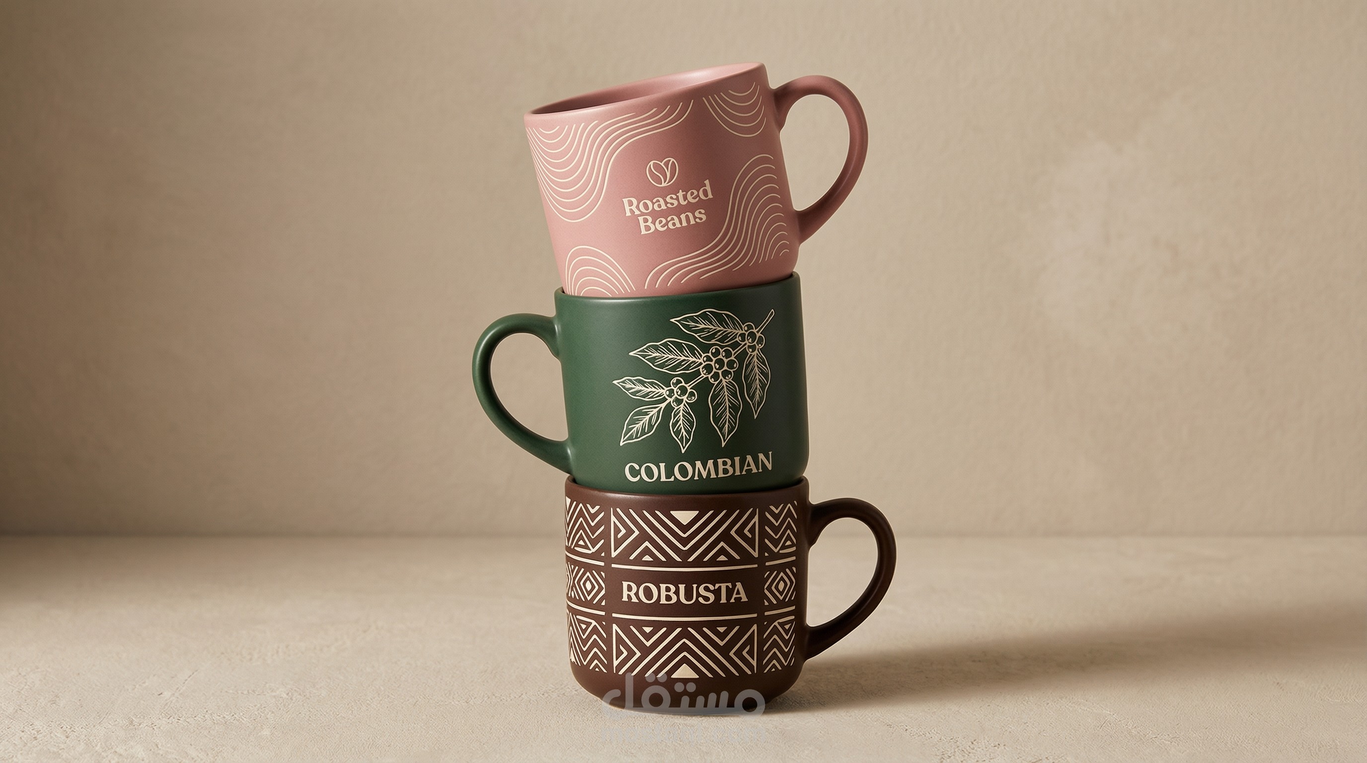
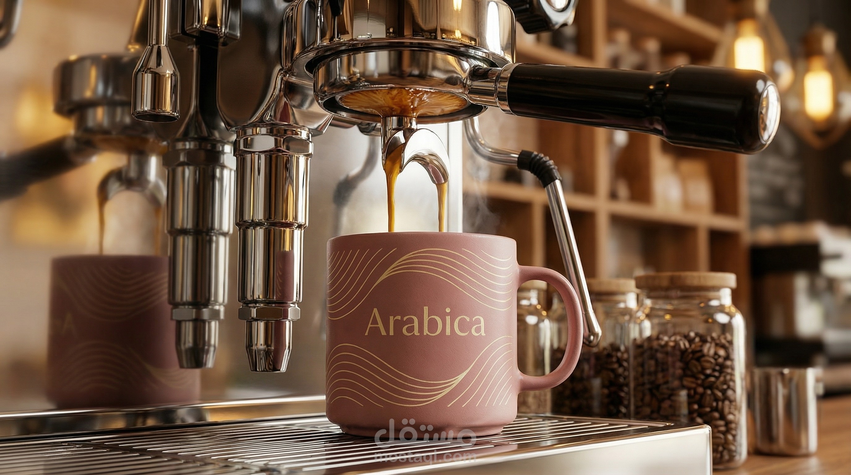
Color Palette: A warm and sophisticated mix of soft pink/tan, deep forest green, and rich brown, echoing the natural colors of the coffee plant and soil.
Illustrations: Fine line art illustrations of coffee branches and beans are featured at the top, lending an artisanal and handcrafted touch to the design.
Variety Differentiation: Distinctive colors and geometric patterns are used in the lower band to clearly distinguish between coffee types (Robusta, Colombian, Arabica), all while maintaining a cohesive brand identity.
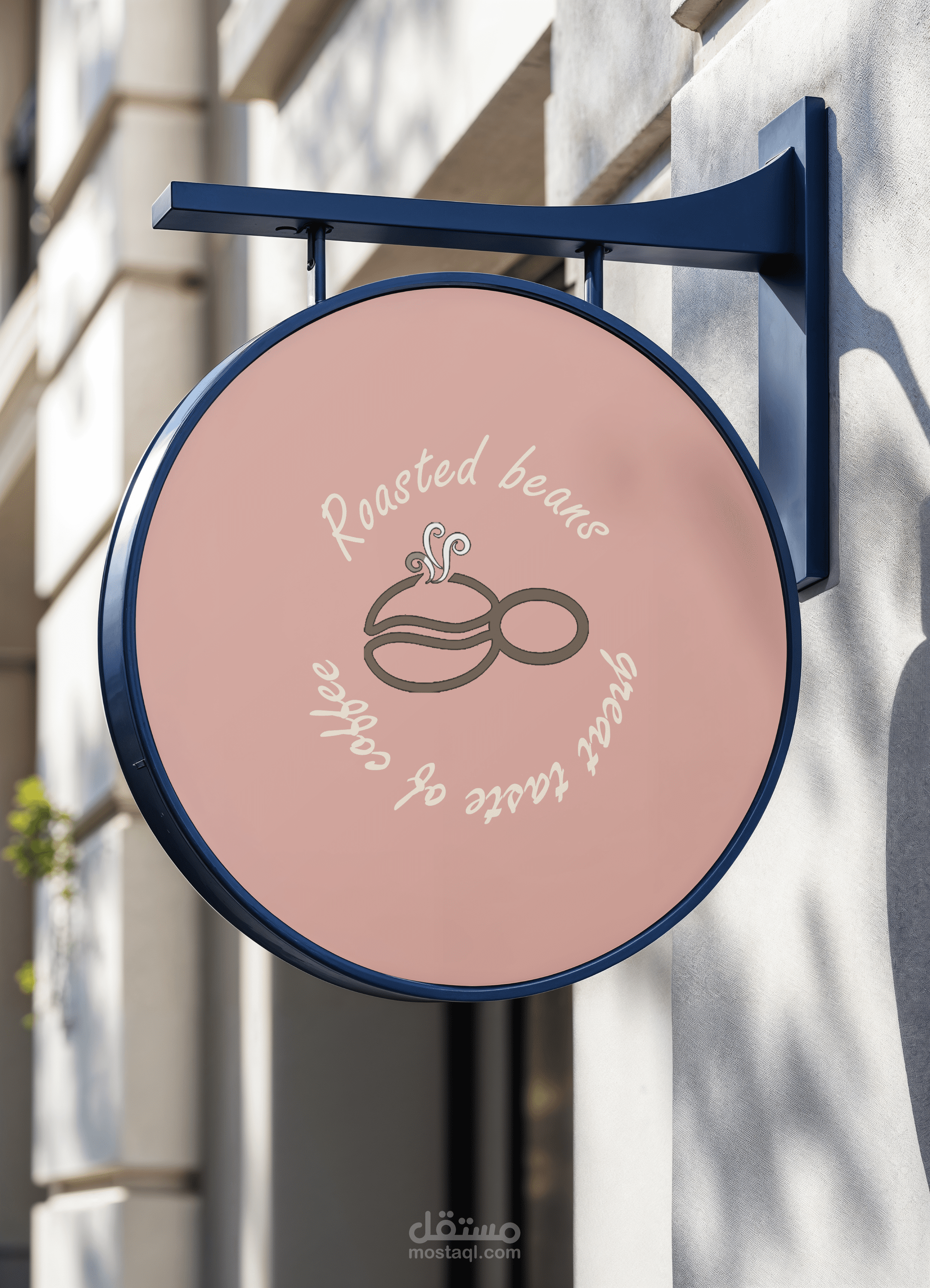
Logo: A simple yet elegant logo that symbolizes the concept of 'roots' or 'continuity' (perhaps representing a coffee bean or an infinity loop), reinforcing the ideas of quality and connection to nature.
Labeling and Typography: Clear typography and icons are used to highlight essential details such as the coffee type (100% Robusta/Arabica), roast level (Medium Roast), and altitude, ensuring transparency for the consumer.
This design aims to create a distinctive visual experience that appeals to coffee enthusiasts seeking authenticity and quality in every detail."