Titanic project
تفاصيل العمل
I transformed raw passenger data into interactive dashboards that reveal who had the best (and worst) chances of survival.
Some of the most striking insights from the dashboards:
1️⃣ Overall Odds
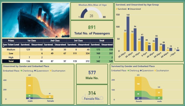
Out of 891 passengers, only 38% survived, while 62% perished.
2️⃣ Gender Gap
577 males, only 109 survived (~19%).
314 females, 233 survived (~74%).
Clear evidence of the "women and children first" rule.
3️⃣ Impact of Class and Fare Ticket Level
1st class survival rate: ~63%
2nd class: ~47%
3rd class: ~24%
Survival wasn’t random — it strongly correlated with ticket class.
4️⃣ Fare Ticket Levels
Passengers with low fares had the highest number of casualties (397 unsurvived).
Those who paid higher fares had much better chances, but some exceptions existed.
5️⃣ Age & Vulnerability
30–39 years were the most at risk: 143 perished.
Children (<10 years) had comparatively better survival odds, reflecting evacuation priorities.
6️⃣ Embarkation Point Differences
Southampton passengers (mostly 3rd class) → highest death toll.
Cherbourg passengers (wealthier, many in 1st class) → higher survival rates.
What stood out most to me wasn’t just the numbers, but how they reflect social inequalities, human decisions, and survival priorities during a historic tragedy.