تحليل وتصوير الأنماط الديموغرافية في الولايات المتحدة باستخدام ArcGIS Pro
تفاصيل العمل
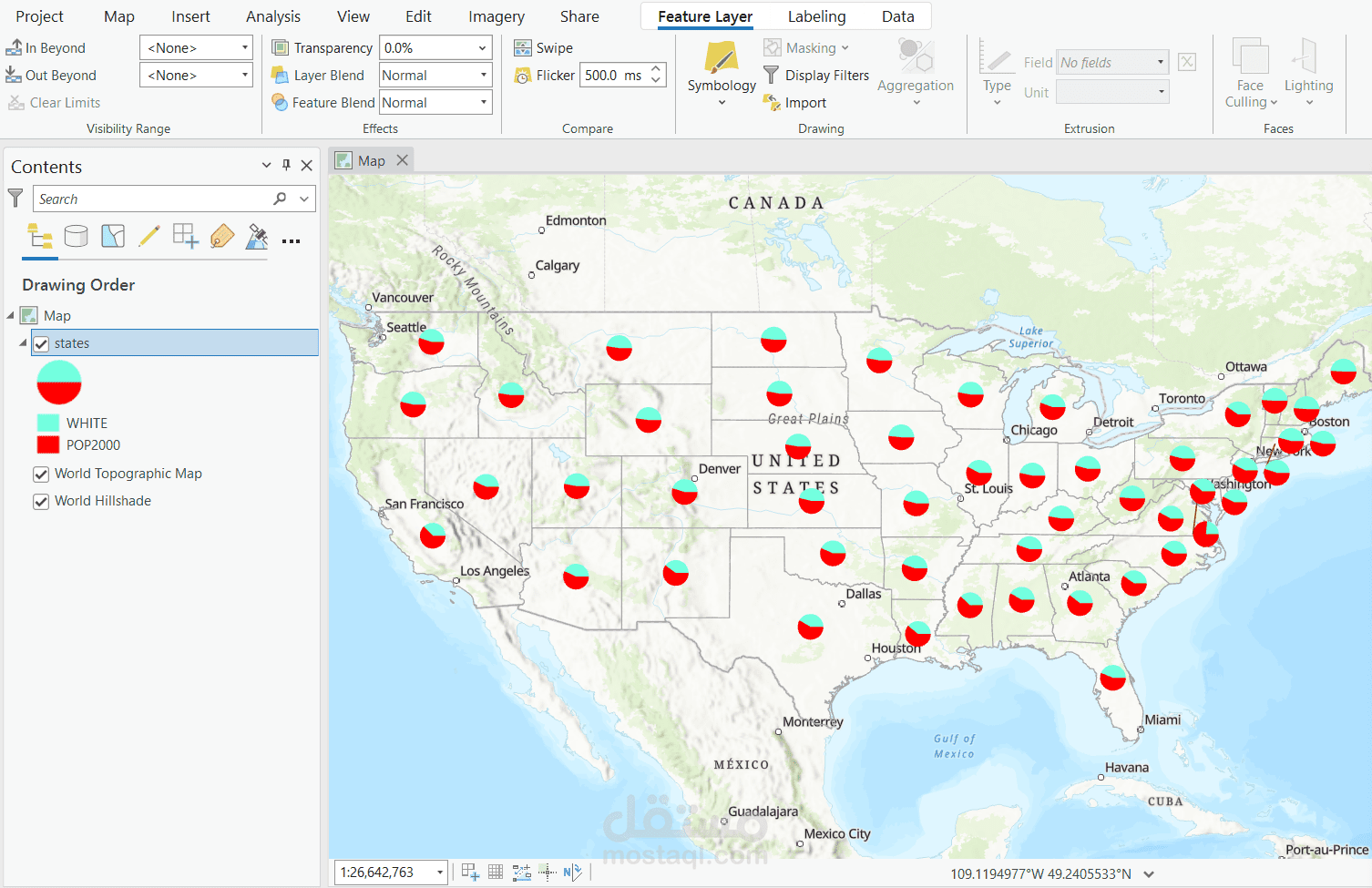

في هذا المشروع، قمت بتحليل الأنماط الديموغرافية في الولايات المتحدة الأمريكية وتصويرها باستخدام ArcGIS Pro، مستفيدًا من مزيج متكامل من التقنيات الإحصائية والكارتوغرافية.
المخططات العمودية (Bar Charts):** عرضت أعمدة متجاورة تُظهر إجمالي عدد السكان لكل منطقة جنبًا إلى جنب مع نسبة السكان من ذوي البشرة السوداء، لتسهيل المقارنة المباشرة بين الفئات.
المخططات الدائرية (Pie Charts):** صممت دوائر مقسمة لتمثيل نسبة السكان البيض في نفس المناطق، لتقديم رؤية واضحة للنسب الديموغرافية.
---
In this project, I analyzed and visualized demographic patterns across the United States using ArcGIS Pro, leveraging a comprehensive combination of statistical and cartographic techniques.
* **Bar Charts:** Created side-by-side columns displaying the total population of each region alongside the percentage of the Black population, enabling direct comparison across groups.
* **Pie Charts:** Designed segmented circles to represent the proportion of the White population in the same regions, providing a clear visual representation of demographic distribution.
---