Python Dashboard - Tkinter
تفاصيل العمل
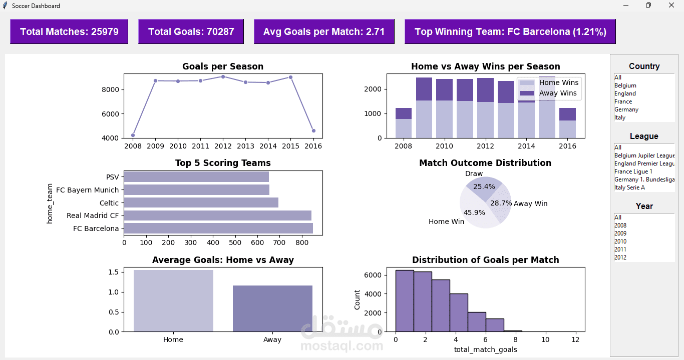
I developed an interactive Soccer Data Dashboard using Python, Tkinter, and Matplotlib to visualize and analyze football match statistics.
The dashboard provides users with an intuitive and organized interface to explore insights and trends from historical soccer data.
Key Features:
Clean and user-friendly GUI built with Tkinter.
Display of total matches, total goals, average goals per match, and top winning team.
Multiple interactive visualizations, including:
Goals scored per season.
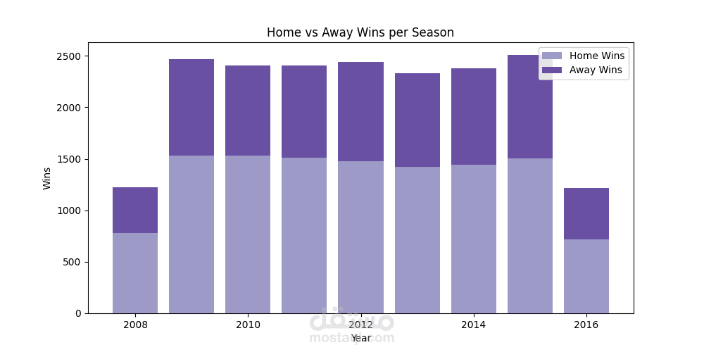
Comparison of home vs. away wins over time.
Match outcome distribution (Home Win / Draw / Away Win).
Top 5 highest-scoring teams.
Average goals scored at home vs. away.
Distribution of goals per match.
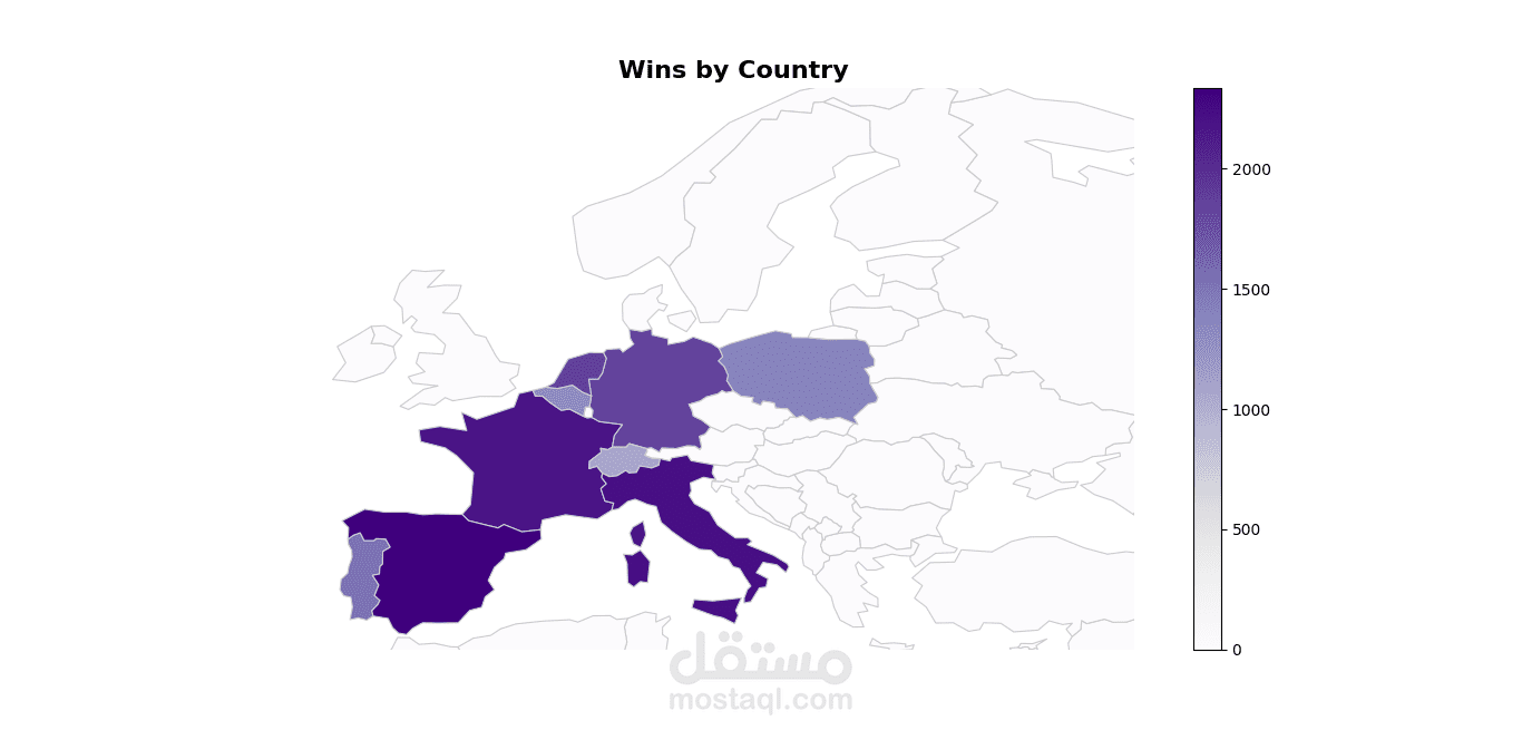
Filtering options by country, league, and season.
Responsive layout designed for readability and clarity.
Easily extendable — can be connected to CSV files or databases for real-time data analysis.
Technologies Used:
Python
Tkinter – for GUI design
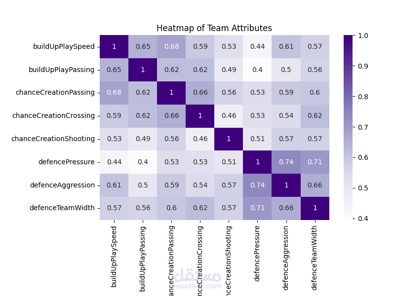
Matplotlib – for data visualization
Pandas – for data manipulation and analysis
Result:
A professional and visually engaging dashboard for exploring and analyzing football statistics.
It provides valuable insights into match performance trends and can be used by sports analysts, researchers, or data enthusiasts.