Logo & package box for cookies and oreshkis brand
تفاصيل العمل
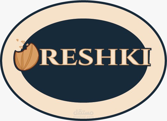
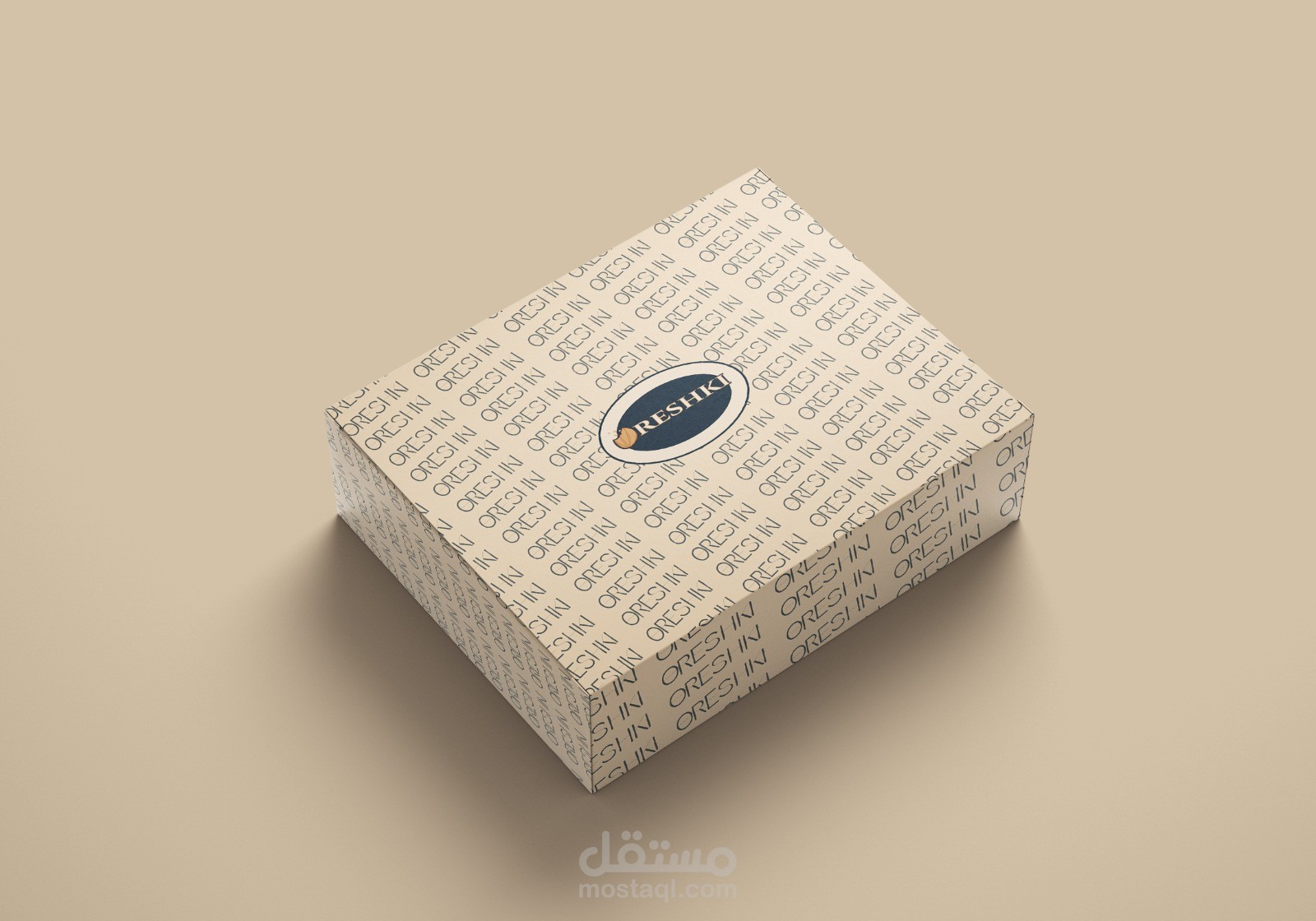
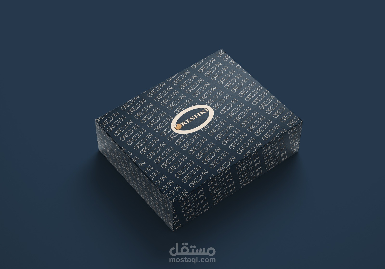
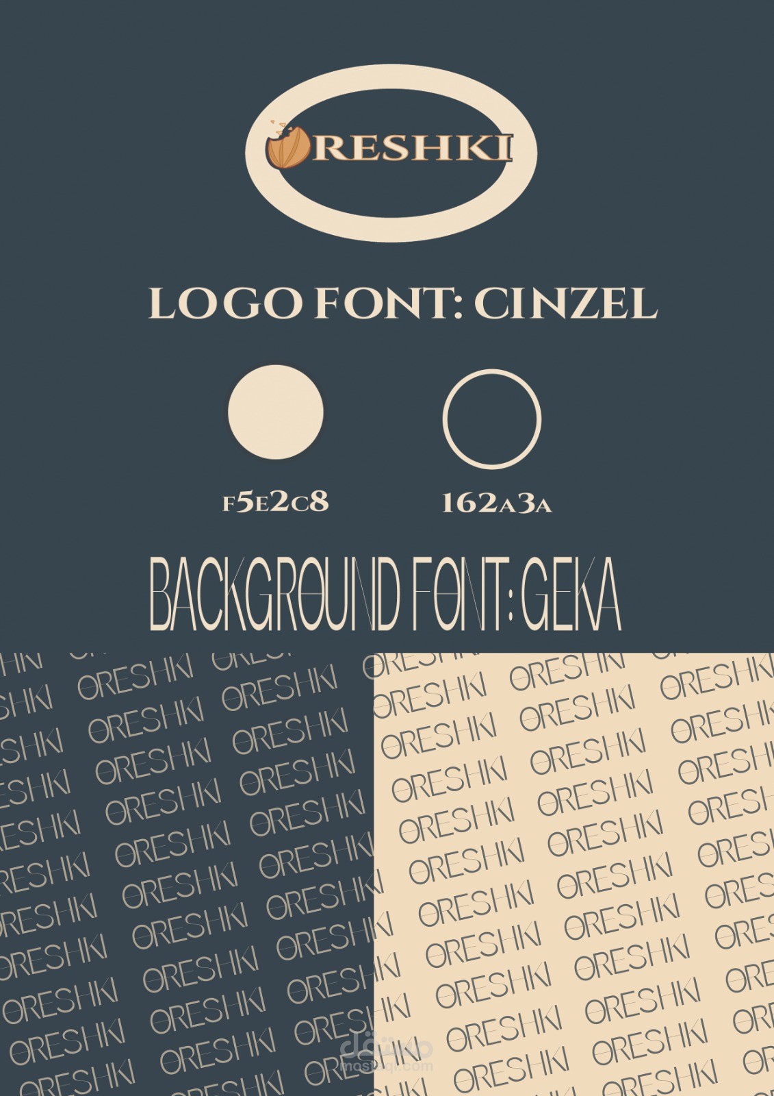
For my Oreshkis logo and packaging design, I wanted to create a look that feels both elegant and comforting — something that reflects the homemade warmth of the product but still appears modern and refined.
I chose a navy blue and cream beige color palette to give a sense of trust, calmness, and sophistication. The walnut illustration adds a playful, personal touch that connects directly to the product itself, while the clean serif font gives the brand a classic and premium feel.
Overall, the design aims to balance authenticity and elegance, making the brand look both inviting and high-