data analysis
تفاصيل العمل
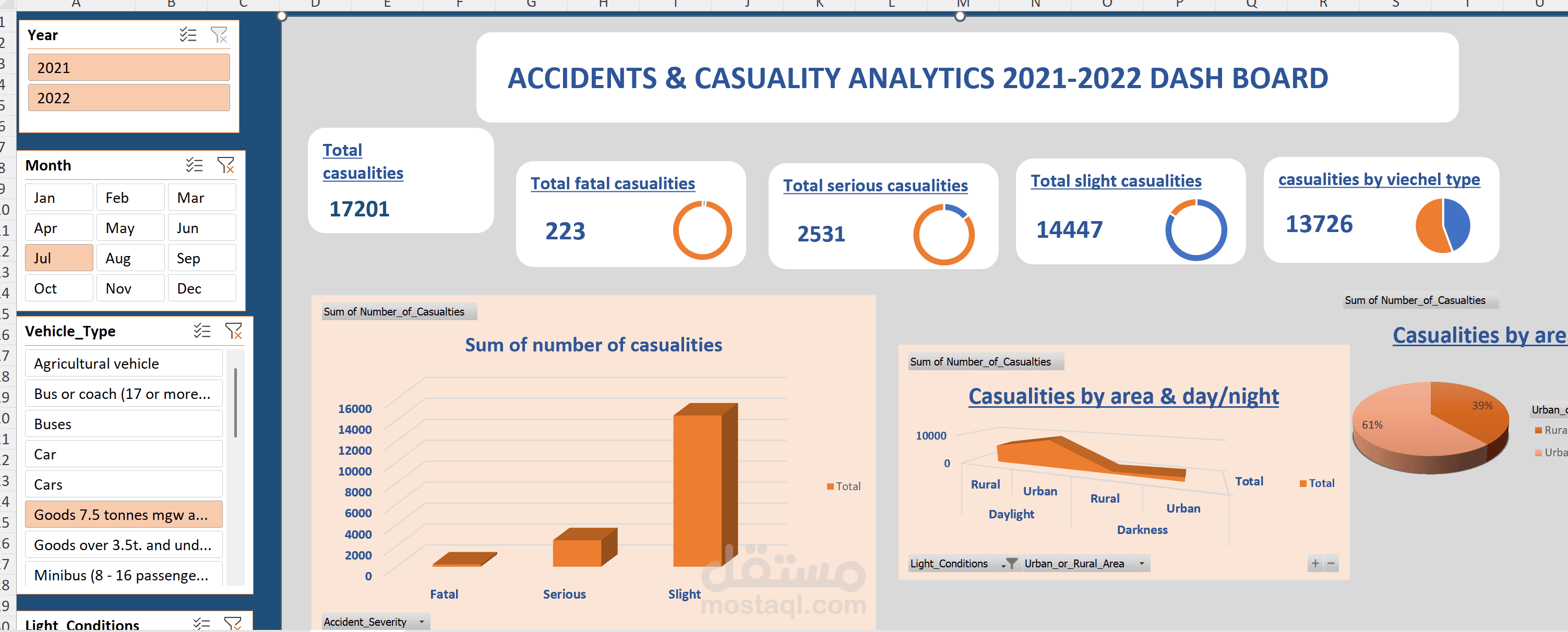
comprehensive data visualization dashboard titled “Accidents & Casualty Analytics 2021–2022 Dashboard.” It presents key insights into road accident statistics across two years (2021 and 2022), focusing on the number, type, and severity of casualties. The dashboard is visually structured and uses a combination of filters, key performance indicators (KPIs), and interactive charts to provide an analytical overview of accident trends.
Overall Structure and Layout
The dashboard has a professional, structured layout with filters on the left-hand side and visual summaries across the main workspace. The design employs muted peach and blue tones, ensuring readability and distinction between data elements. The top header prominently displays the dashboard title, giving immediate context to the report.
Filters and Interactivity
On the left panel, several interactive slicers (filters) are visible:
Year: Allows users to select data for 2021, 2022, or both combined.
Month: Displays months from January to December, enabling filtering by specific months (e.g., July is selected in the image).
Vehicle Type: Offers a detailed list of vehicle categories such as “Agricultural vehicle,” “Bus or coach,” “Car,” “Goods 7.5 tonnes mgw and above,” and more.
Light Conditions (partially visible): Suggests filtering by daylight or darkness conditions.
These filters enable a dynamic exploration of accident data for more targeted insights.
Key Performance Indicators (KPIs)
Across the top section of the dashboard, several critical KPIs summarize the overall accident data:
Total Casualties: 17,201
Total Fatal Casualties: 223
Total Serious Casualties: 2,531
Total Slight Casualties: 14,447
Casualties by Vehicle Type: 13,726
Each KPI is displayed in a distinct, rounded rectangular card with clear numeric emphasis and consistent typography. Circular progress visuals accompany some indicators (e.g., fatal, serious, and slight casualties), giving a quick visual sense of proportion.
Charts and Visual Analytics
The dashboard includes a variety of graphical representations to enhance interpretability:
Bar Chart – Sum of Number of Casualties:
Categorizes casualties by severity (Fatal, Serious, Slight).
Visually emphasizes that slight casualties dominate the total, followed by serious and fatal incidents.
The orange 3D bars add depth and make comparisons more intuitive.
3D Area Chart – Casualties by Area & Day/Night:
Illustrates how accidents vary across rural and urban areas under daylight and darkness conditions.
Indicates that urban daylight accidents likely contribute most to total casualties.
Pie Chart – Casualties by Area:
Compares the percentage distribution of casualties between urban (61%) and rural (39%) areas.
Uses contrasting orange shades for differentiation and quick interpretation.
Insights and Interpretation
From the data displayed:
A total of 17,201 casualties were recorded across 2021–2022.
The majority of casualties were slight injuries (14,447), while serious and fatal cases were significantly lower, reflecting expected accident severity patterns.
Urban areas account for a larger share of casualties (61%), possibly due to higher traffic density and vehicle exposure.
Filtering options allow for deeper insights by month, vehicle type, or lighting condition, enabling pattern identification (e.g., whether certain months or conditions see higher accident frequencies).
Design and Usability
The dashboard’s clean, professional aesthetic promotes easy comprehension. Rounded panels, consistent typography, and subtle color gradients contribute to a polished appearance. The interactive filters on the left make it ideal for exploratory analysis by transportation authorities, policy analysts, or safety auditors.