Netflix Movies Interactive Dashboard with Power BI
تفاصيل العمل
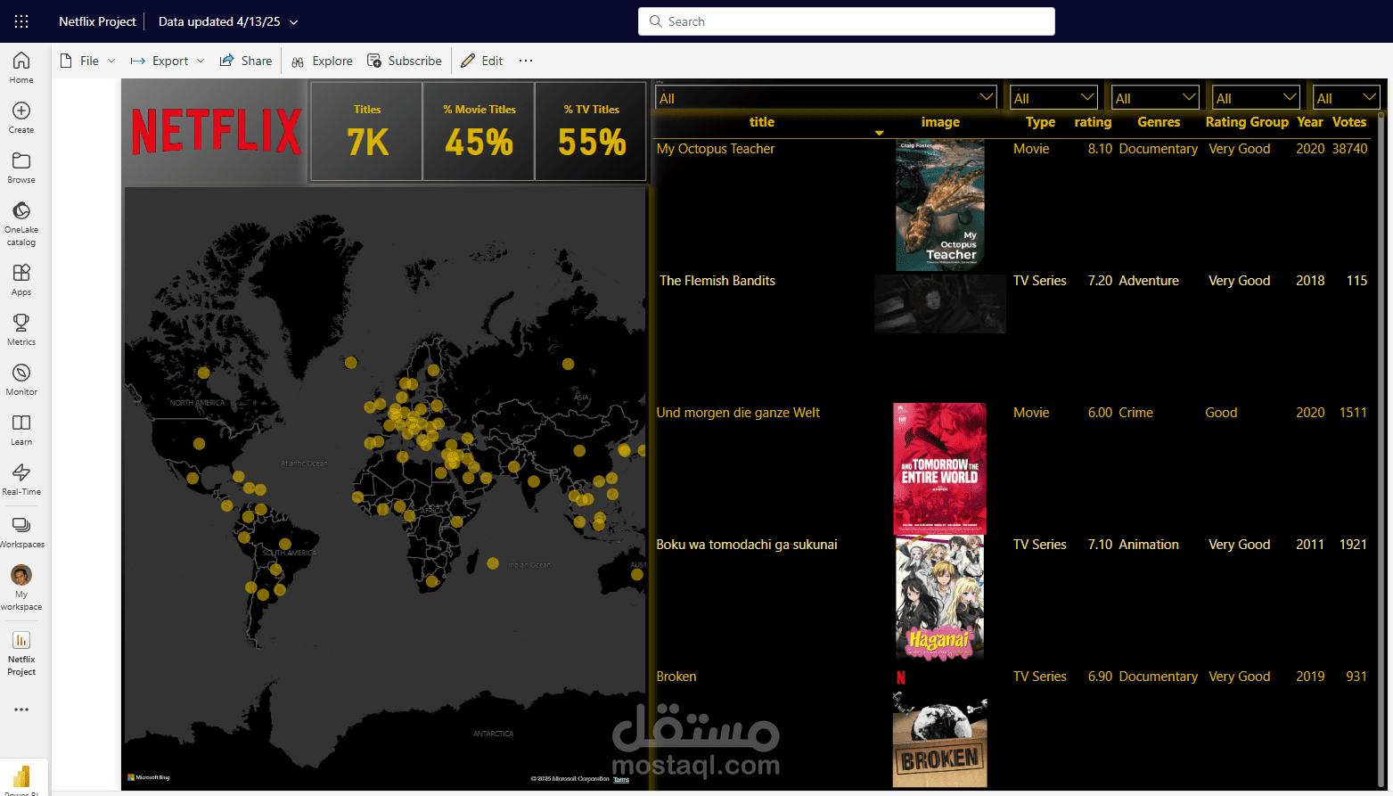
Project Overview:
This project showcases my ability to extract, clean, and visualize real-world data using Power BI. I built an interactive dashboard based on a dataset containing detailed information about Netflix movies, enabling users to explore the platform’s film catalog in a dynamic and engaging way.
️ Tools Used:
Power BI for data modeling and dashboard design
Excel for initial data cleaning
DAX for calculated columns and measures
Online data sources for Netflix movie details
Power BI Maps Visualization for geographic insights
? Project Creation Process:
Data Collection & Preparation:
I started by collecting a dataset containing metadata about Netflix movies, including titles, release years, genres, countries of production, ratings, and image URLs.
Data Cleaning:
Using Excel and Power BI, I cleaned the dataset to remove duplicates, fix missing values, and normalize data fields like genres and countries.
Data Modeling:
I structured the data tables and relationships to ensure smooth filtering and performance, and used DAX to create calculated columns and custom measures for average ratings, movie counts, etc.
Dashboard Design:
I designed an intuitive dashboard layout including:
A table view with movie title, rating, genre, release year, and image
Slicers for filtering by movie name, release year, rating, and genre
️ A map visualization that shows Netflix movie production by country, with interactive filtering
Key Features:
Fully interactive dashboard with slicers and visual filters
Dynamic map for exploring Netflix production across countries
A clean and modern design that emphasizes user experience
Real-time insights into Netflix's global movie content
Objective:
To demonstrate the power of data storytelling using Power BI by turning raw Netflix data into an informative and visually appealing dashboard that delivers insights at a glance.