Diversity in The US Dashboard
تفاصيل العمل
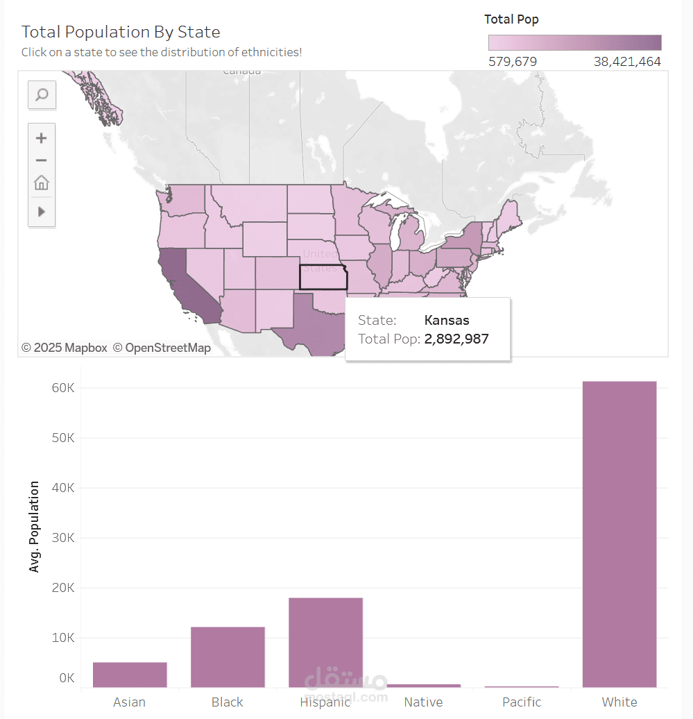

The dashboard shows the total population and distribution of different ethnicities by state.
States are shaded with colors depending on how populated they are. Less populated states
have lighter colors. The map shows that Wyoming has the lightest shade and smallest
population with only 579,679, by clicking on it the graph shows the average population for
each ethnic group, as it shows, the state doesn’t have much diversity. On the other hand,
California, the most populated is very diverse with nearly the same population of White and
Hispanic People with Asian and Black next with less but still substantial numbers.
The map and the bar chart are both monochromic as to not aggravate the eyes or distract
the viewer.