Dashboard design
تفاصيل العمل

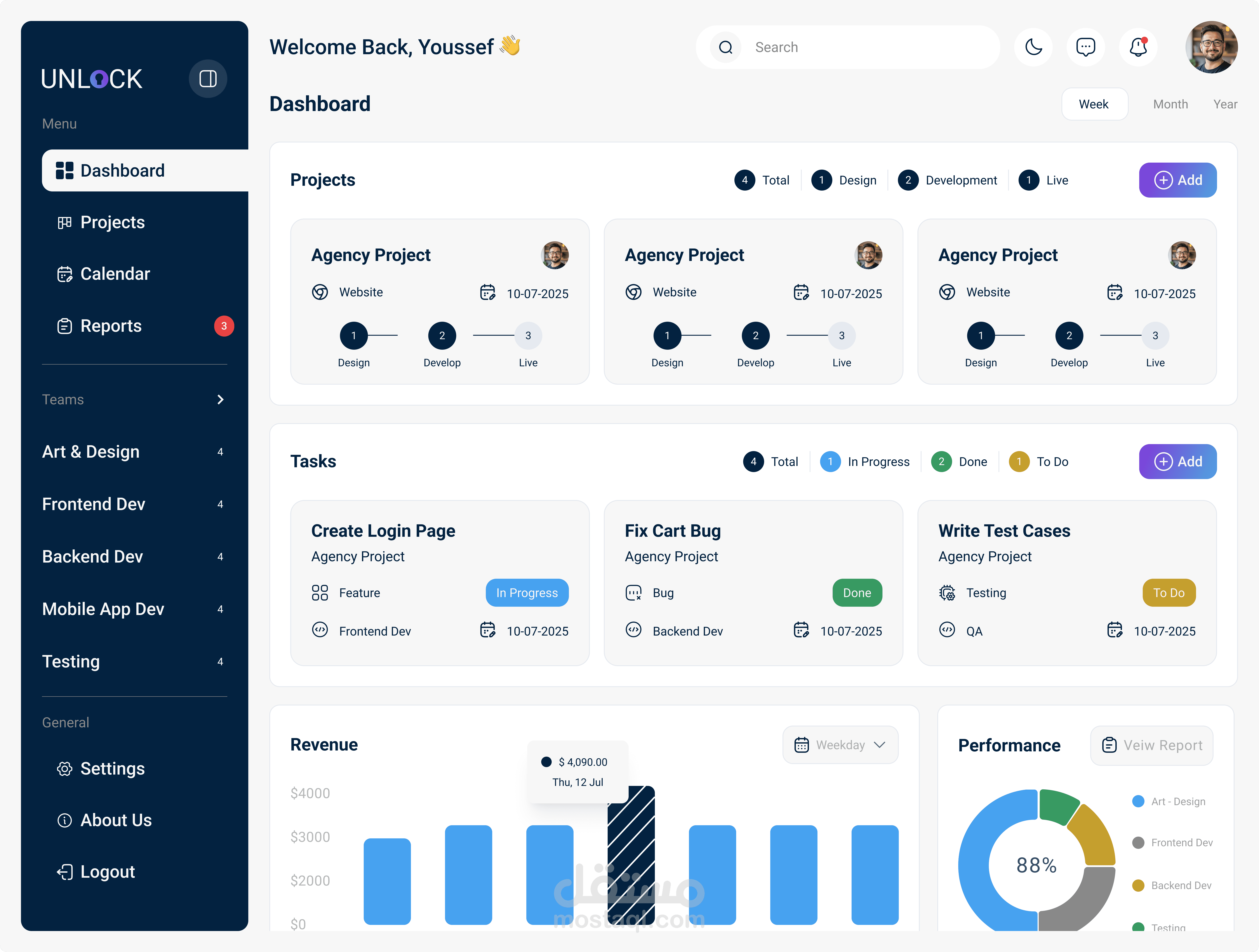
This dashboard design follows a desktop-first approach, evident from its spacious layout, multicolumn grid, and horizontal data visualizations. The rationale behind the layout is to maximize clarity
and efficiency for teams managing multiple projects simultaneously. Key components—like project
status, analytics, active meetings, and team lists—are compartmentalized into clearly defined cards,
enabling users to quickly scan, prioritize, and act without feeling overwhelmed. The use of a
persistent left-hand navigation menu supports ease of access and quick switching between views
such as Projects, Reports, and Calendar.
From a UX perspective, the design prioritizes visual hierarchy and real-time awareness. Important
elements such as active meetings and notifications are highlighted with contrast and badges, while
progress and analytics are represented through intuitive visual charts. Team member avatars help
create a sense of collaboration and visibility. One challenge addressed here is balancing data density
with usability—the design uses color, white space, and modularity to avoid clutter.