Data Visualization
تفاصيل العمل
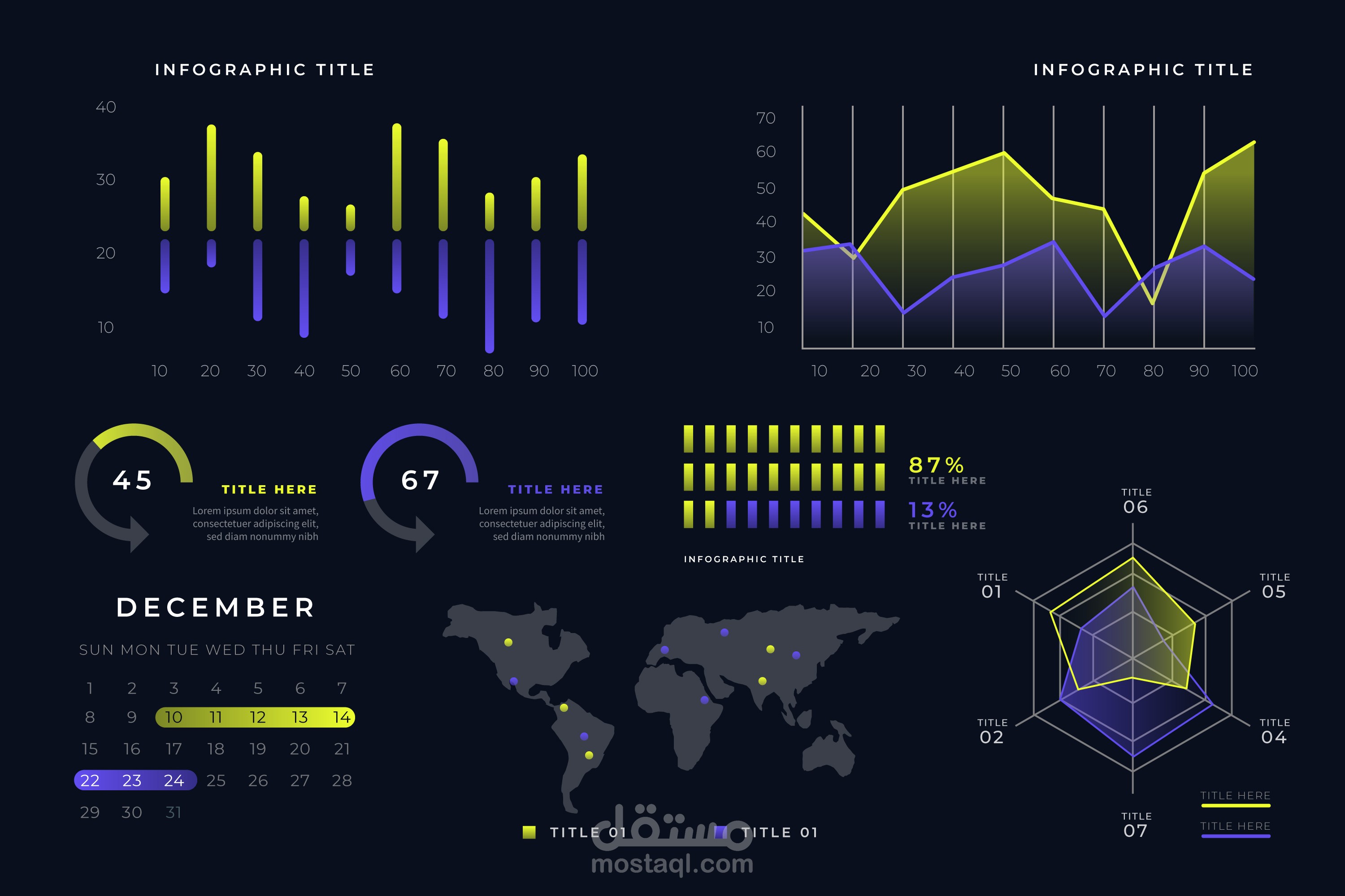

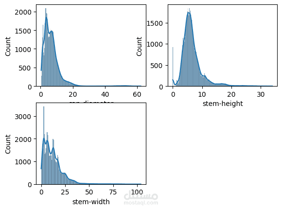
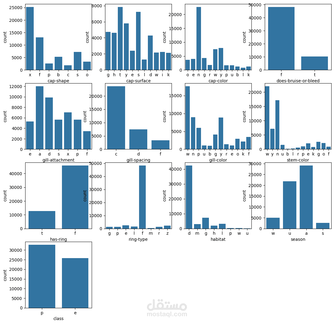
This project focuses on visualizing data to uncover insights, patterns, and trends in a clear and interactive way. By transforming raw datasets into charts, graphs, and dashboards, the project makes complex information easier to understand and interpret. The goal is to provide decision-makers, researchers, and users with intuitive visuals that highlight key findings and support data-driven decision-making.
Key features include:
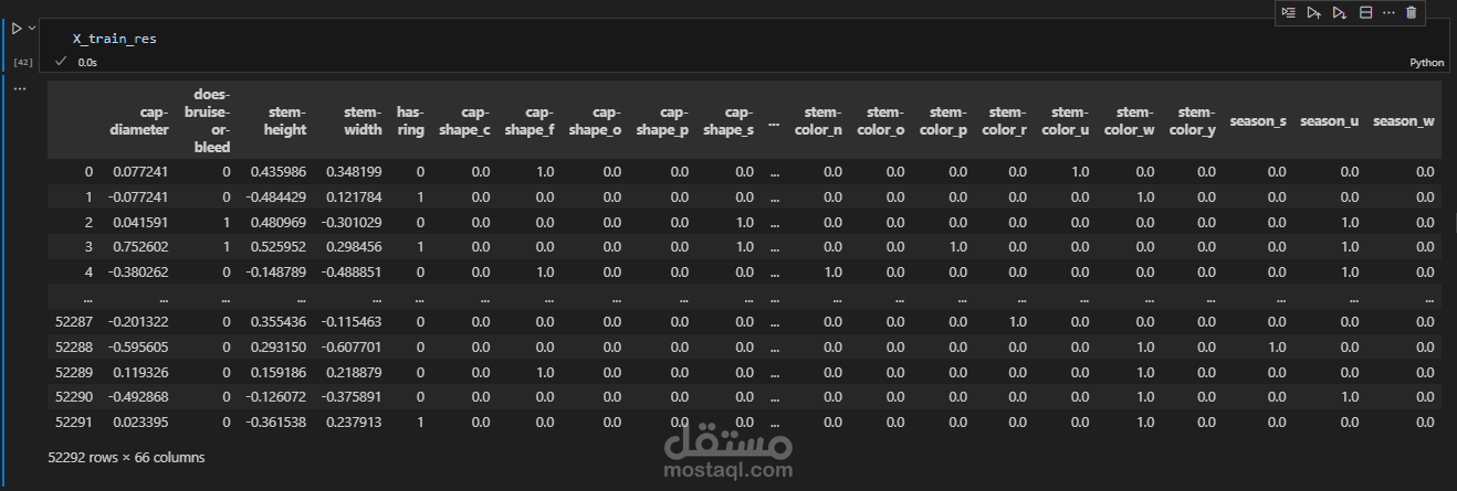
Cleaning and preparing datasets for analysis.
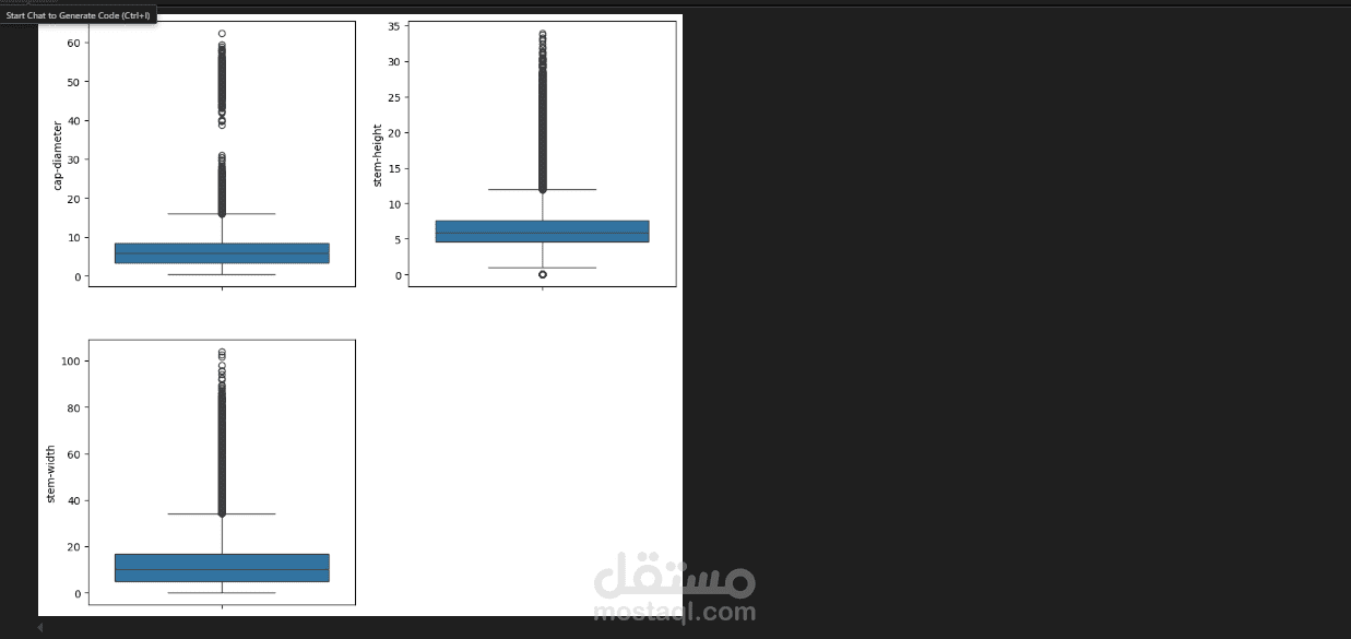
Creating interactive visualizations such as bar charts, line graphs, scatter plots, and heatmaps.
Using tools and libraries (e.g., Matplotlib, Seaborn, Plotly, or Power BI) for dynamic and engaging presentations.
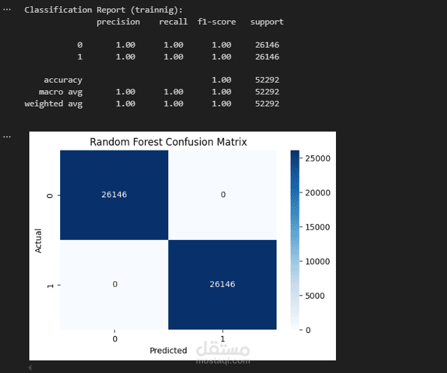
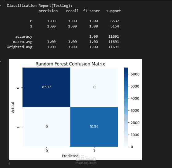
Delivering a dashboard or report that communicates insights effectively.