data visualization with python
تفاصيل العمل
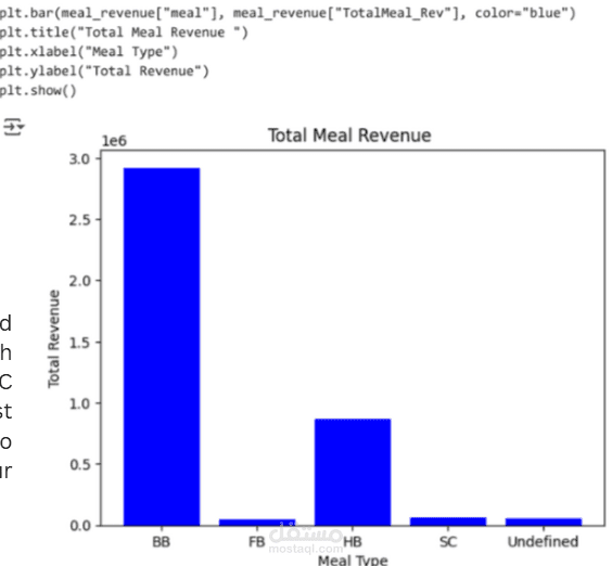
I created a visualization for hotel data using Python (Matplotlib and Seaborn). I aggregated the data by meal type to calculate the total revenue for each category, then displayed it in a bar chart for clearer comparison and insights.
Based on the chart, the BB and HB meal types generate high revenue, while FB and SC generate less; therefore, I suggest reevaluating FB and SC to achieve a balance across the four meal types