Data visualization
تفاصيل العمل

I wrote a Python script to analyze hotel booking data using two main libraries: pandas to read and handle the dataset.
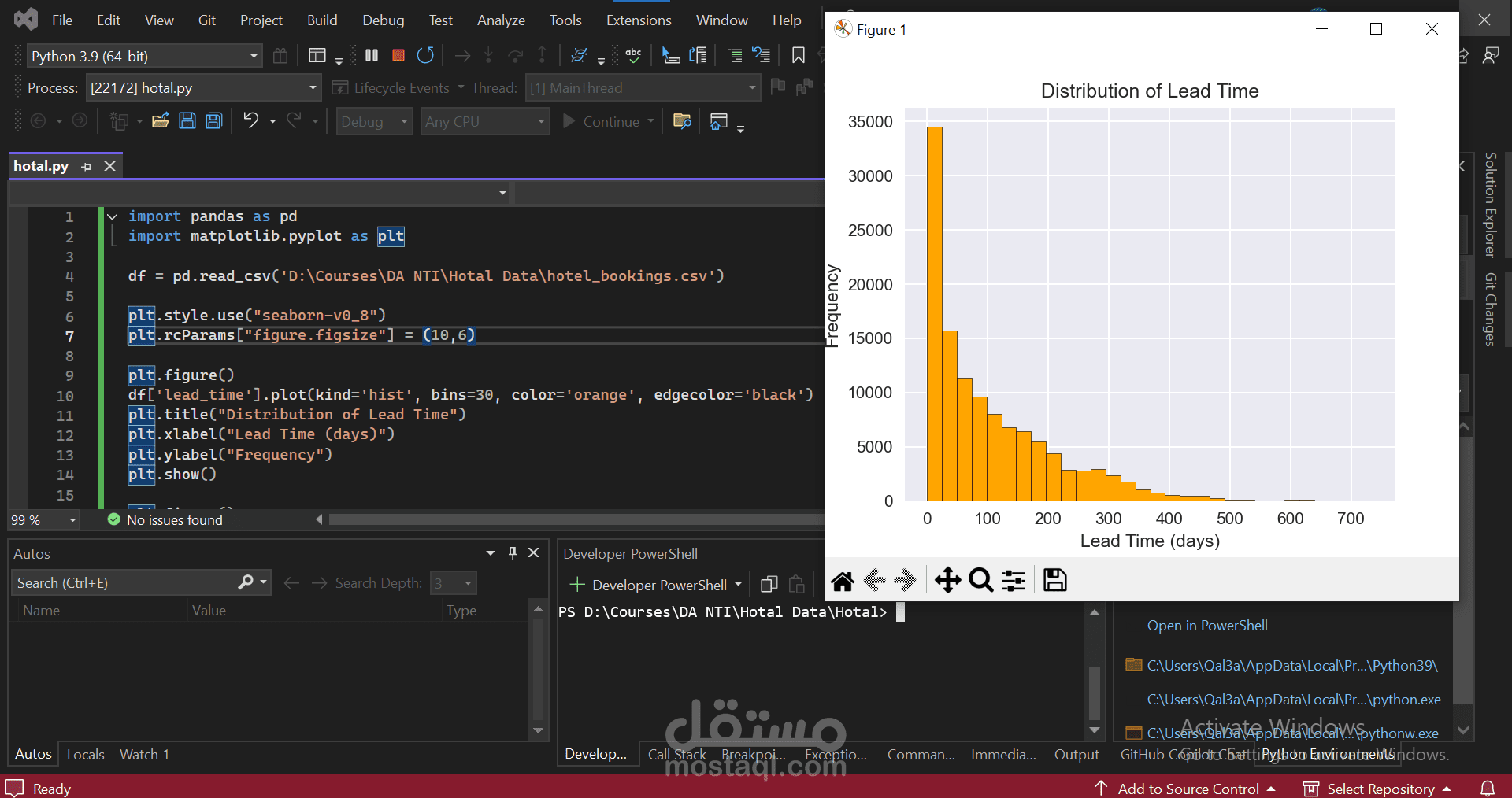
matplotlib.pyplot → to create visualizations. In this specific case, I focused on the lead_time column, which represents the number of days between the booking date and the actual arrival date.
Here's what I did step by step:
Loaded the dataset into a pandas DataFrame.
Set the visualization style (Seaborn theme) and figure size for better readability.
Created a histogram of the lead_time column, splitting the data into 30 bins.
Bars are orange with black edges for clarity.
The X-axis shows the lead time (days).
The Y-axis shows how many bookings fall into each range.