Blinkit power Bi Dashboard
تفاصيل العمل
Blinkit, a retail delivery platform, needed a simple yet powerful way to track sales performance across outlets, product types, and time.
Objective
Build an interactive dashboard that highlights KPIs, sales trends, and product performance to support data-driven decision-making.
️ Tools & Techniques
Excel → Data cleaning & preprocessing
Power BI → Data modeling & visualization
Power Query (ETL)
Power Pivot (data modeling)
DAX (custom KPIs & measures)
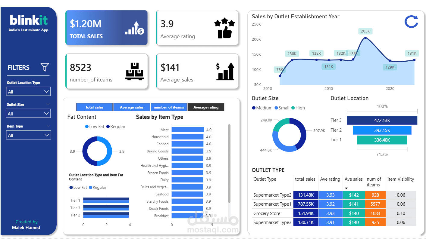
Key Insights
Total Sales: $1.20M across 8,523 items
Average Sale Value: $141 | Avg. Rating: 3.9
Outlet Insights: Tier 3 outlets topped sales ($472K)
Yearly Trend: Sales peaked in 2018 ($205K) before stabilizing
Product Performance: Meat, Household, and Canned Goods performed strongly with higher ratings
Impact
The dashboard empowers managers to:
️ Monitor performance in real time
️ Identify high-performing outlets
️ Optimize product strategies
️ Drive sustainable sales growth
This project demonstrates how data visualization + analytics = smarter business strategies.