Controlns Branding
تفاصيل العمل
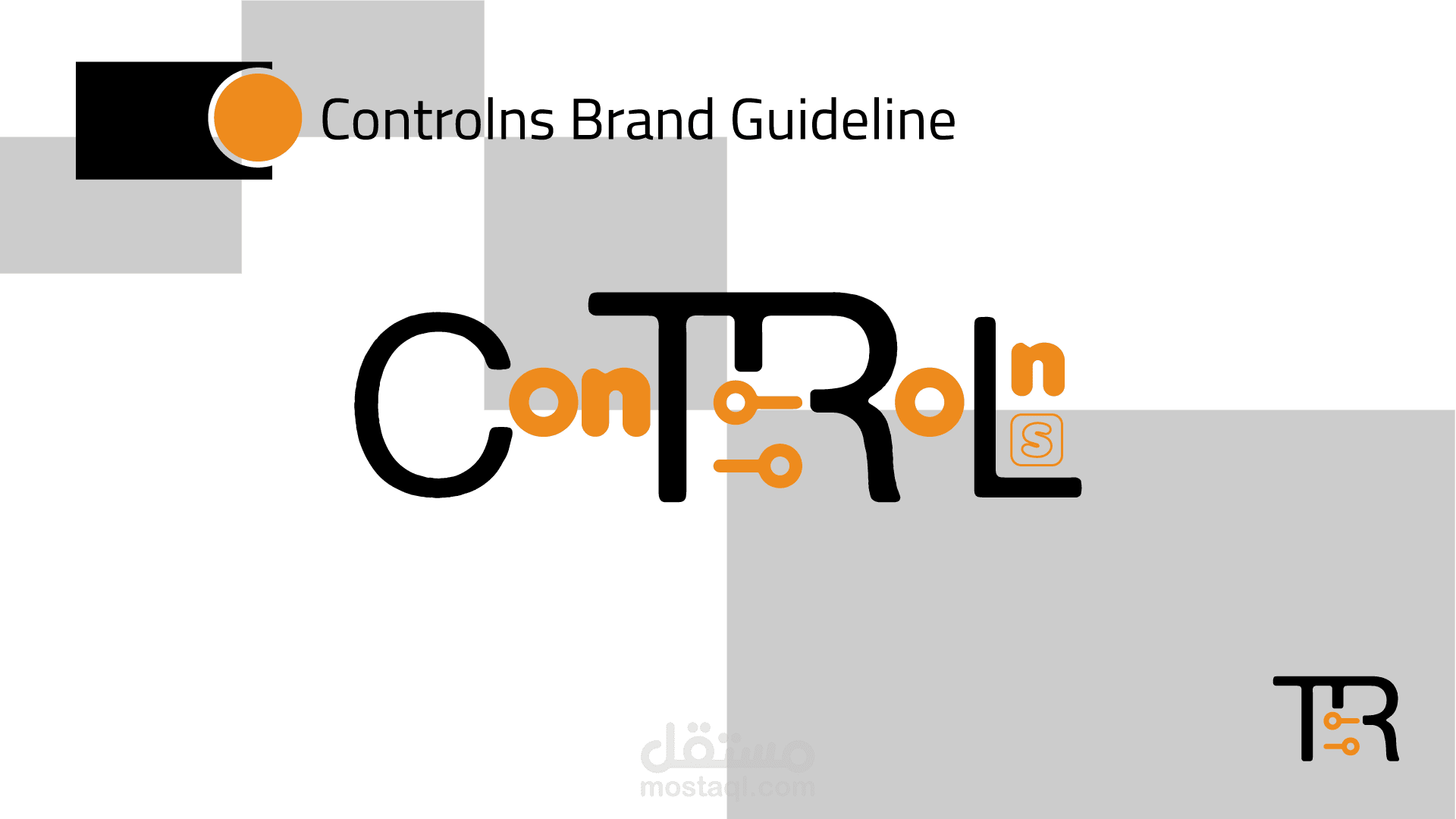
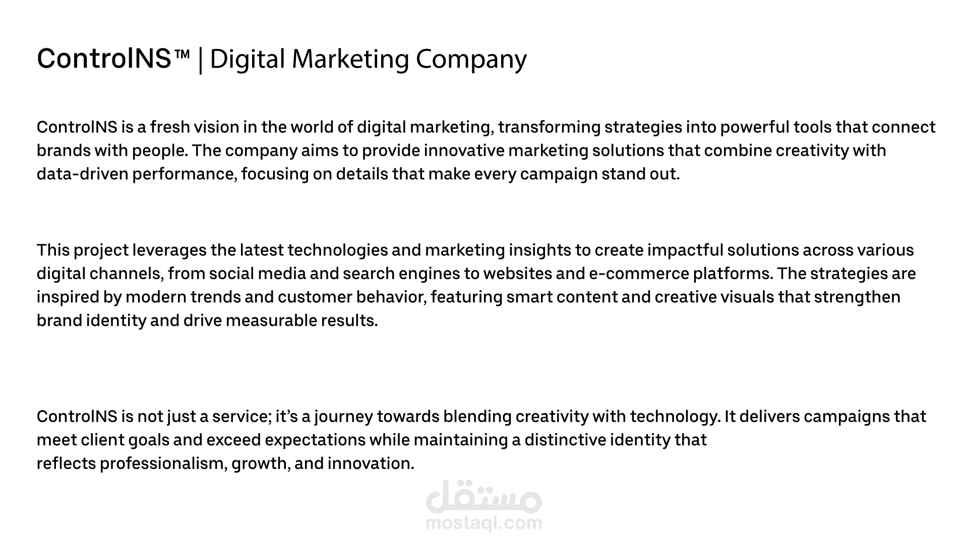
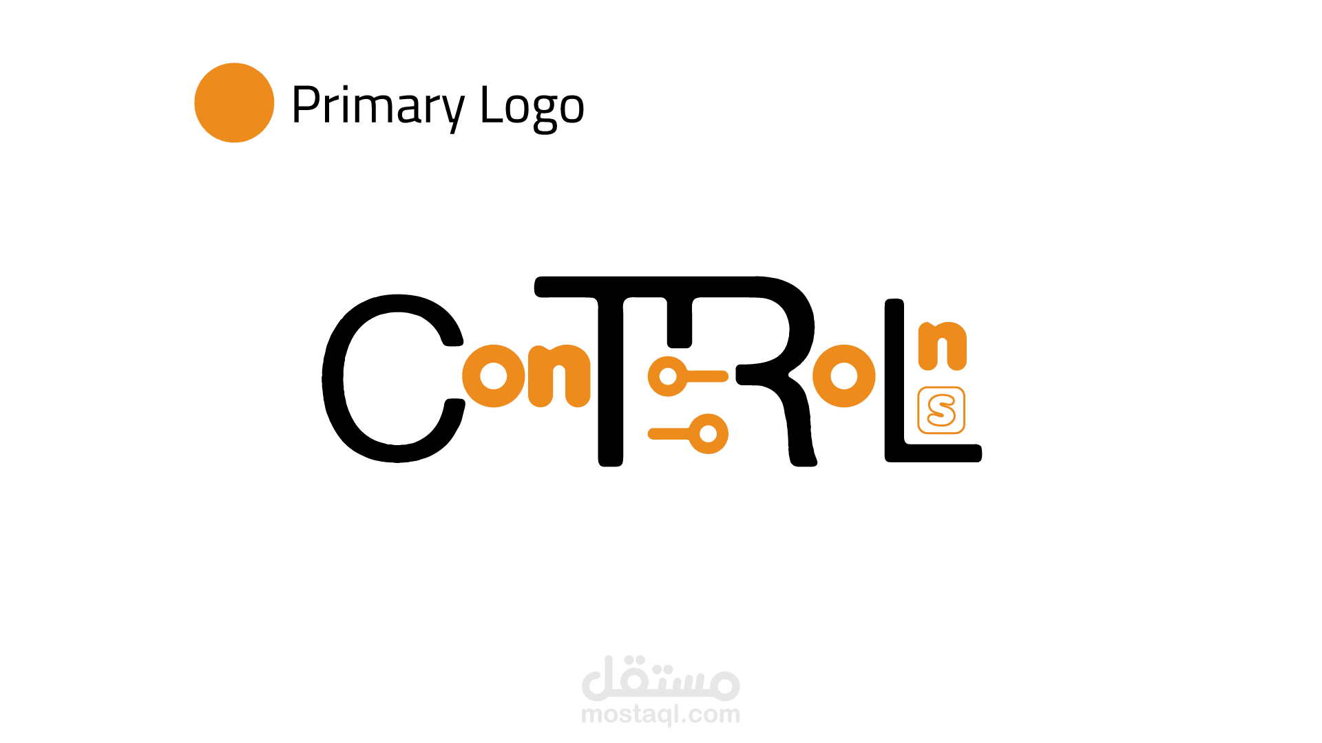
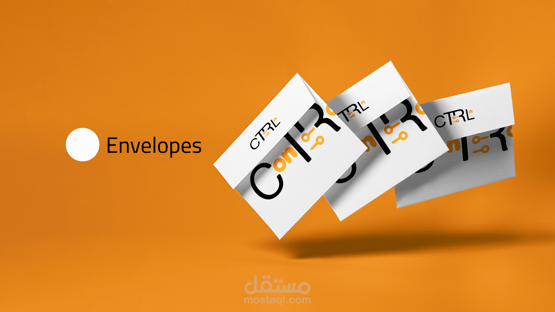
Controlns – Brand Identity & Logo Design
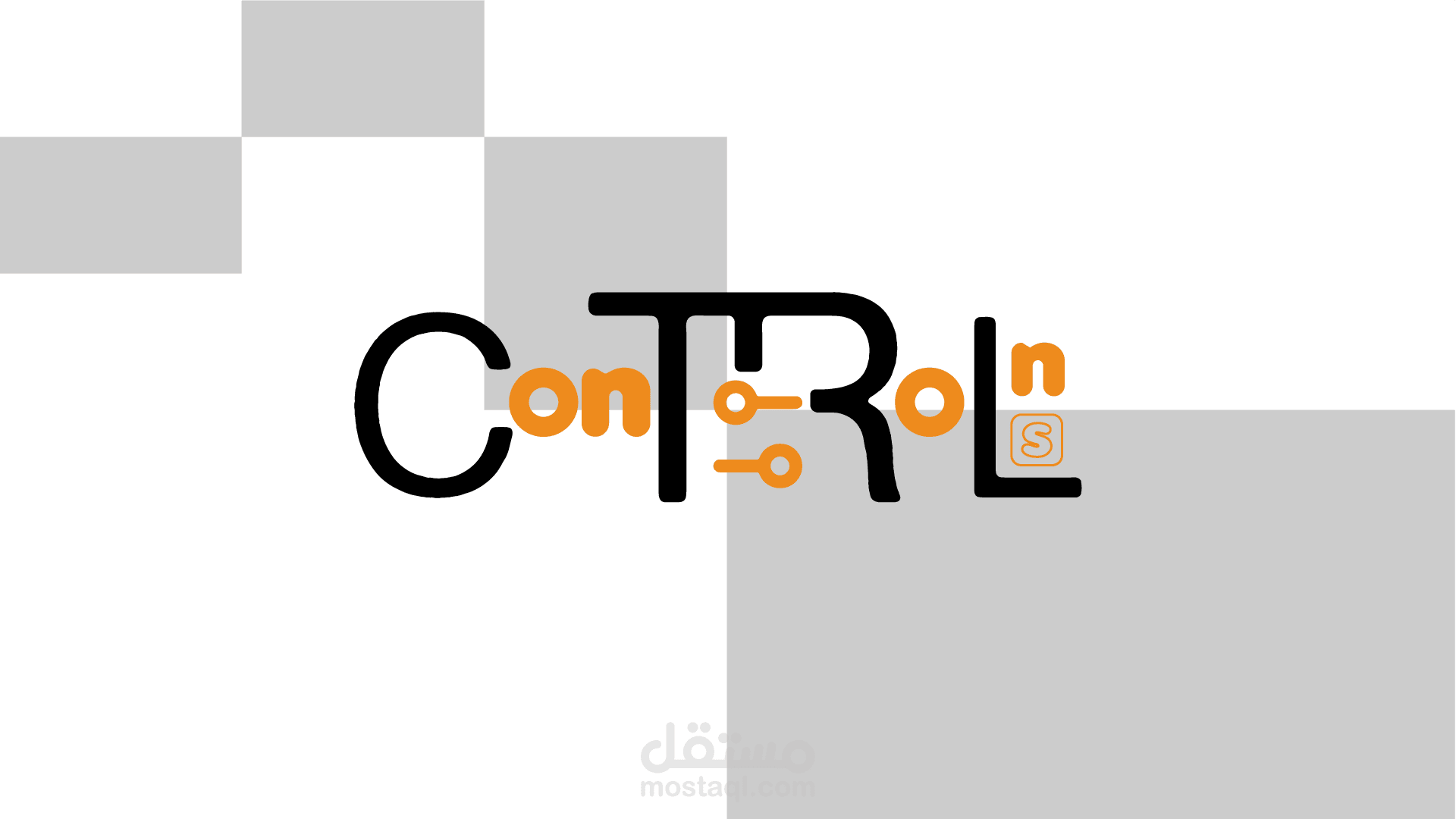
Controlns is a modern technology-oriented brand whose identity is built around the idea of control, creativity, and progress.
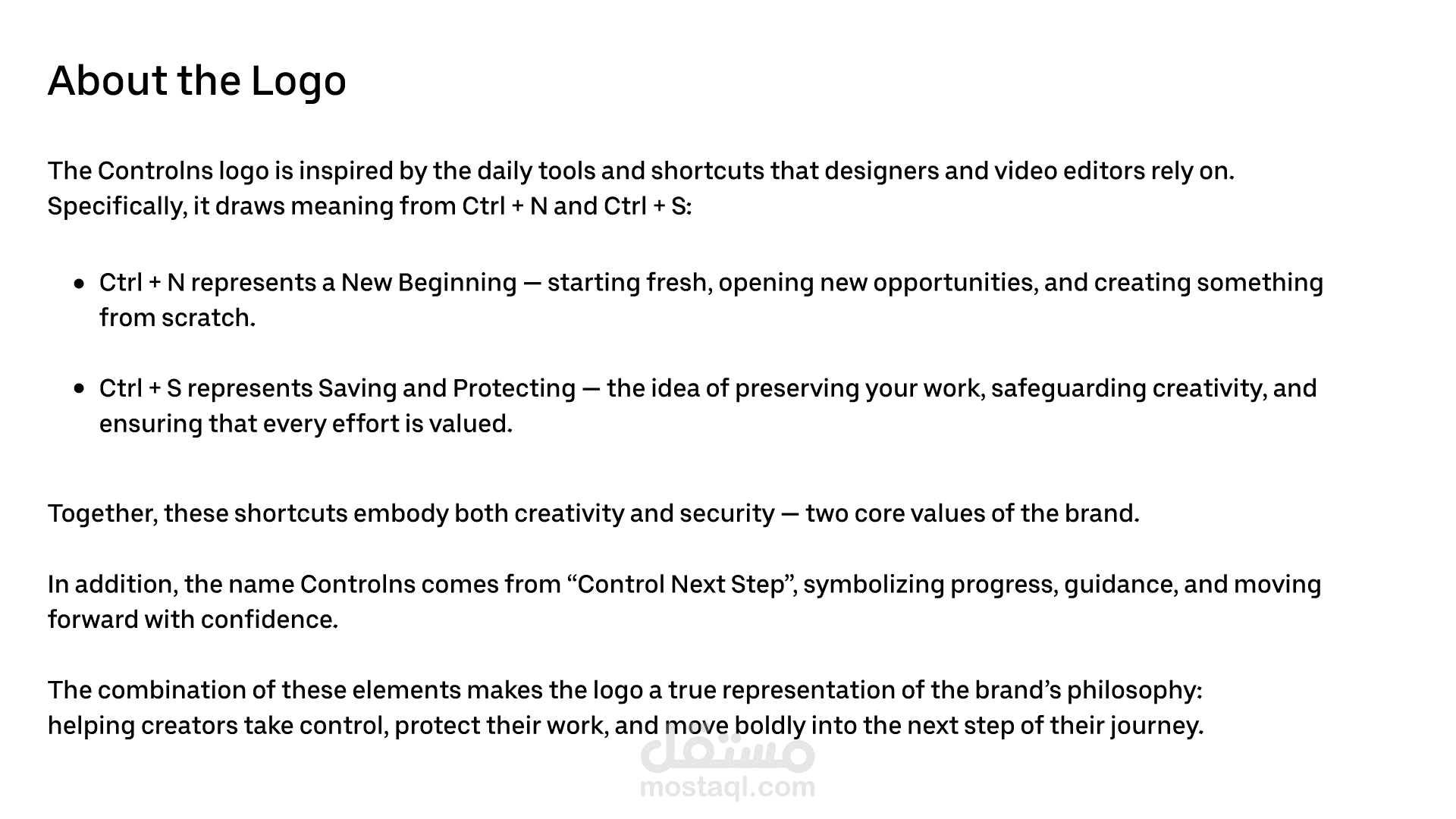
The logo concept is inspired by the essential shortcuts that every designer and video editor uses daily:
Ctrl + N → symbolizing a New Beginning and fresh opportunities.
Ctrl + S → representing Saving and Protecting creative work.
The brand name itself comes from “Control Next Step”, reflecting the philosophy of guiding businesses and creators forward with confidence into their next stage.
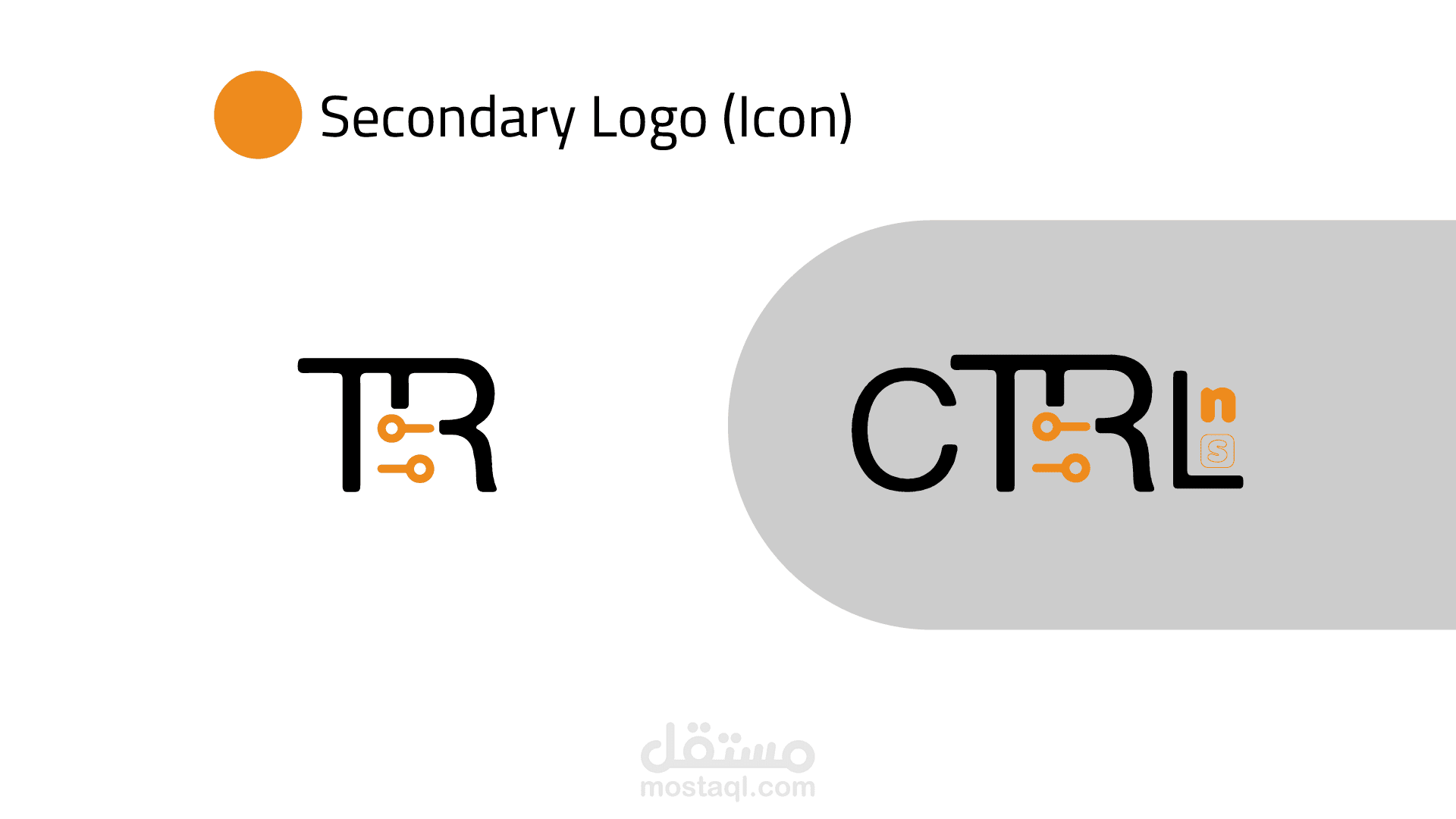
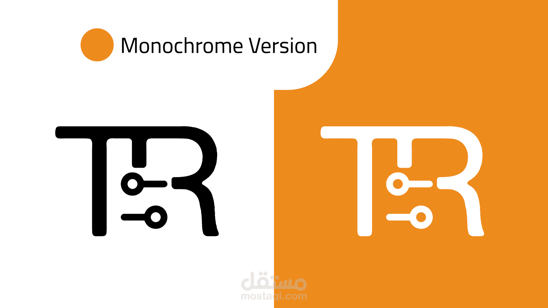
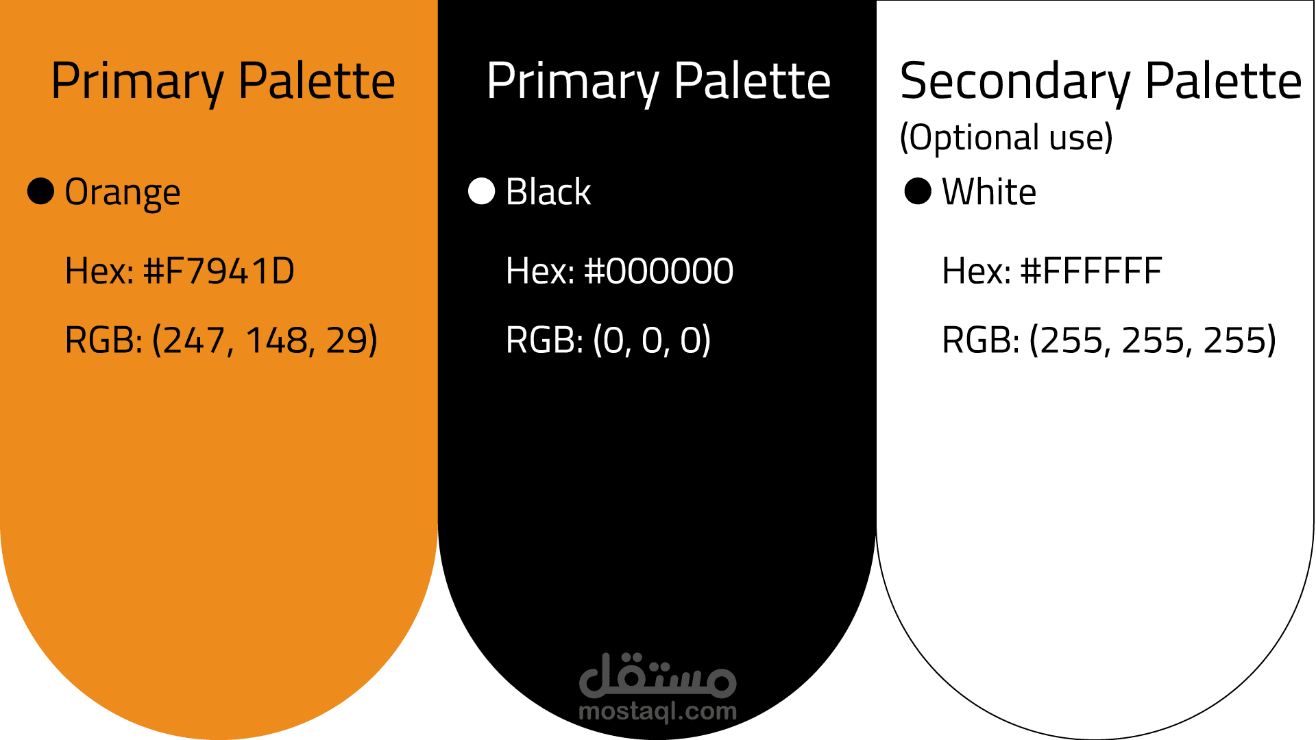
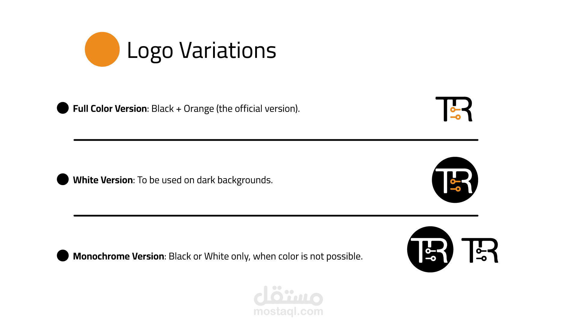
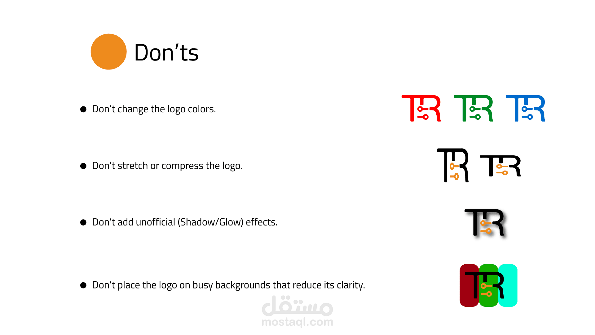
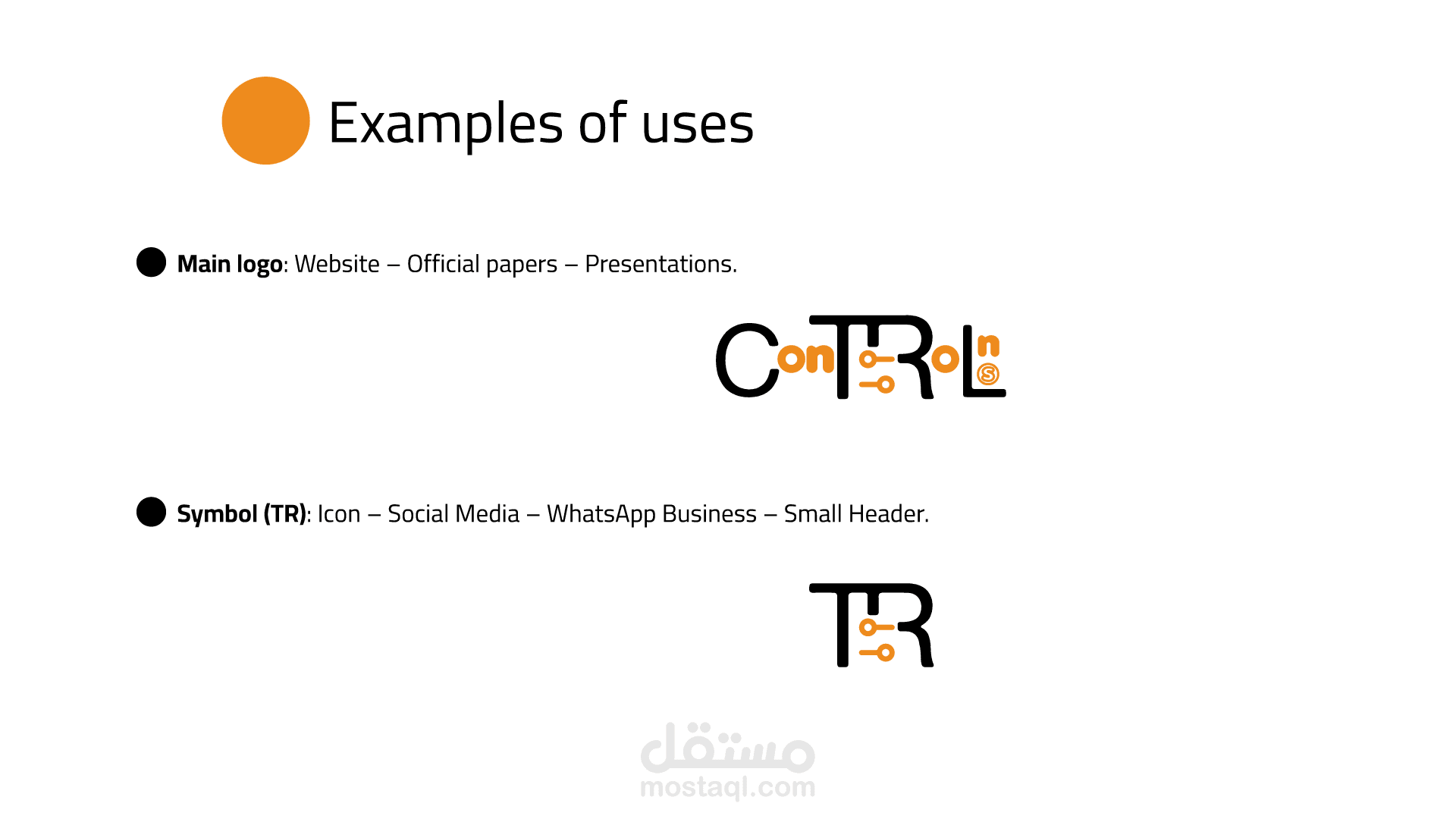
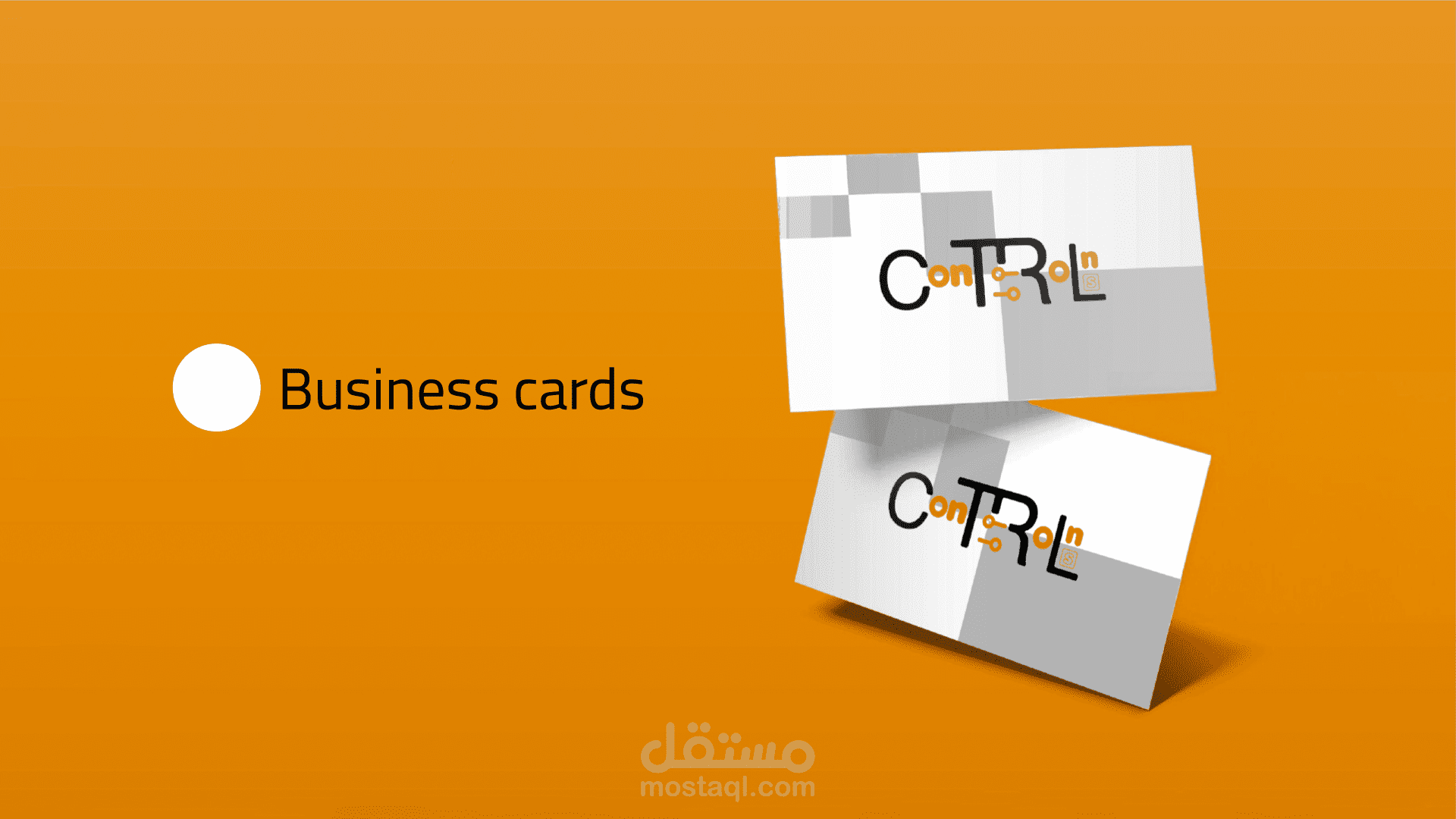
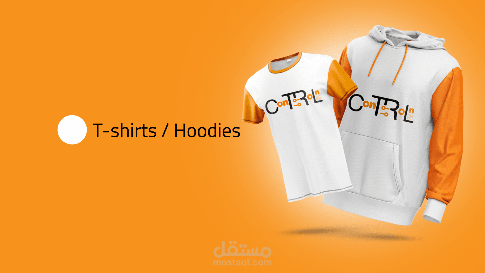
The visual identity combines clean geometric shapes, a bold black base, and vibrant orange accents to communicate both professionalism and innovation. The system includes a primary logo, secondary icon (TR), and multiple variations designed for digital, print, and outdoor applications.
This project showcases the full branding process, from concept development to final visual guidelines and real-world mockups.