plamen logo design
تفاصيل العمل

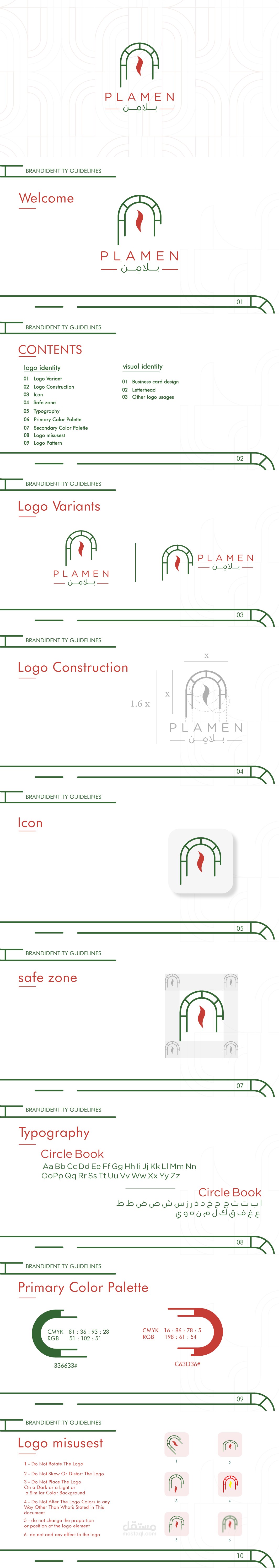
براند Plamen Pizza اتبنى من فكرة البساطة والحيوية، علشان يعكس روح البيتزا الإيطالية بمذاقها المميز.
الشعار صممناه بخطوط واضحة ولمسة عصرية تخلي العلامة سهلة التذكر.
الألوان الأساسية للبراند هي الأحمر اللي بيعبر عن الشغف والطماطم الطازة، والأخضر اللي بيرمز للنضارة والخضرة، والاتنين مع بعض بيدّوا طاقة إيجابية ودفء مرتبط بالأكل الإيطالي.
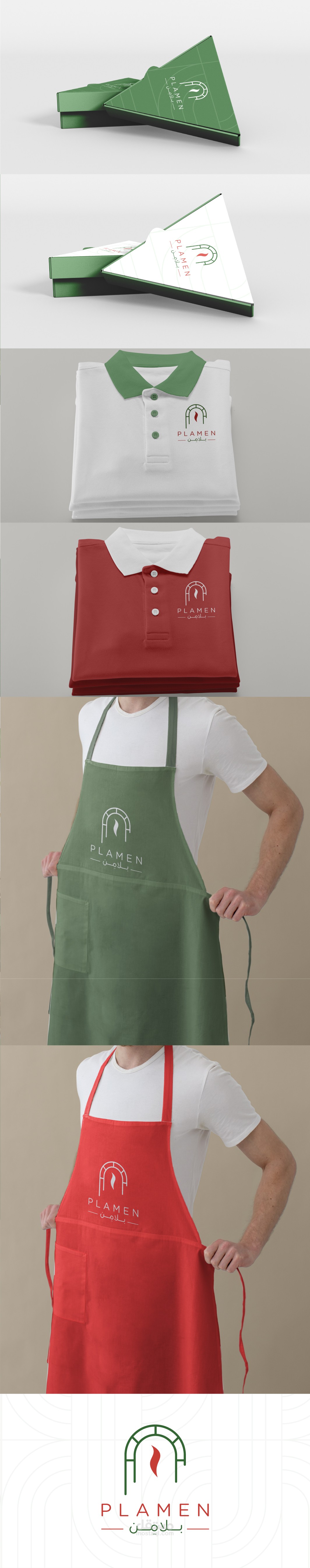
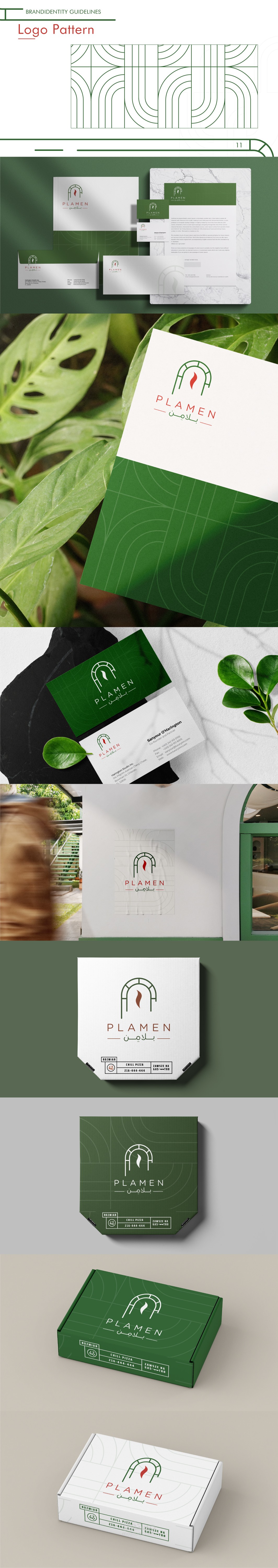
الهوية البصرية اتجهت لستايل شبابي ومرح، بحيث تناسب كل استخدامات البراند من تغليف وديكور وأدوات دعائية، وتدي إحساس بالود والقرب من العميل.
---------------------------------------
he Plamen Pizza brand was built on the idea of simplicity and vibrancy, reflecting the true spirit of authentic Italian pizza.
The logo was designed with clean lines and a modern touch, making the brand easy to recognize and memorable.
The core brand colors are red, symbolizing passion and fresh tomatoes, and green, representing freshness and natural ingredients. Together, they create a warm and energetic vibe strongly connected to Italian cuisine.
The visual identity follows a youthful and lively style, making it suitable for packaging, interior design, and promotional materials, while giving the brand a friendly and approachable character.