brochure design
تفاصيل العمل
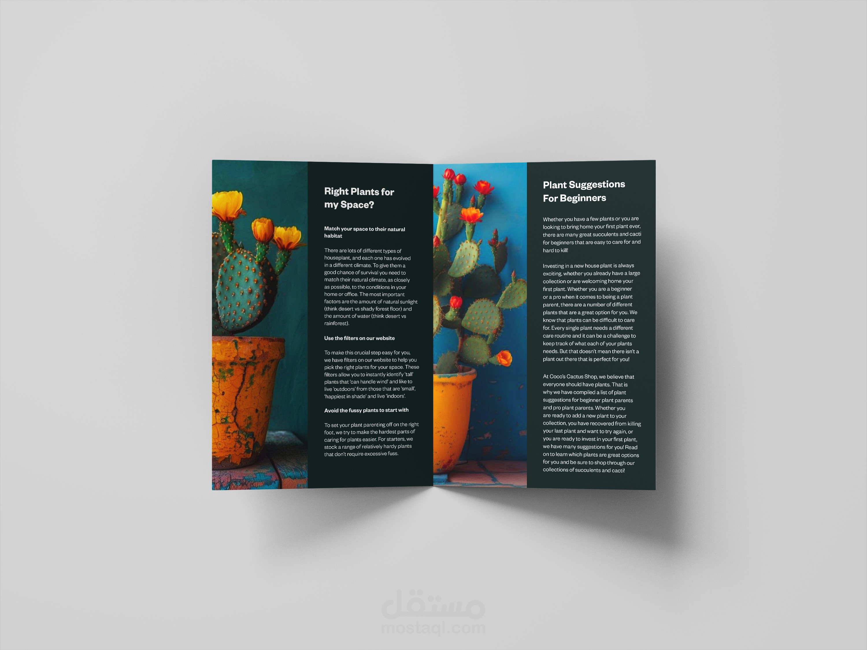
In my layout, I've used a great design technique by placing the main text and images in a balanced way. The image on the left page has a lot of open space, which is balanced by the image on the right page being placed directly next to the main text. This makes the entire design look and feel harmonious.
The text is also split into two columns, which makes it easy to read and helps it fit perfectly with the images. I've also used different text sizes and headings to make the important points stand out. This shows you have a strong understanding of how to use both images and text to create a professional and easy-to-read design.