Call center company
تفاصيل العمل
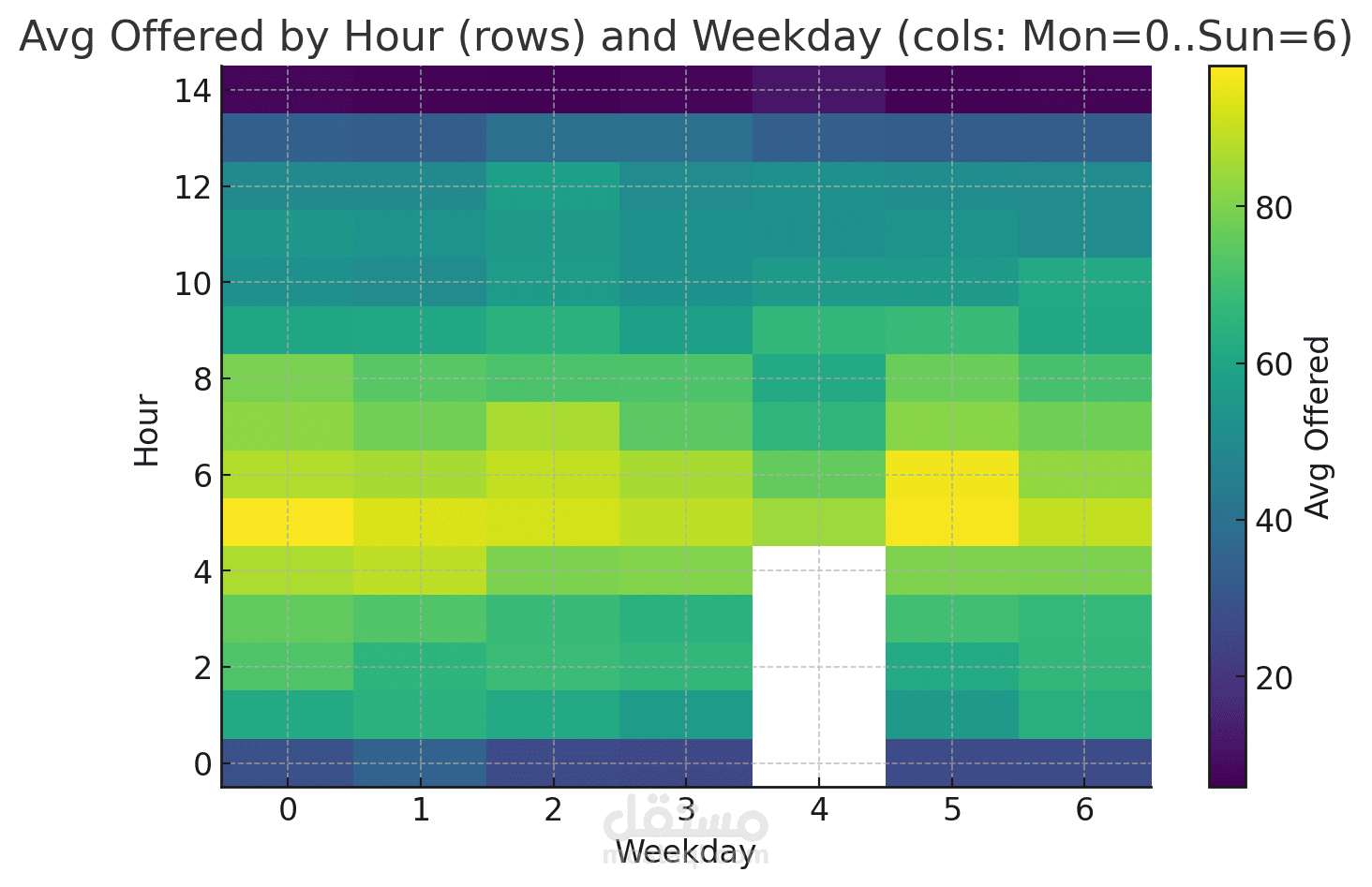
•This is a heatmap showing how the average value of a variable (“Offered”) changes across hours of the day and days of the week.
•Y-axis: Hours of the day (0 to 14 shown here, likely truncated from 24).
•X-axis: Days of the week, numbered from 0 = Monday to 6 = Sunday.
•Color scale: From purple (low) to yellow (high), representing the average offered values.
•We can see that:
•Early morning hours (around 4–6) have the highest activity (yellow zones), especially on Monday (0) and Friday (5).
•Activity drops off significantly after ~10 hours (darker green/blue zones).
•Thursday (4) has missing data (shown as a white block).
•Overnight hours (0–2) show the lowest averages (purple/blue).