Sales_Performance
تفاصيل العمل
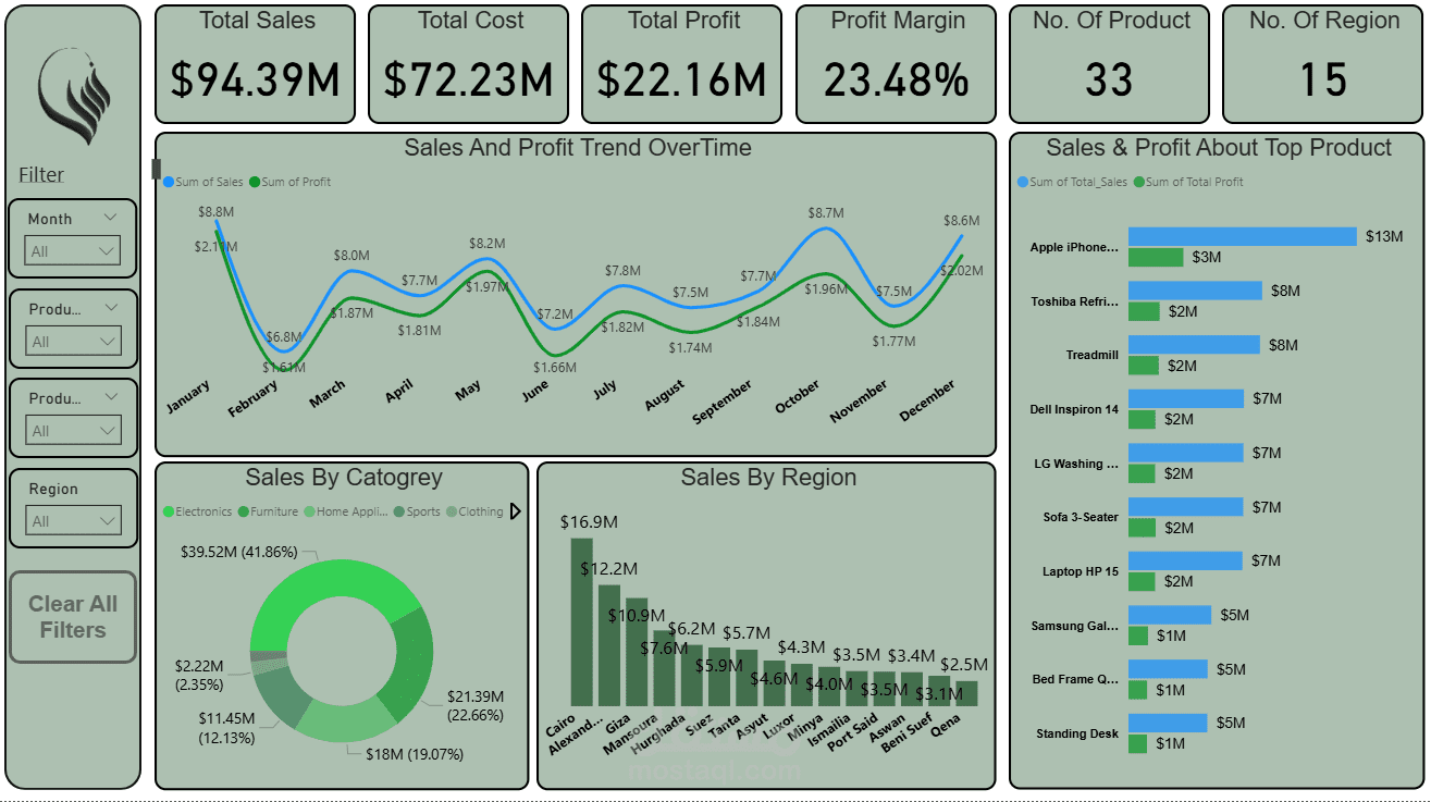
Sales Performance Dashboard | Power BI
This interactive Power BI dashboard delivers a full analysis of company sales and profit performance across products, categories, and regions — providing a clear picture of business trends and growth opportunities
Project Overview:
The goal of this dashboard was to analyze overall company performance, identify top-performing products and regions, and understand sales and profit trends over time.
The dataset included transactional sales data with columns for Date, Product, Category, Cost, Sales, Profit, and Region.
After data cleaning and transformation using Power Query, several calculated measures were created using DAX to compute:
Total Sales
Total Cost
Total Profit
Profit Margin (%)
Product & Regional Performance
Key Insights:
Total Sales: $94.39M | Total Profit: $22.16M | Profit Margin: 23.48%
Top Region: Cairo – $16.9M in total sales
Top Product: Apple iPhone – $13M in sales and $3M in profit
Best Categories: Electronics (41.8%) and Furniture (22.6%) dominate total revenue.
Profit and sales show strong recovery and upward trend from mid-year to December.
? Dashboard Features:
Interactive filters for Month, Product Category, Product Name, and Region
KPIs cards on top for a quick summary of total metrics
Sales & Profit Trend line chart to visualize performance over time
Top Products Analysis with sales vs. profit comparison
Category and Regional Breakdown using Donut and Bar Charts
Clean layout with consistent color palette and intuitive navigation
️ Tools & Skills Used:
Power BI for dashboard design and visualization
Power Query for data transformation and cleaning
DAX for calculated measures and performance metrics
Data storytelling and UI design principles for better insight communication