Microwize Technology LinkedIn Carousel Post
تفاصيل العمل

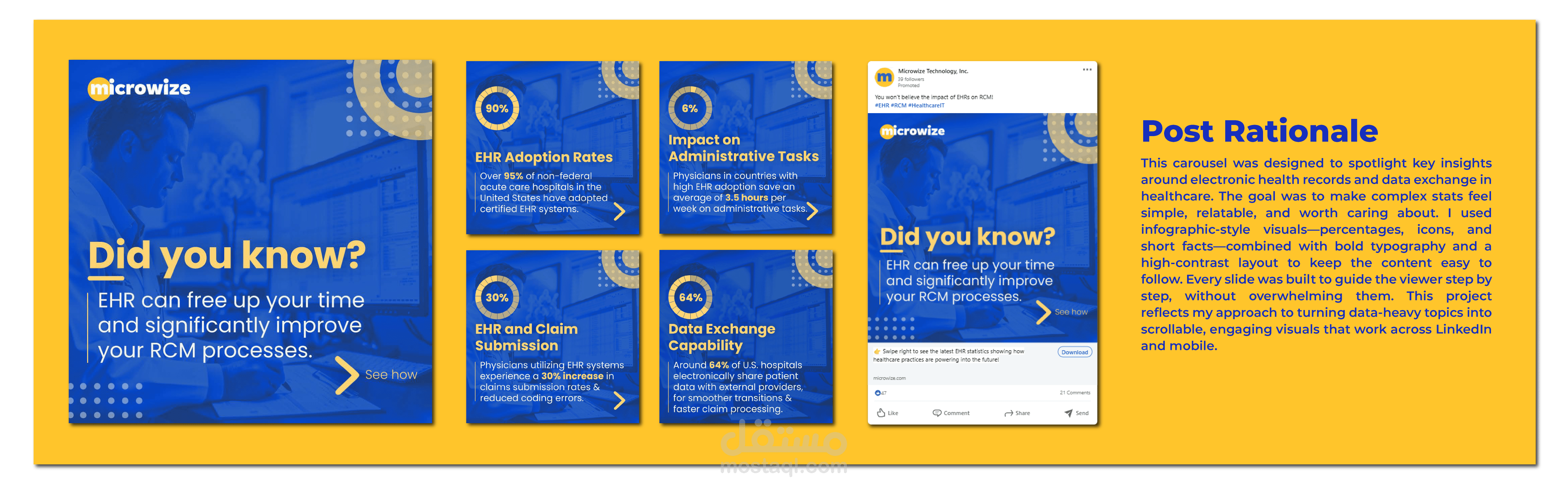
This carousel was designed to spotlight key insights around electronic health records and data exchange in healthcare. The goal was to make complex stats feel simple, relatable, and worth caring about. I used infographic-style visuals—percentages, icons, and short facts—combined with bold typography and a high-contrast layout to keep the content easy to follow. Every slide was built to guide the viewer step by step, without overwhelming them. This project reflects my approach to turning data-heavy topics into scrollable, engaging visuals that work across LinkedIn and mobile.