Super Store Dashboard
تفاصيل العمل
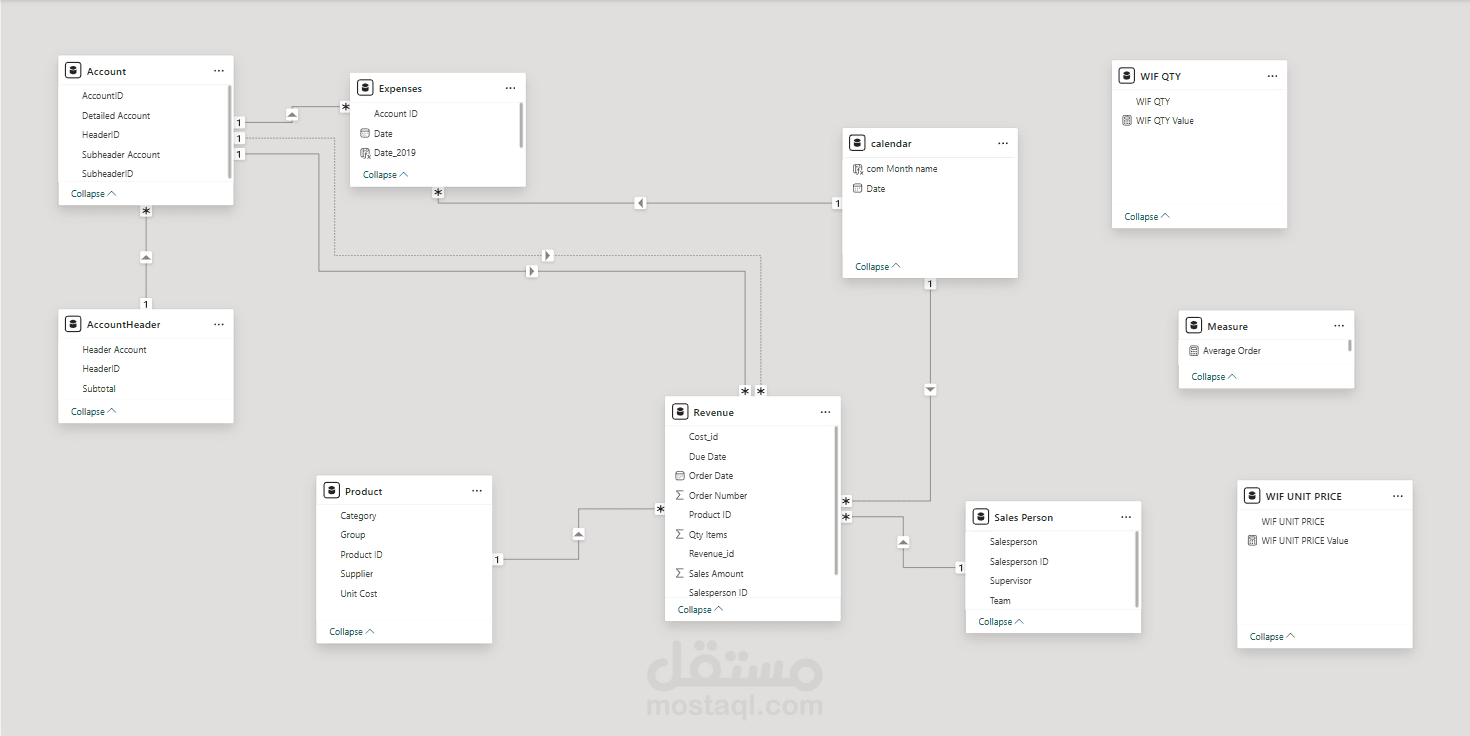
Dashboard Breakdown:
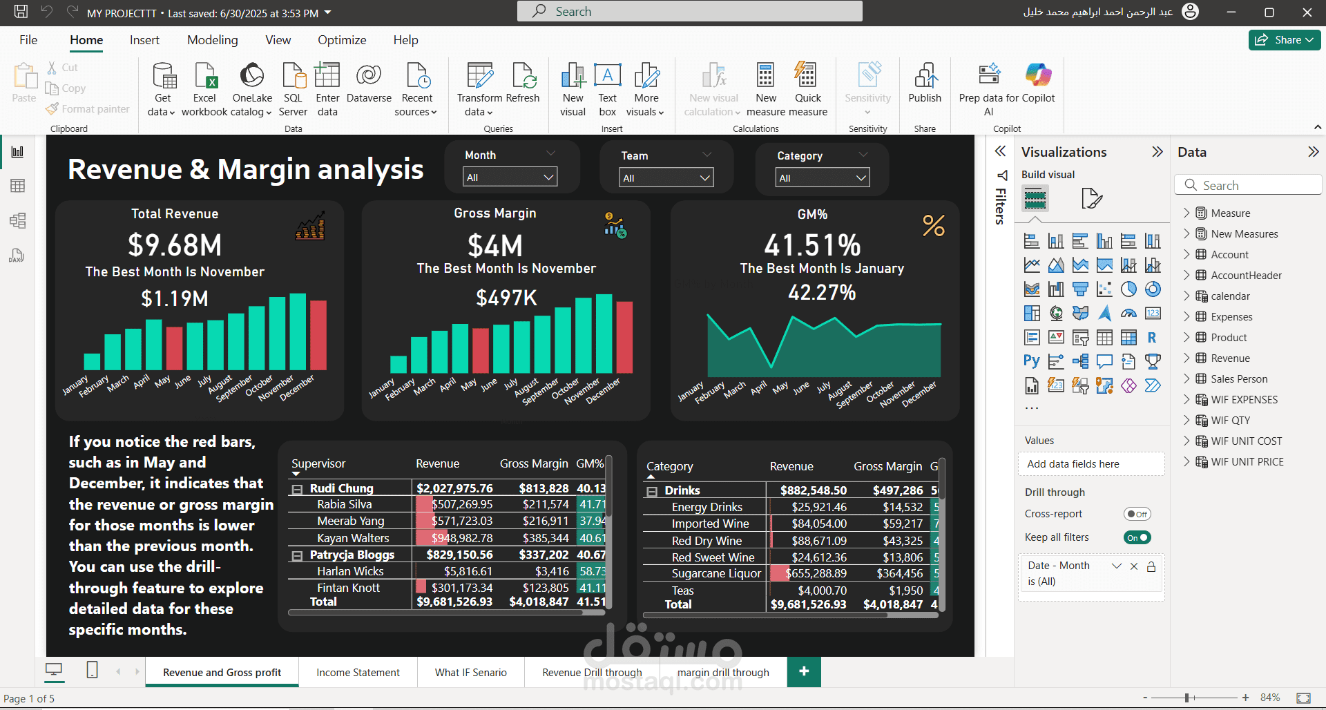
Page 1: Revenue & Margin Analysis (2019)
This is the main analytical view, featuring 3 core KPIs:
Total Revenue
Gross Margin
Gross Margin % (GM%)
I applied conditional formatting to the bar charts for Revenue by Month and Gross Margin by Month:
If a month’s performance dropped compared to the previous one, the bar turns red, making it easy to spot declining trends.
Also added a drill-through feature – users can right-click on any data point to navigate to a detailed page focused on Revenue or Margin insights.
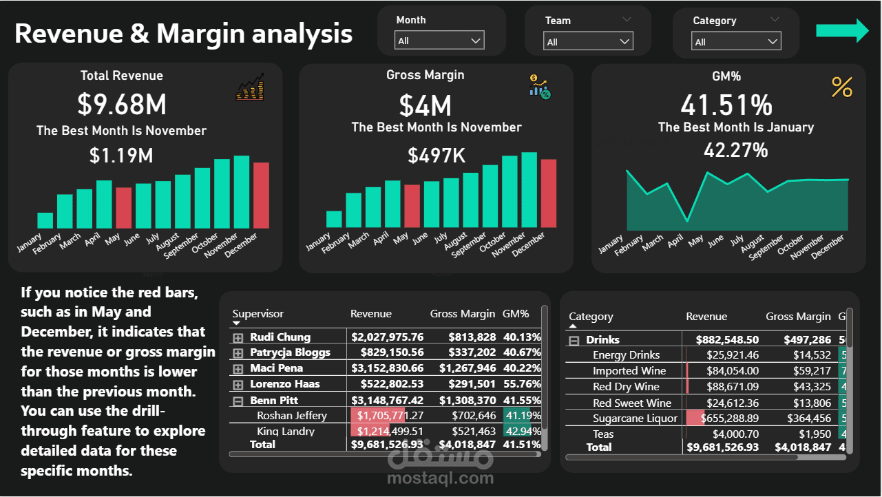
Page 2: Income Statement
A clear financial summary focused on:
Net Income
Revenue, Cost, and Expenses
All visualized through dynamic cards and charts for interactive financial reporting.
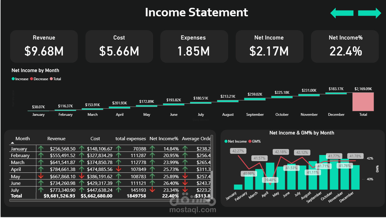
Page 3: What-If Scenario
I created a What-If Simulation Tool using Power BI’s parameters:
“What happens if quantity changes by +20%?”
The model instantly recalculates Revenue, Cost, Expense, and Net income, allowing decision-makers to forecast the financial impact.
? Technical Highlights:
-Developed advanced DAX functions for dynamic KPIs and logic
-Implemented conditional formatting for visual alerts
-Built a drill-through experience for deeper exploration
-Optimized data model for performance and interactivity