rehana visual idenity redesign
تفاصيل العمل
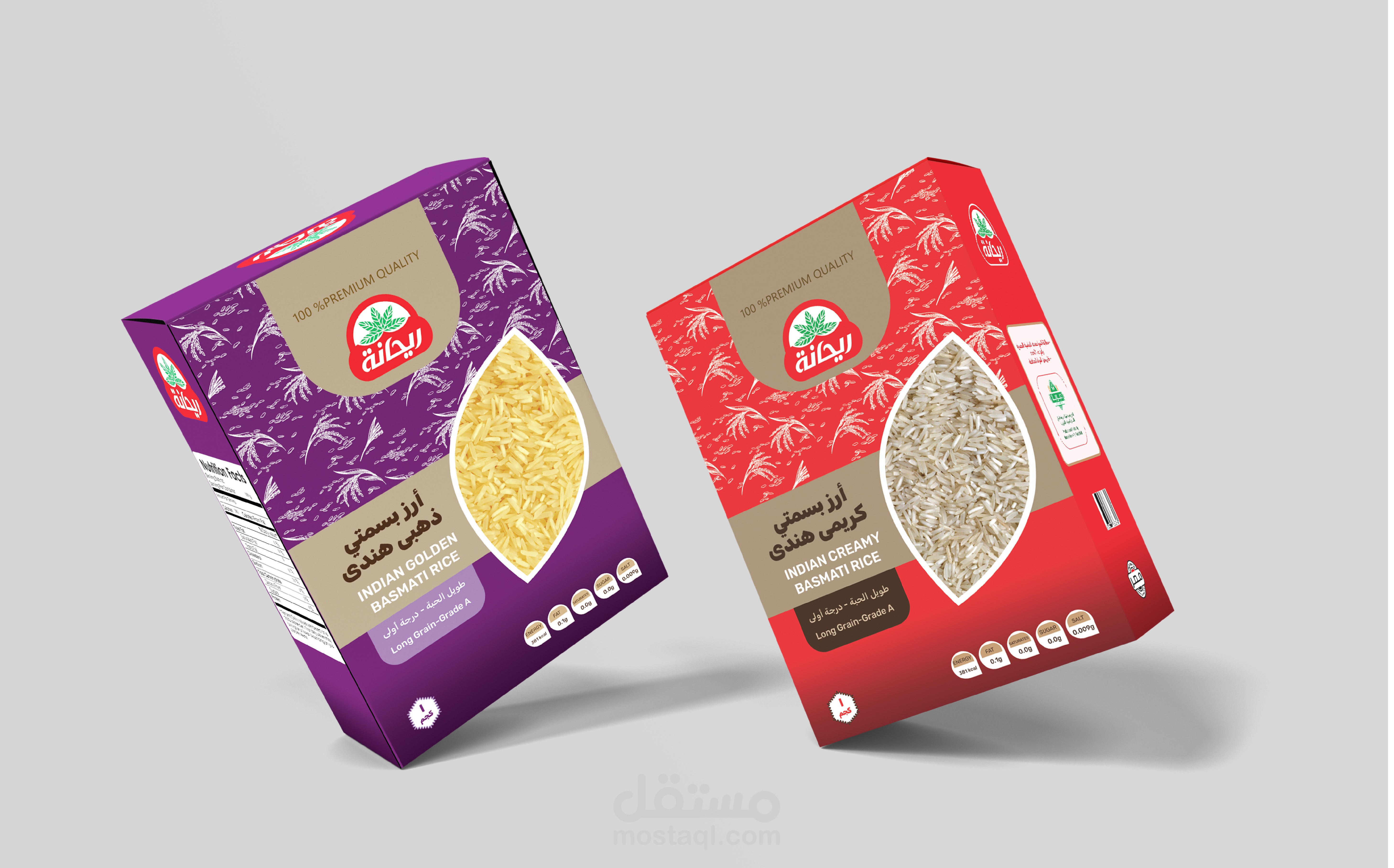
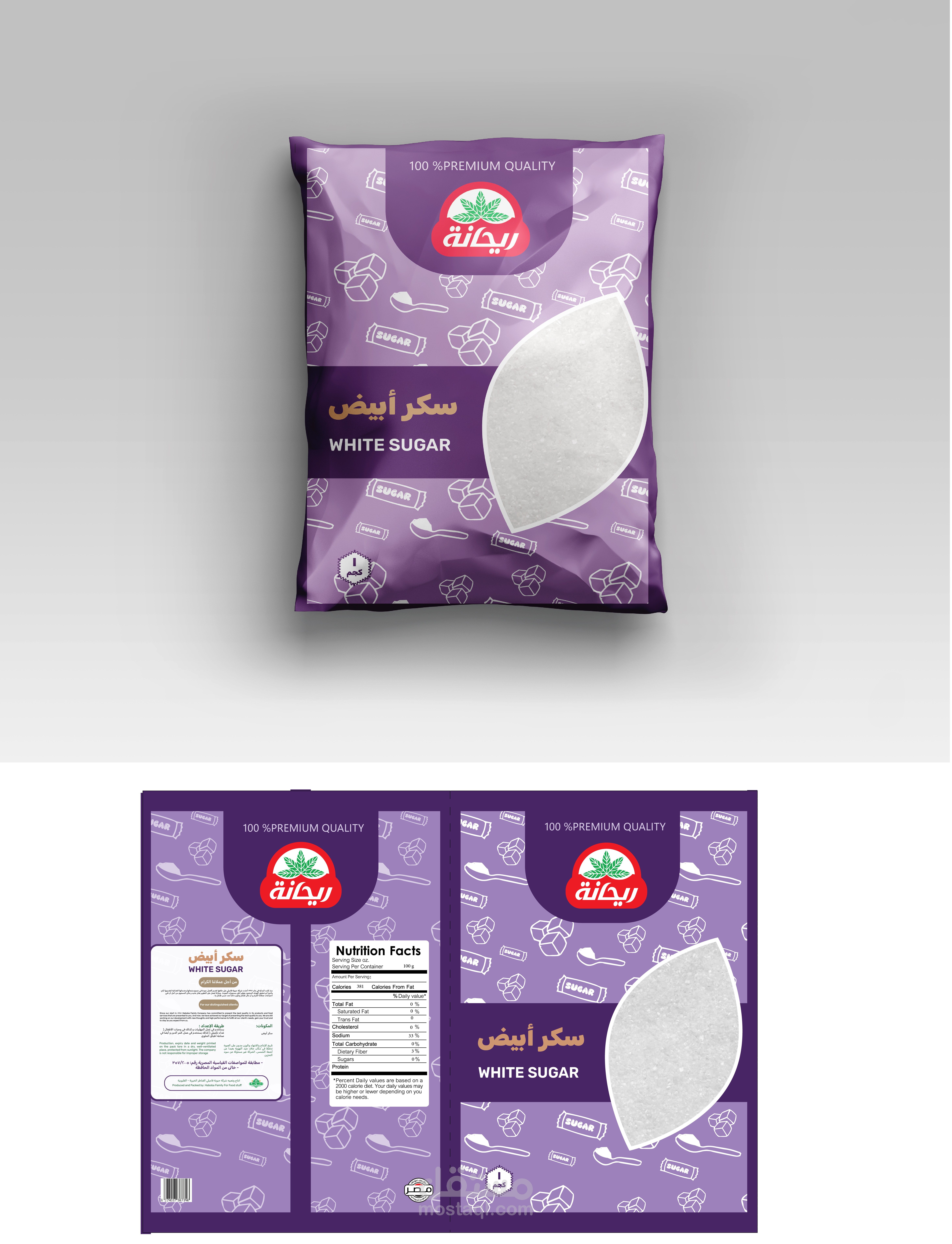
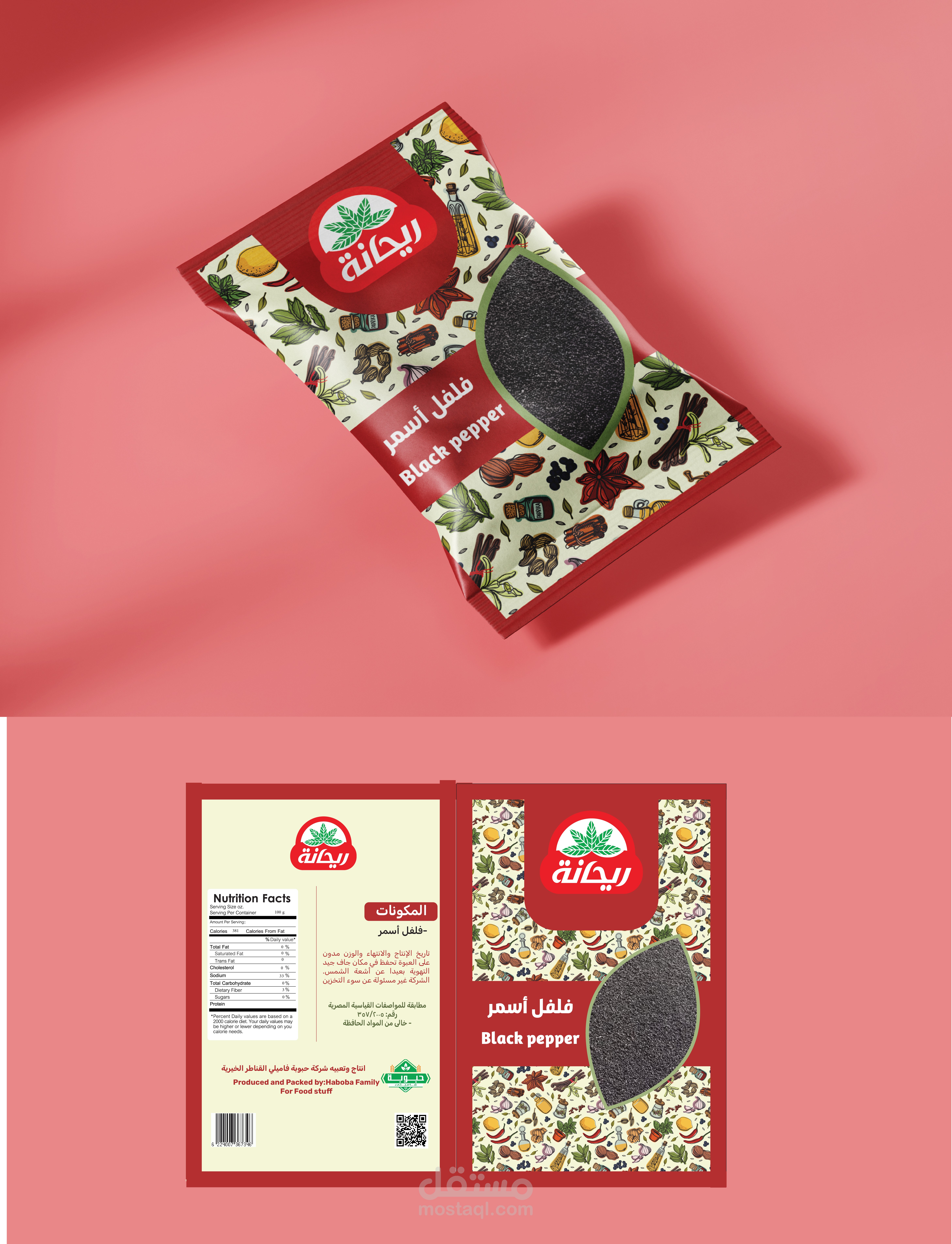
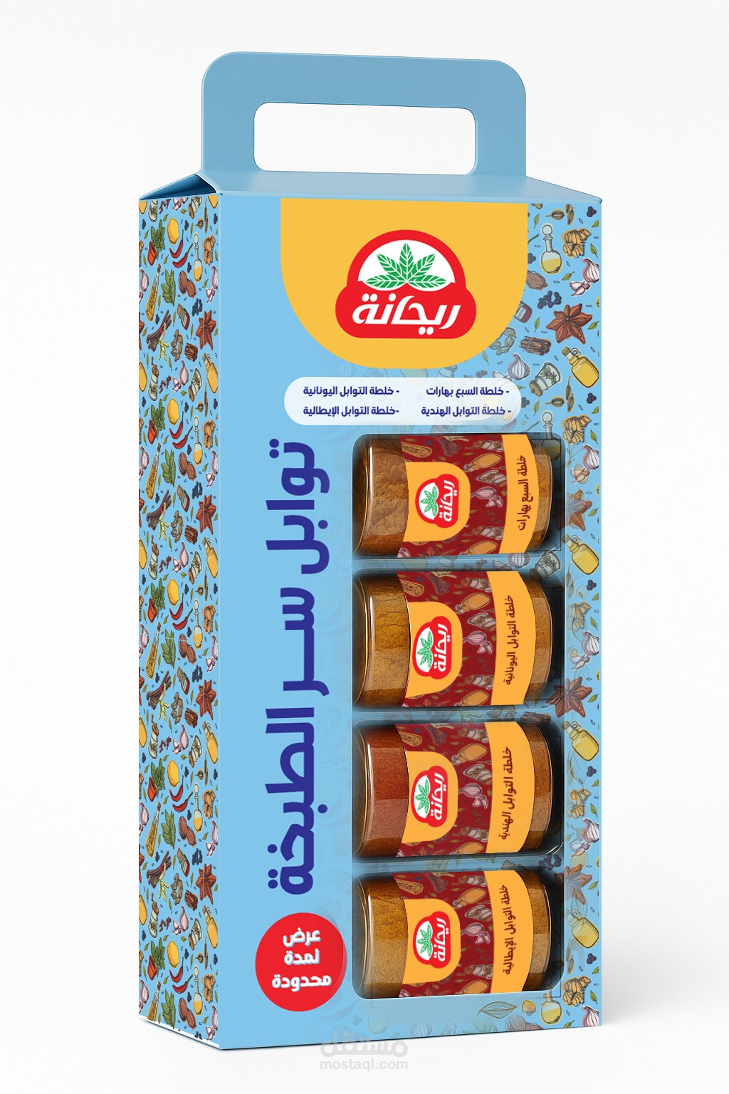
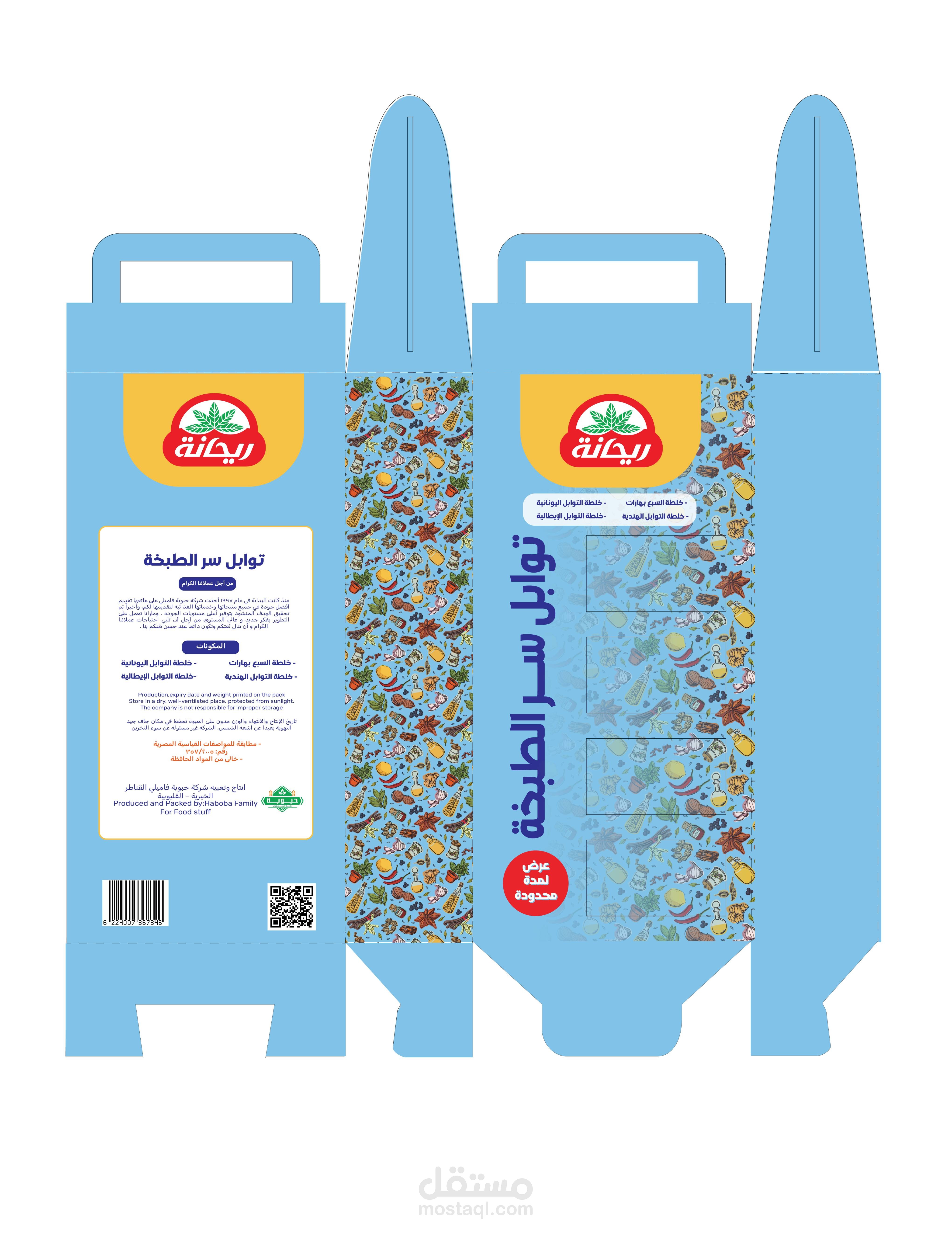
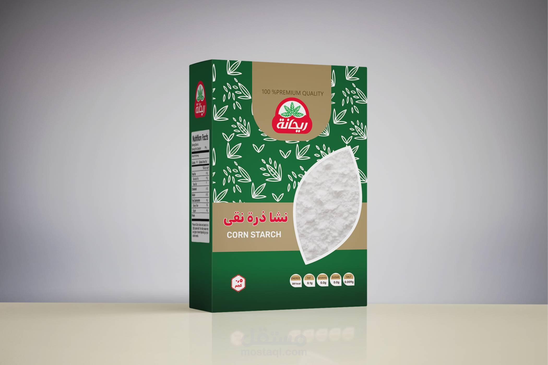
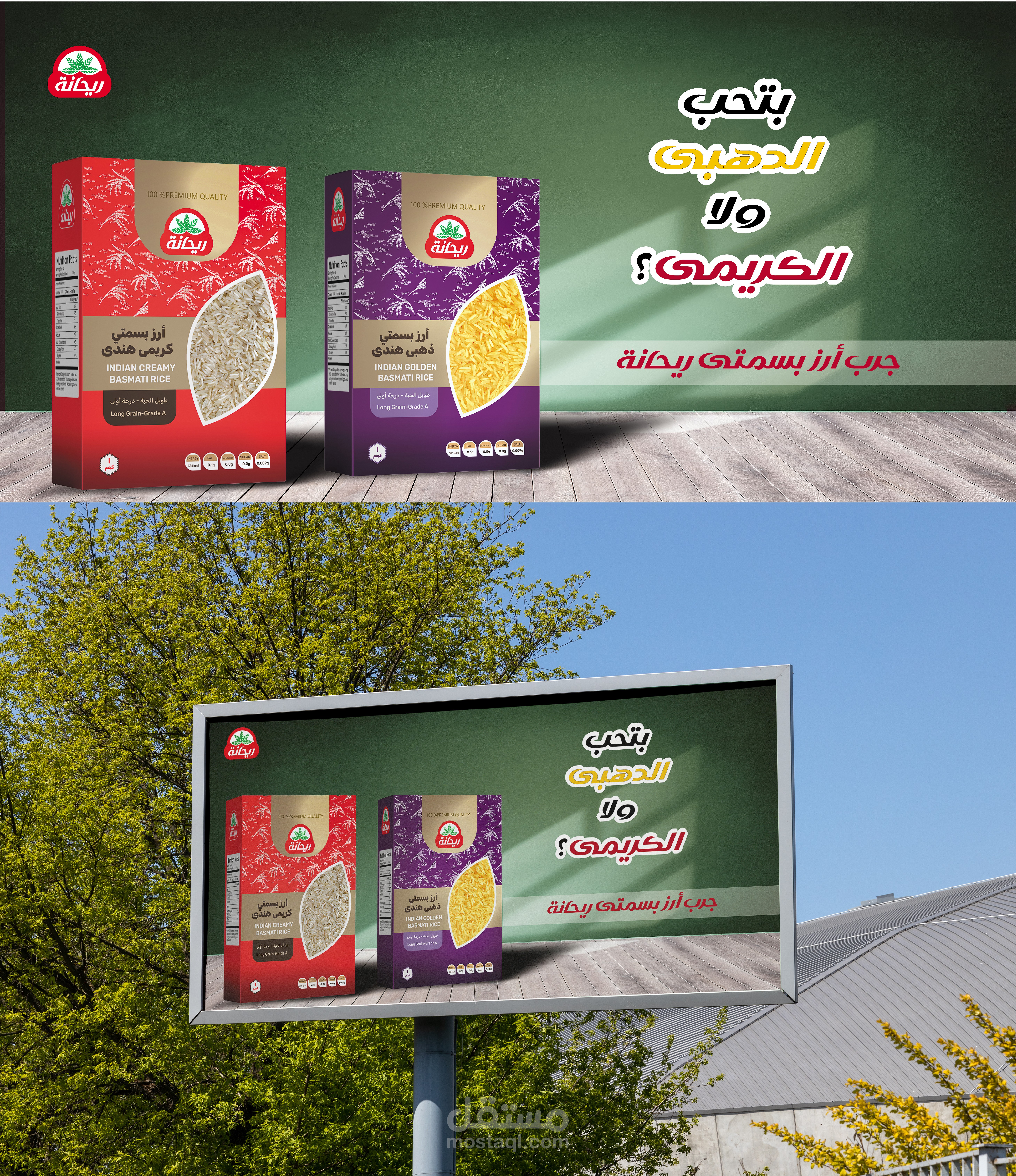
This project focuses on rebranding the Rehana product line by enhancing both the graphic and structural design of the packaging. Inspired by the brand name “Rehana,” which means basil, we created a die-cut window in the shape of a basil leaf to reflect the brand identity while offering a direct view of the product inside. Each product in the line features a unique background pattern inspired by its ingredients, helping differentiate between items while maintaining a cohesive family look. The goal is to modernize the packaging, improve shelf appeal, and create a cleaner, more premium visual language that connects naturally with the consumer.