Johor Students - Visual identity
تفاصيل العمل


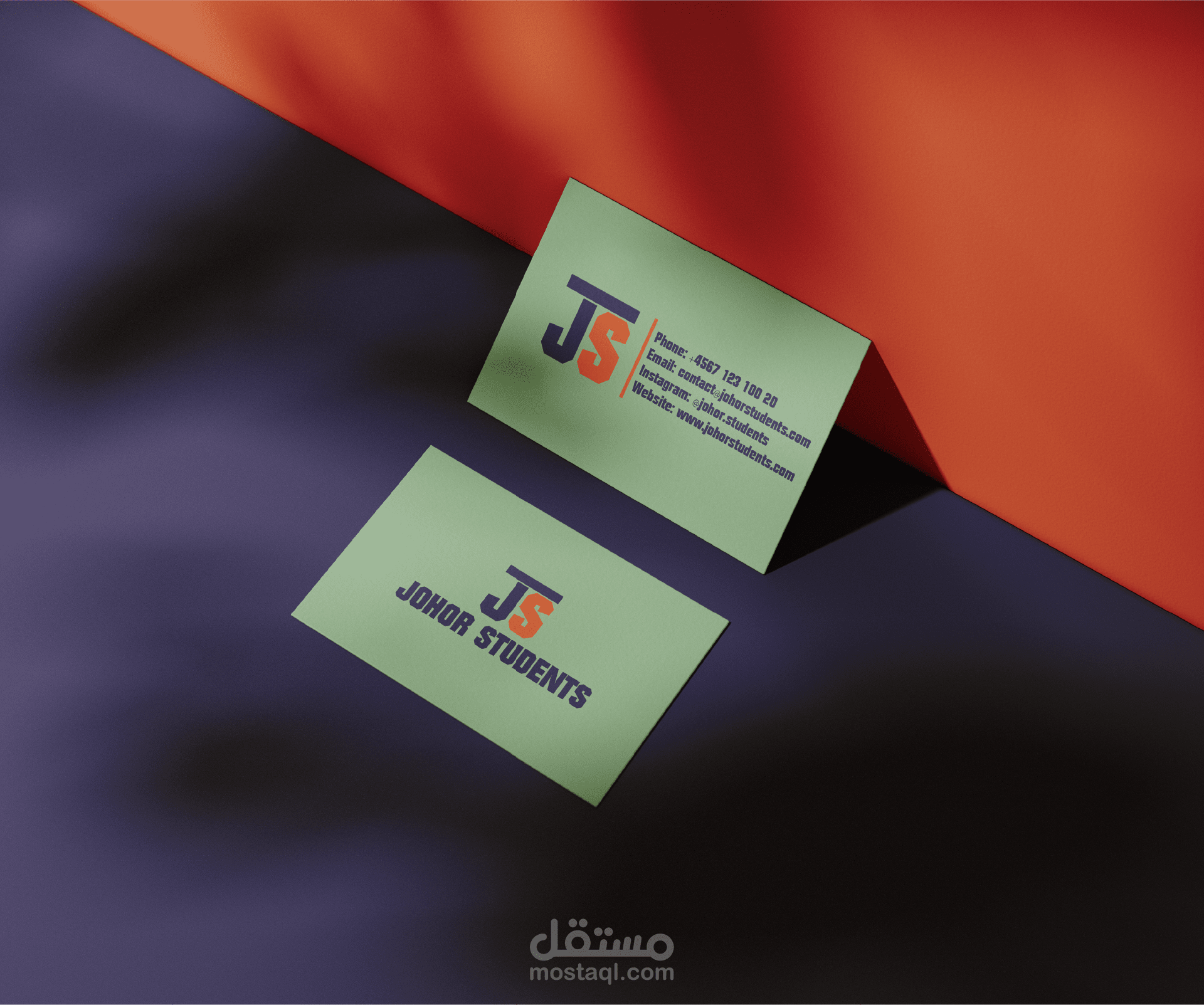
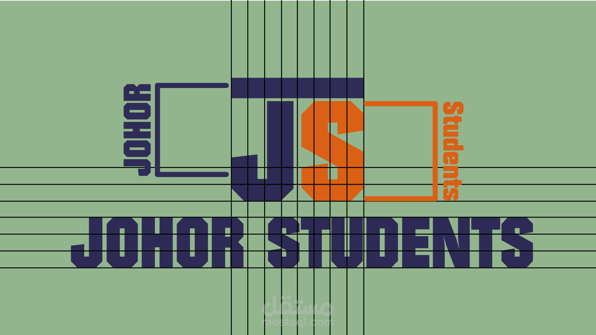
The visual identity of Johor Students blends academic professionalism with a modern, bold personality. The logo centers around the initials "JS", where the letter "J" is colored in deep navy blue, conveying trust, stability, and intelligence, while the letter "S" in vibrant orange introduces energy, enthusiasm, and a forward-thinking spirit. This contrast creates a dynamic visual balance that reflects both structure and innovation.
The custom typography is strong and geometric, reinforcing the brand’s commitment to clarity, guidance, and academic support. The extended logotype “JOHOR STUDENTS” beneath the monogram maintains the same robust, angular typeface, enhancing recognition and consistency across applications.
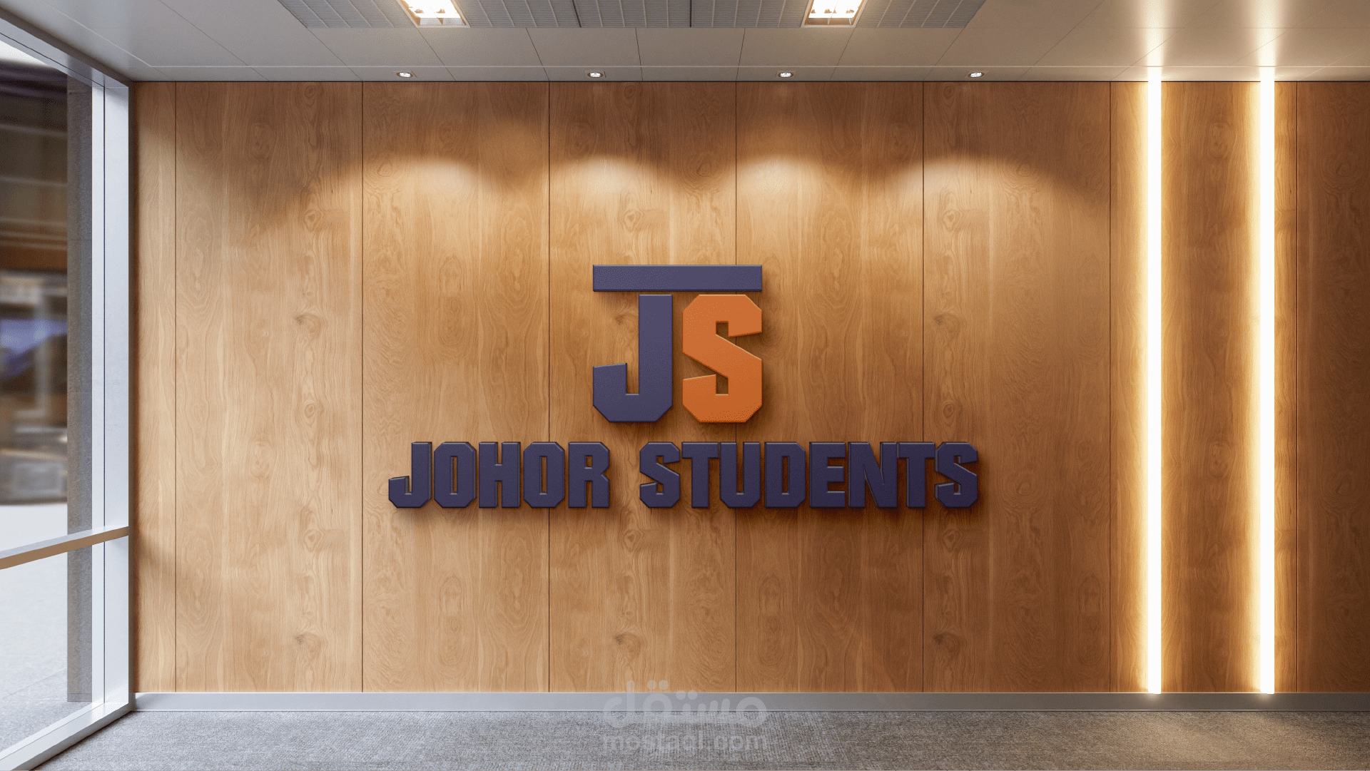
The visual grid and layout show a meticulous attention to alignment and spacing, which symbolizes the brand’s structured approach to student consulting. Business card mockups apply the color palette effectively, using a soft green background that complements the primary logo colors while keeping the overall look clean and approachable.
The background elements, including educational books and subtle overlays, reinforce the brand’s academic focus without distracting from the bold identity at the forefront.
Overall, Johor Students’ brand design is visually impactful, modern, and professional—ideal for an organization dedicated to student guidance, consulting, and education abroad.
تعكس الهوية البصرية لبراند Johor Students مزيجًا من الاحتراف الأكاديمي والطابع العصري الجريء. يتمحور الشعار حول الحرفين "JS"، حيث يأتي حرف "J" باللون الأزرق الداكن، ليعبّر عن الثقة والاستقرار والذكاء، في حين يظهر حرف "S" باللون البرتقالي النابض، مما يضيف لمسة من الحماس والطاقة وروح الابتكار. هذا التباين بين اللونين يخلق توازنًا بصريًا يعكس الجمع بين التنظيم والتجديد.
يتميّز الخط المستخدم بطابع هندسي قوي وزوايا حادة، مما يعكس التزام البراند بالوضوح والصرامة والدقة في تقديم خدماته. النص الكامل "JOHOR STUDENTS" بأسلوب خط مماثل يعزز من ثبات الهوية واتساقها عبر مختلف الاستخدامات.
التركيبة الشبكية والتخطيط الدقيق يعكسان اهتمامًا واضحًا بالتنظيم والمحاذاة، في إشارة إلى الأسلوب المنهجي الذي تتبعه المؤسسة في تقديم الاستشارات الأكاديمية. كما تُبرز الكروت الشخصية الألوان الرسمية بشكل فعّال، حيث يظهر اللون الأخضر الناعم في الخلفية ليتناغم مع الأزرق والبرتقالي، مما يعطي إحساسًا بالهدوء والاحتراف في آنٍ واحد.
أما العناصر الخلفية مثل الكتب التعليمية والخلفية ذات الطبقة الشفافة، فتُعزز الطابع الأكاديمي دون أن تشتت الانتباه عن الشعار الرئيسي.
بشكل عام، يُقدم تصميم Johor Students هوية بصرية قوية وعصرية واحترافية، تعبّر عن مؤسسة متخصصة في إرشاد الطلاب وتقديم الاستشارات التعليمية محليًا ودوليًا.