Logo for Emmy's
تفاصيل العمل
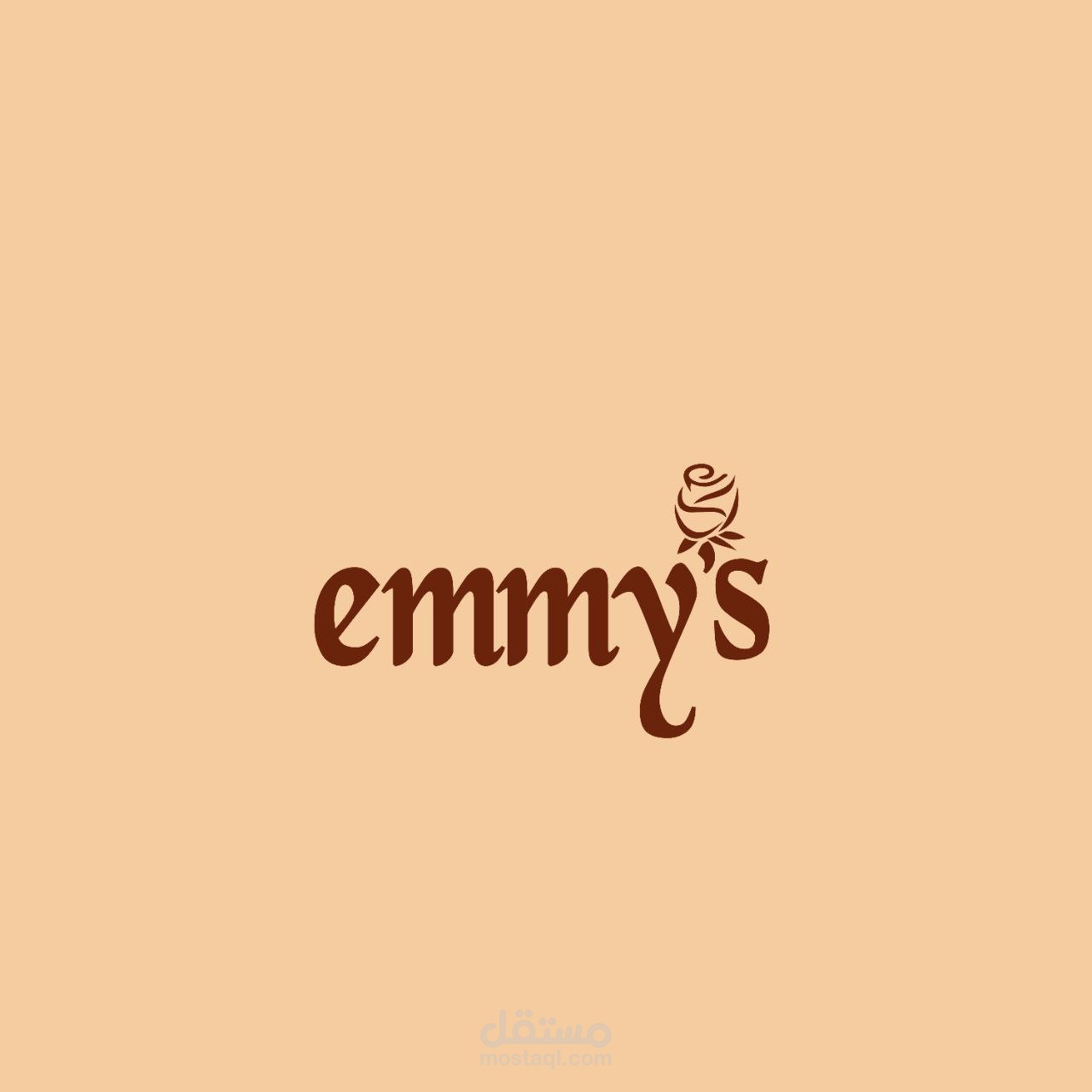
1. The Rose Detail
The apostrophe in emmy’s is replaced with a delicate rose, symbolizing elegance, beauty, and femininity.
This makes the logo visually memorable and ties in emotions or themes such as romance, care, or artisanal quality.
---
2. Typography with Personality
The custom serif typeface blends soft curves with elegant strokes, giving it a warm and inviting handcrafted feel.
The "y" is especially distinctive — it’s elongated and stylized, adding a graceful, flowing movement that enhances the visual rhythm.
---
3. Sophisticated Color Palette
The combination of rich brown typography on a peach-beige background conveys warmth, class, and subtle luxury.
These colors are often associated with coffee, chocolate, florals, or skin care, making it ideal for boutiques, patisseries, or wellness brands.
---
4. Clean and Focused Composition
The design avoids clutter, focusing purely on the brand name and its symbolic rose. This simplicity makes it timeless