"This logo represents my identity as a UI/UX designer Logo Description & Highlights
تفاصيل العمل
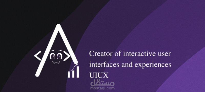
"This logo represents my identity as a UI/UX designer
Logo Description & Highlights
This logo creatively combines visual identity with functional symbolism to reflect expertise in UI/UX design and interactive user interface development.
Key Features:
Stylized ‘A’ Shape:
The core of the logo is a bold, geometric "A" which stands as a visual metaphor for “Architecture” and “Approach”, reflecting structure and methodology in design.
Interactive Facial Expression:
Two expressive cartoon-style eyes and a smiling mouth are embedded inside the “A”, giving the logo a friendly, approachable personality. This represents user-centered design, which is the heart of any good UI/UX work.
Code Elements (< >):
Positioned beside the “A”, the angle brackets represent HTML/CSS/JS development, directly hinting at frontend development skills.
Bar Chart Icon:
The simple bar graph reflects data-driven design, analytics, and performance-focused UX improvements. It's cleverly connected to the leg of the "A", showing how business goals and design are interlinked.
Color Scheme:
The use of deep purples and gradients adds a modern, tech-inspired feel. Purple is often associated with creativity, imagination, and innovation—perfect for a UI/UX identity.
Typography:
The clean serif font used in the tagline “Creator of interactive user interfaces and experiences” adds professionalism and clarity, ensuring the message is serious yet elegant.
Overall Impression:
The logo balances professional tech aesthetics with a human and playful character, making it ideal for a UI/UX developer or creative studio that wants to appear both approachable and highly skilled