GENOVA | Brand idenitiy
تفاصيل العمل
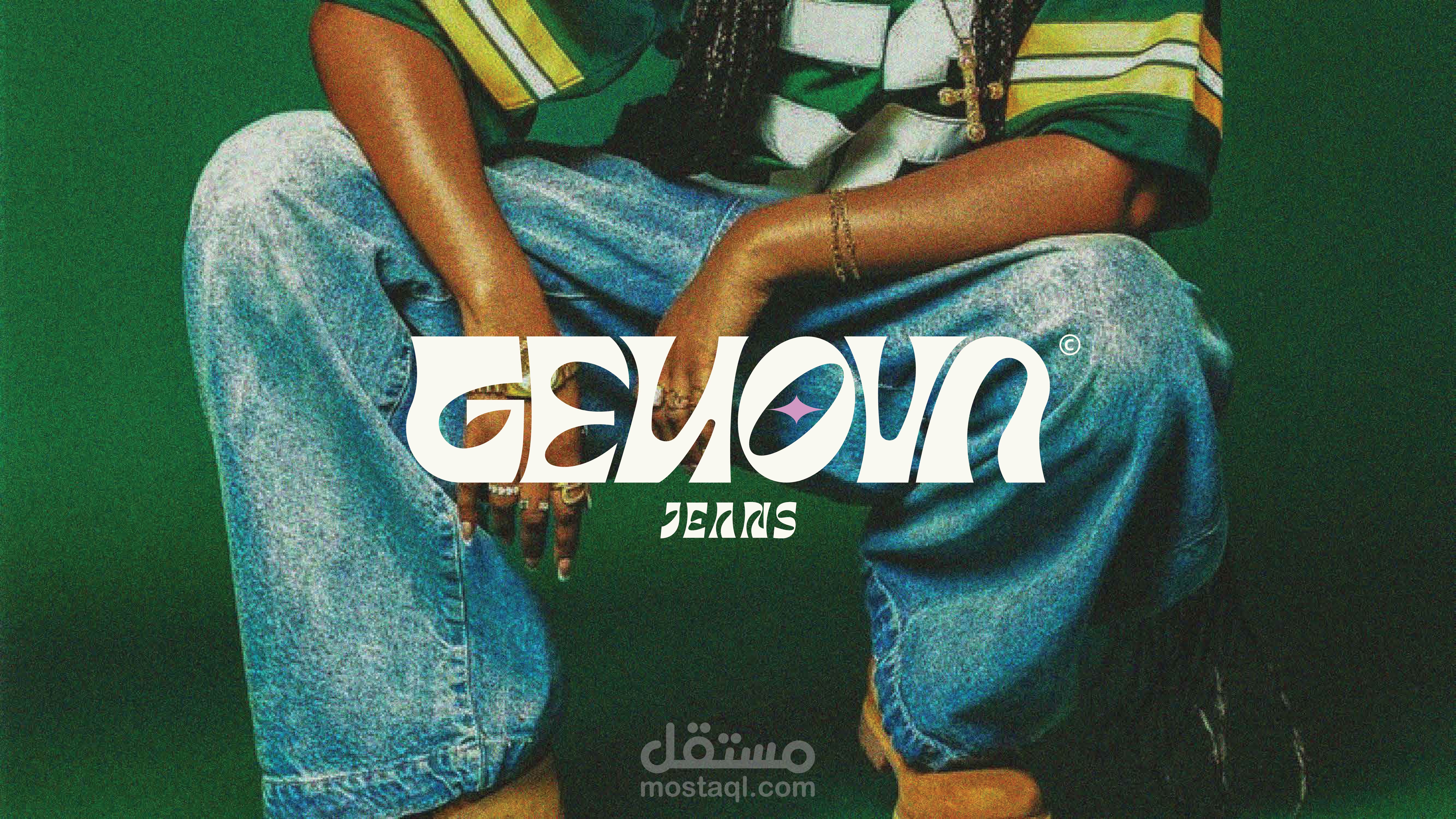
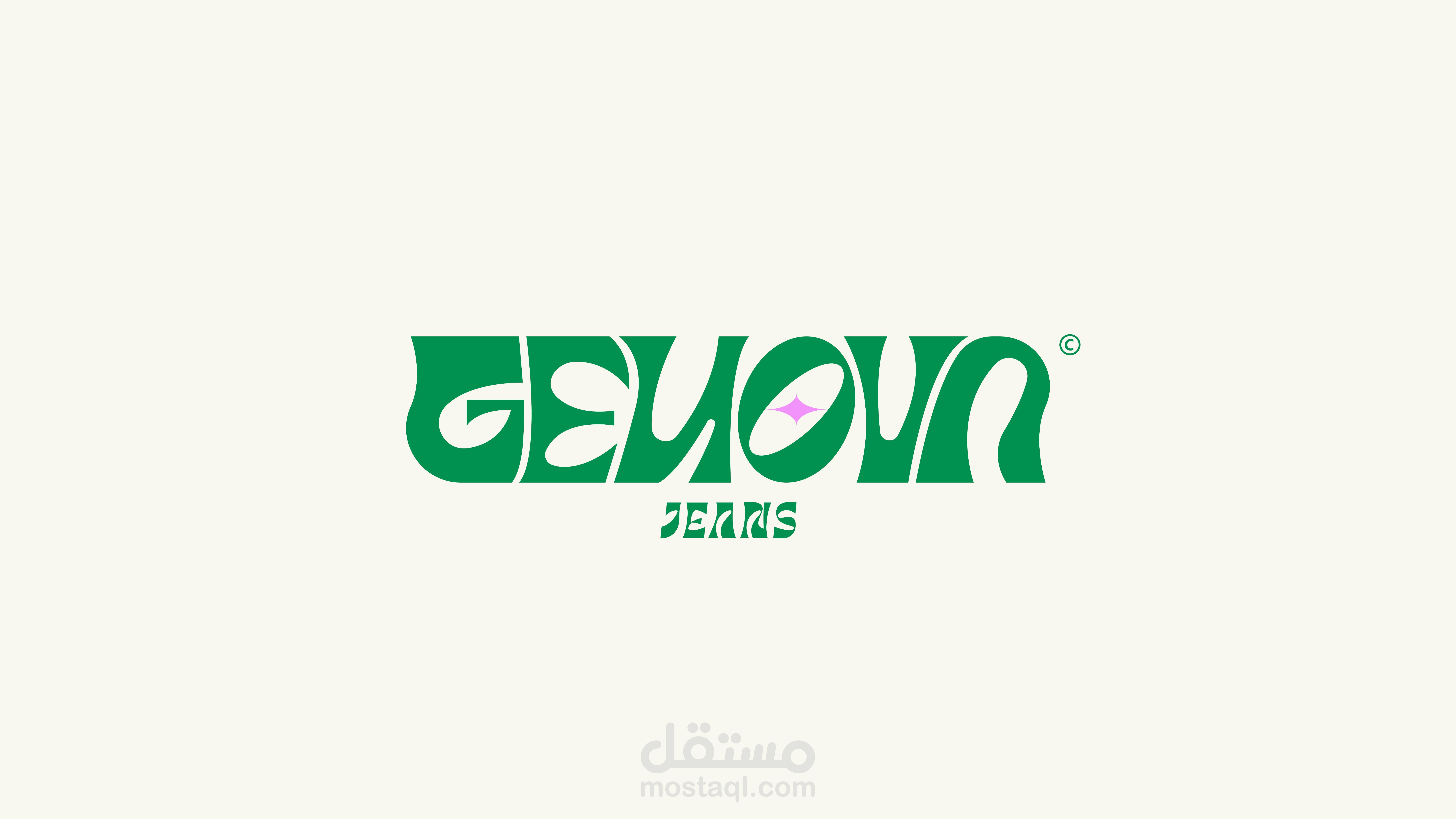
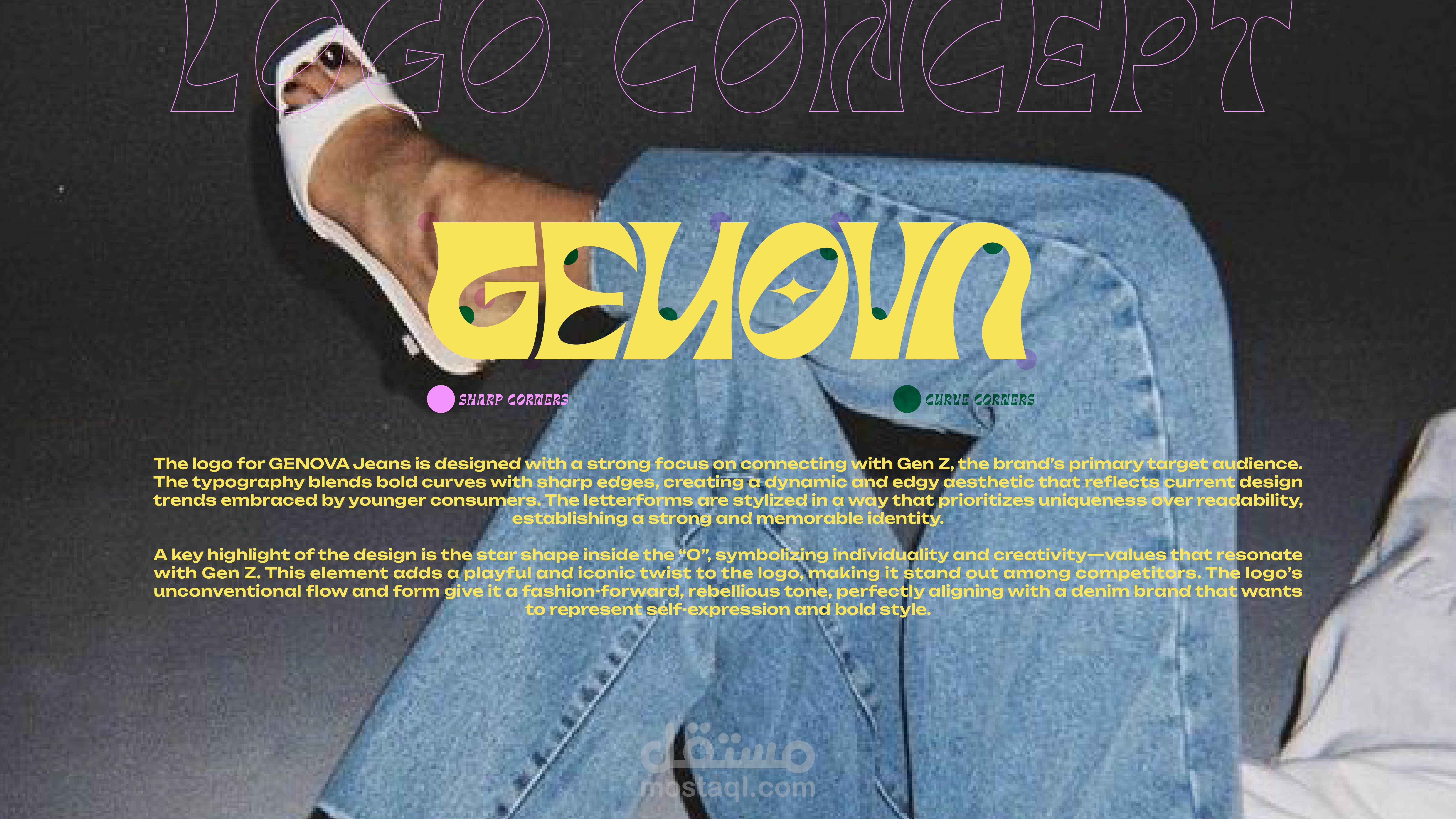

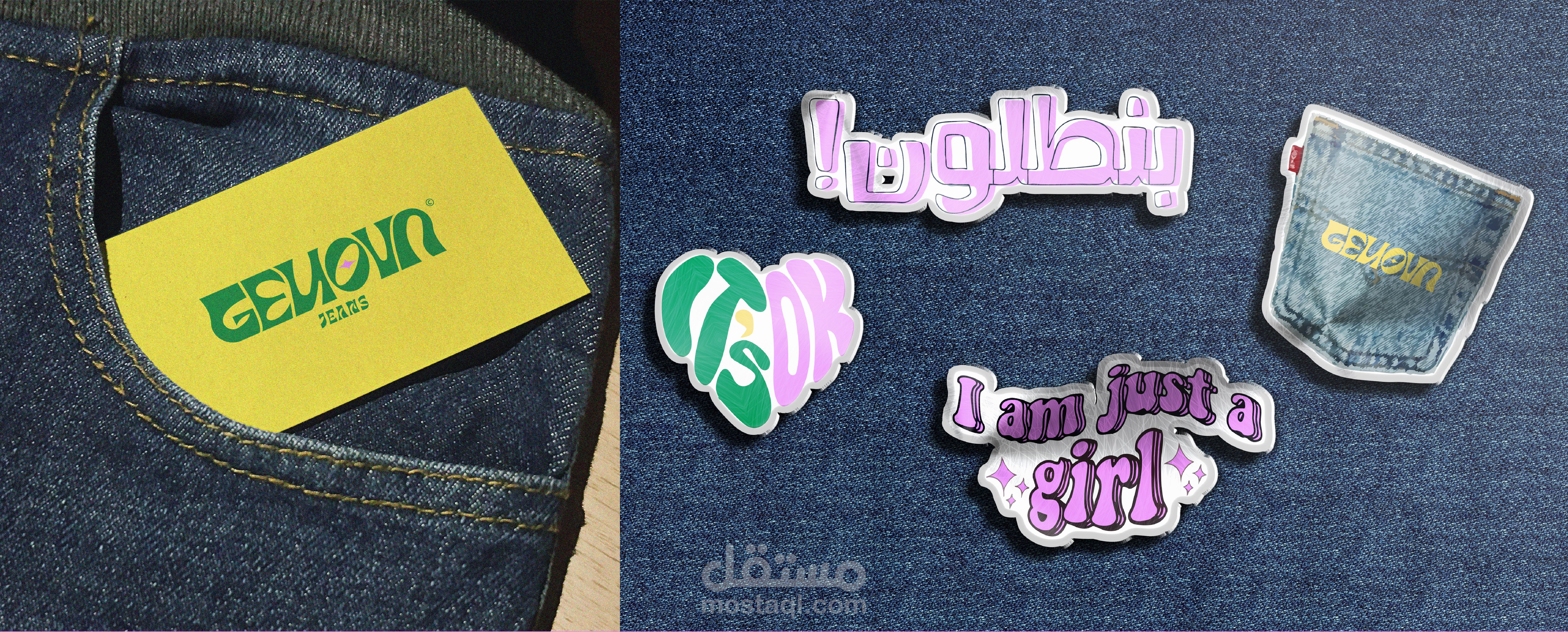
The logo for GENOVA Jeans is designed with a strong focus on connecting with Gen Z, the brand’s primary target audience.
The typography blends bold curves with sharp edges, creating a dynamic and edgy aesthetic that reflects current design
trends embraced by younger consumers. The letterforms are stylized in a way that prioritizes uniqueness over readability,
establishing a strong and memorable identity.
A key highlight of the design is the star shape inside the “O”, symbolizing individuality and creativity—values that resonate
with Gen Z. This element adds a playful and iconic twist to the logo, making it stand out among competitors. The logo’s
unconventional flow and form give it a fashion-forward, rebellious tone, perfectly aligning with a denim brand that wants
to represent self-expression and bold style.