BUILD-UP Logo Design – Premium Branding
تفاصيل العمل
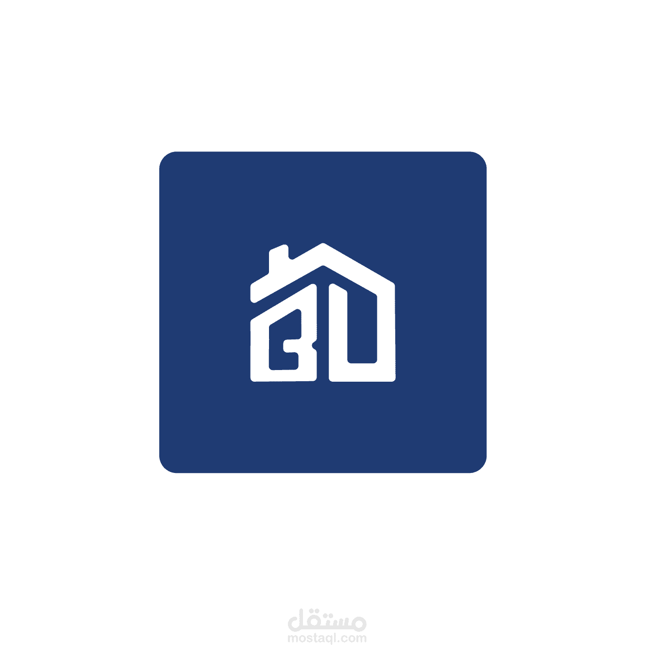
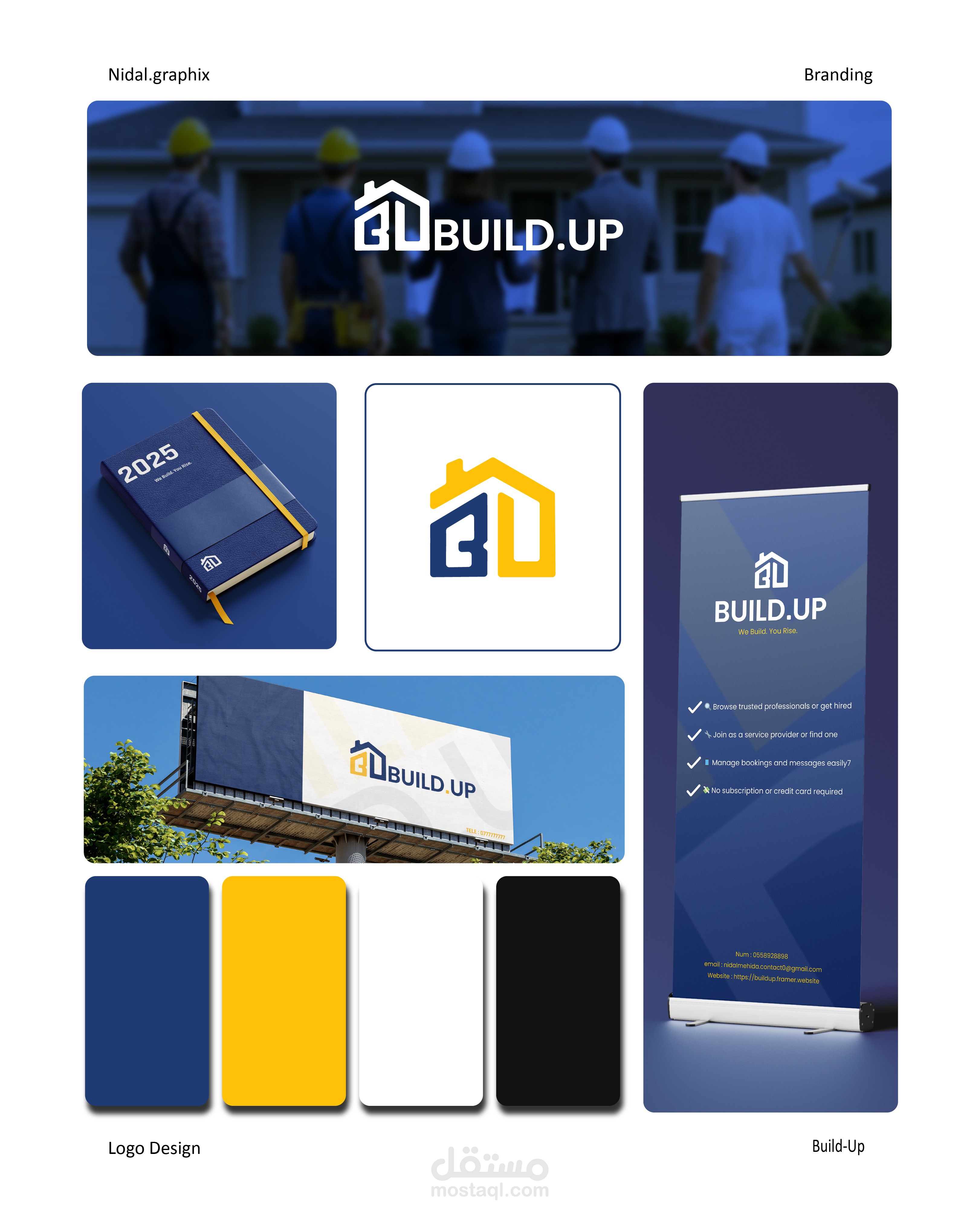
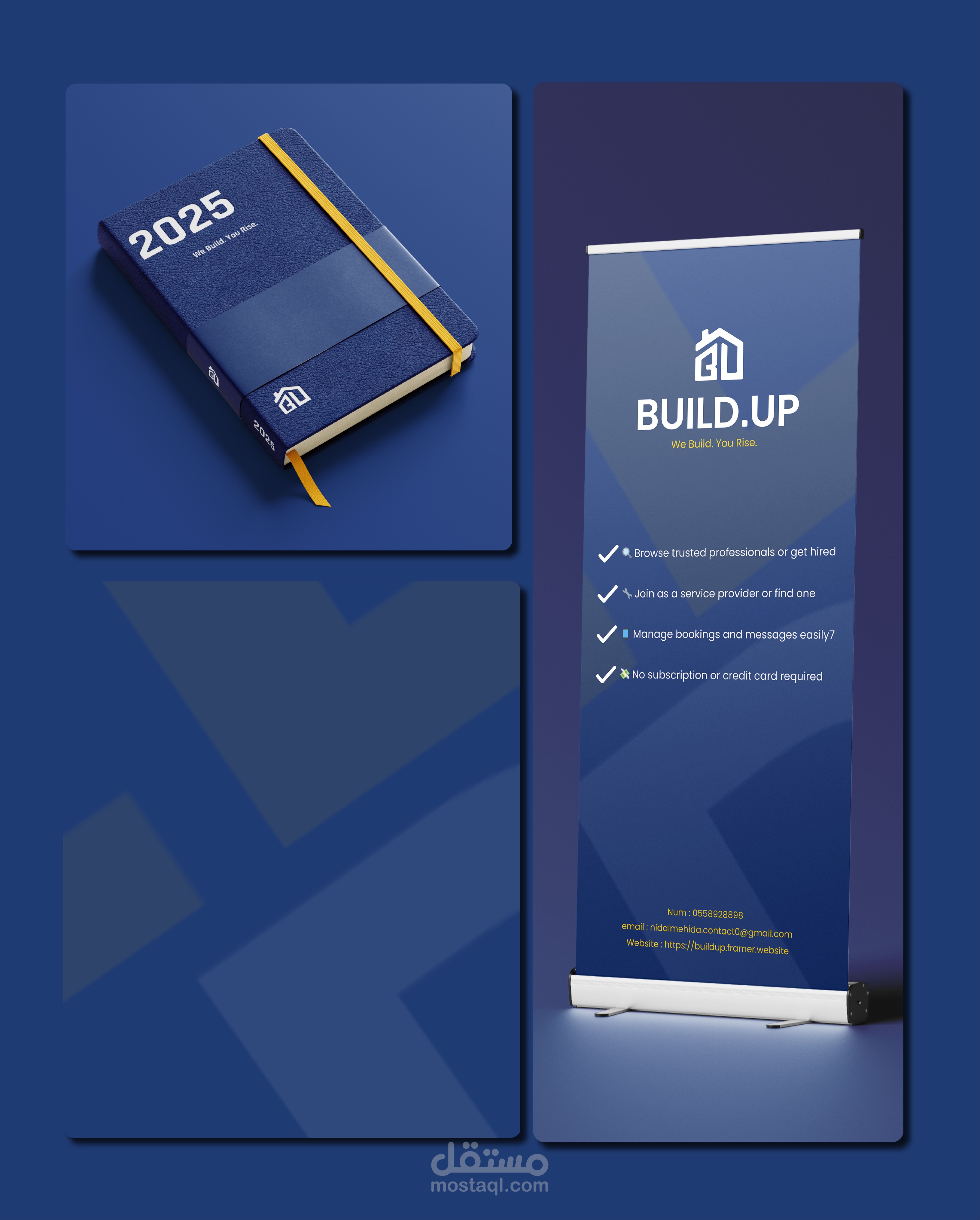
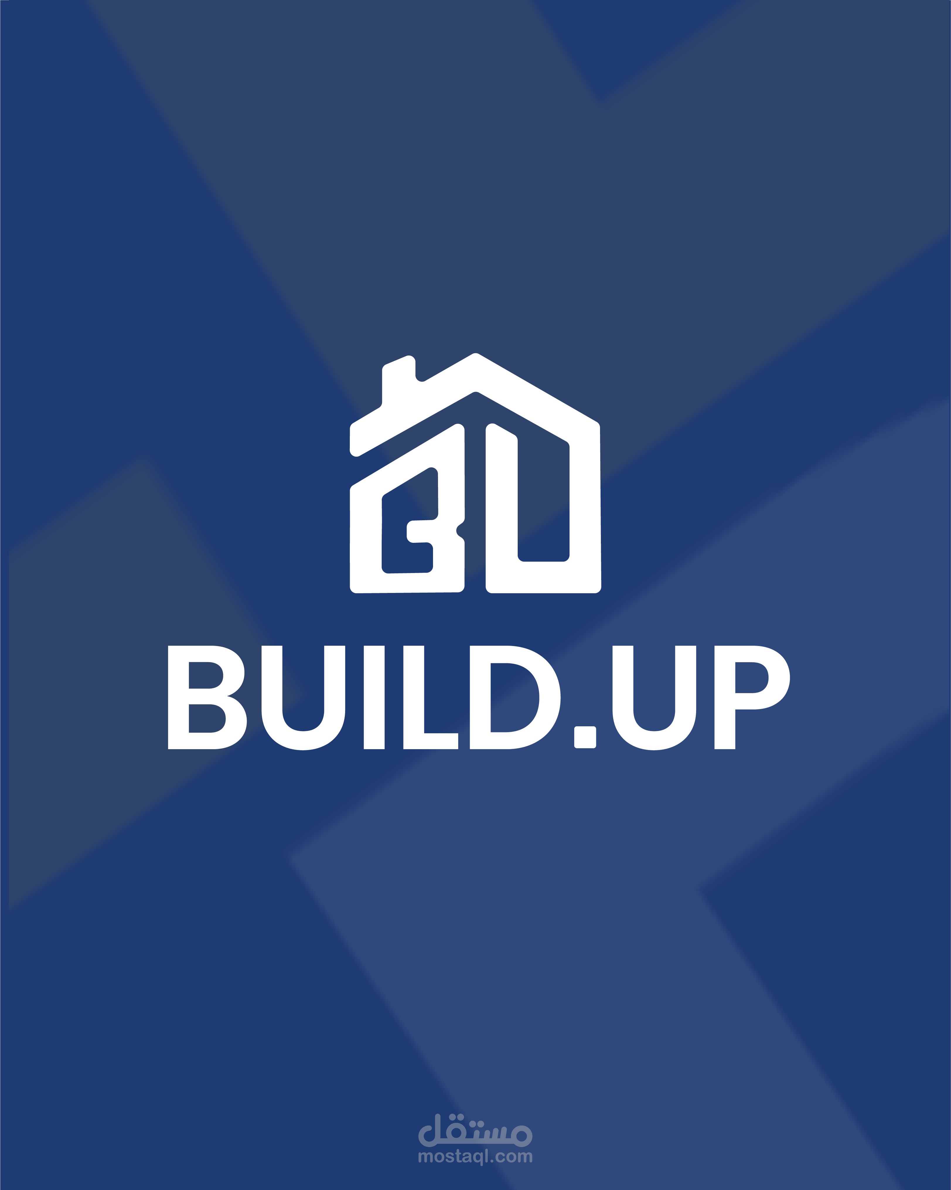
The Build.Up logo blends a modern, minimalist house icon with a bold and structured font to reflect trust, stability, and functionality. The upward arrow subtly integrated within the house symbolizes growth and support — a nod to both building physical spaces and empowering users through reliable services. The use of deep blue conveys professionalism and security, while the vibrant yellow adds a sense of energy, optimism, and approachability. Together, these elements position Build.Up as a smart, user-first platform for finding dependable home service professionals.