qeet brand identity
تفاصيل العمل

QEET – Transport Brand Identity Design
A bold, minimal identity system for a modern transportation service
brand identity Brand Design branding Graphic Designer Logo Design Logotype logo typography adobe illustrator ILLUSTRATION
Project Goal
The objective of this project was to create a clean, striking, and functional visual identity for a transportation brand named QEET. The focus was to reflect speed, reliability, and accessibility through a carefully considered logo, color system, and brand applications—while keeping the design modern and minimal.
brand identity Brand Design branding Graphic Designer Logo Design Logotype logo typography adobe illustrator ILLUSTRATION
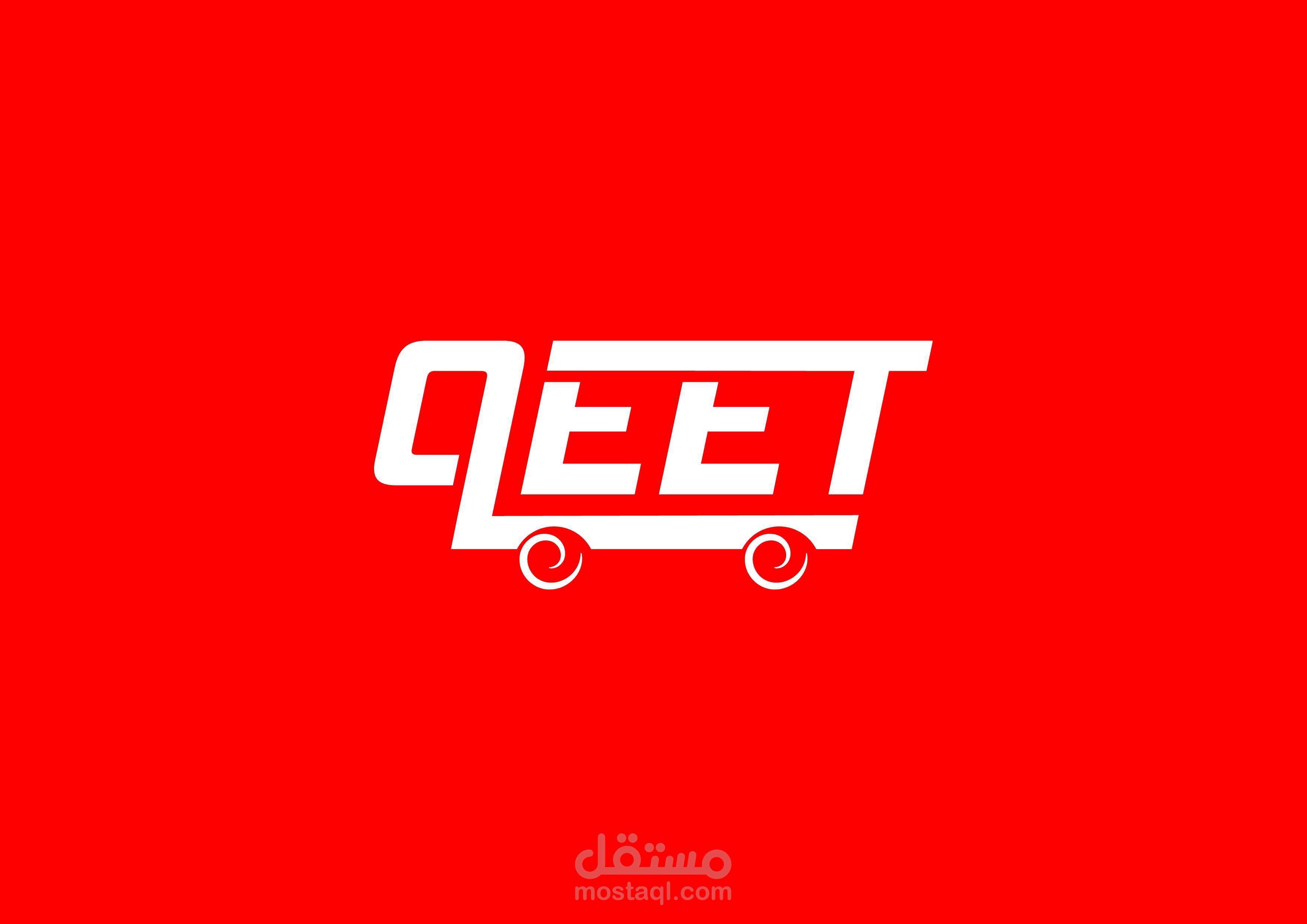
️ Logo Design Concept
The QEET logo is a custom wordmark that visually suggests motion and transit. Inspired by the shapes of wheels and movement lines, the typography is:
Angular and dynamic, representing speed.
Balanced for high legibility and adaptability.
Enhanced with subtle wheel-like elements beneath the letterforms to imply movement and travel.
This gives the logo a strong directional energy, perfect for a transit brand.
brand identity Brand Design branding Graphic Designer Logo Design Logotype logo typography adobe illustrator ILLUSTRATION
Color Psychology & Visual Identity
The color palette plays a major role in defining QEET’s character:
Red:
Represents power, urgency, and energy. As the dominant color, it grabs attention and reflects the fast-paced nature of urban transport.
→ Also symbolizes confidence and action—making the brand feel active and dependable.
White:
Chosen for clarity, simplicity, and contrast. It gives the design a clean, minimal backdrop, ensuring legibility and modernity.
Together, the palette ensures a visually arresting and clean identity that works well across environments—both digital and physical.
brand identity Brand Design branding Graphic Designer Logo Design Logotype logo typography adobe illustrator ILLUSTRATION
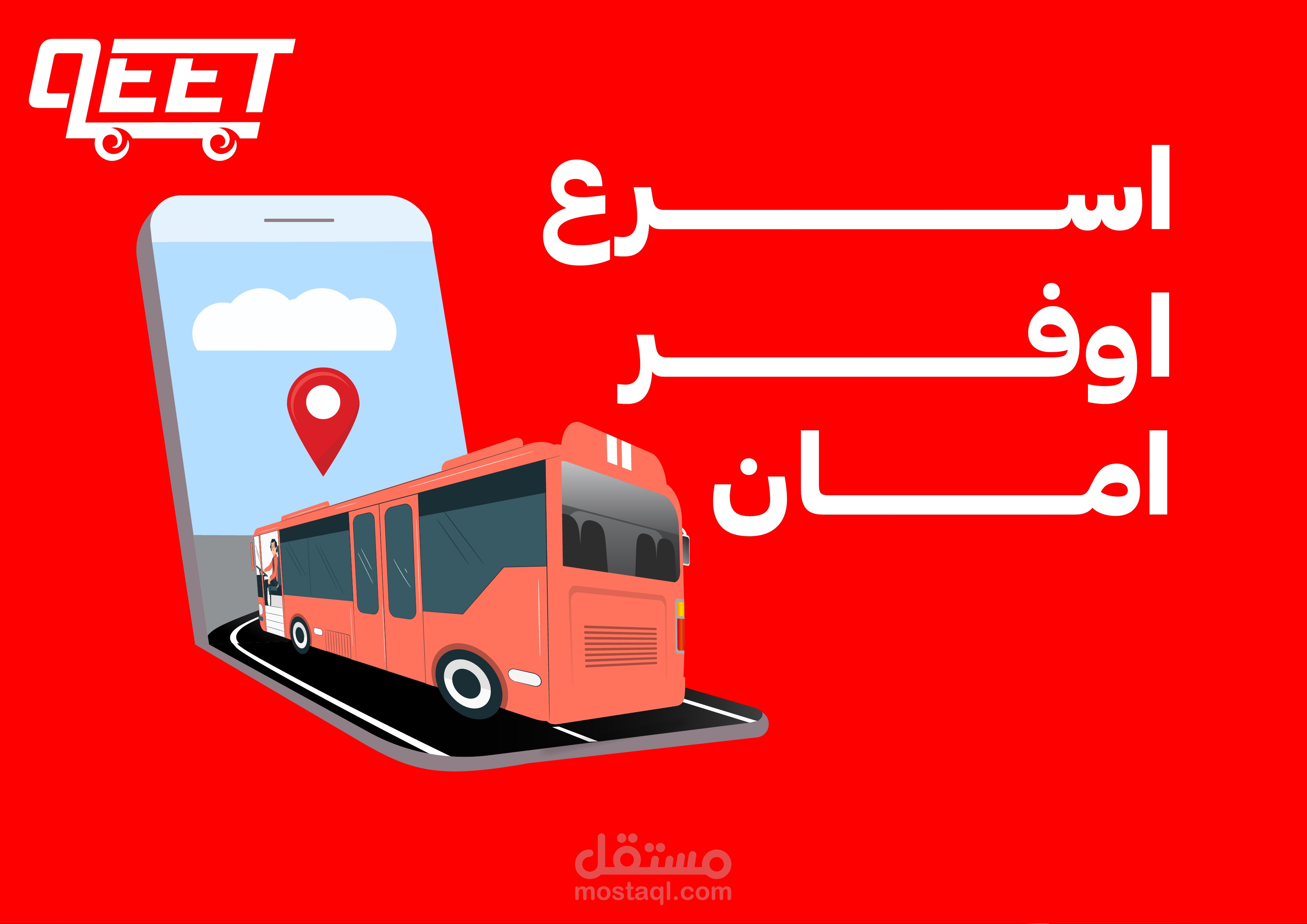
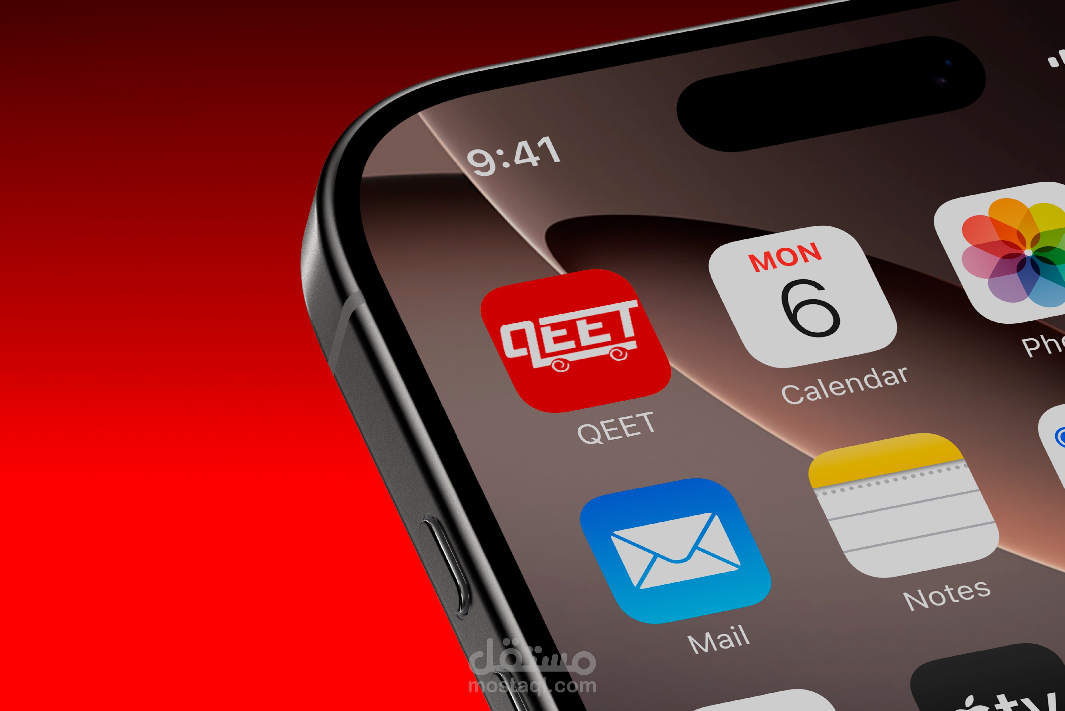
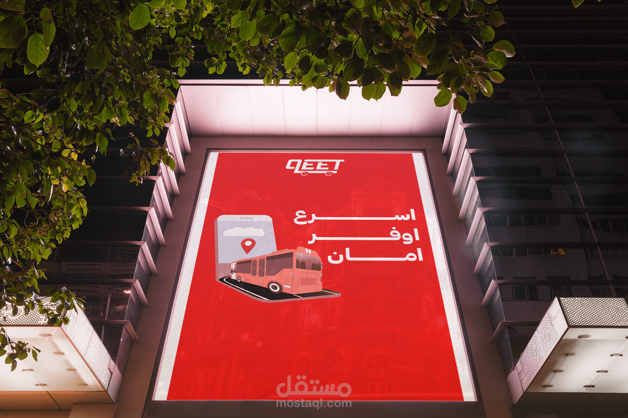
Brand Applications
The identity was tested and applied across various use cases to ensure versatility:
App Icon:
Clean, compact, and instantly recognizable on mobile screens.
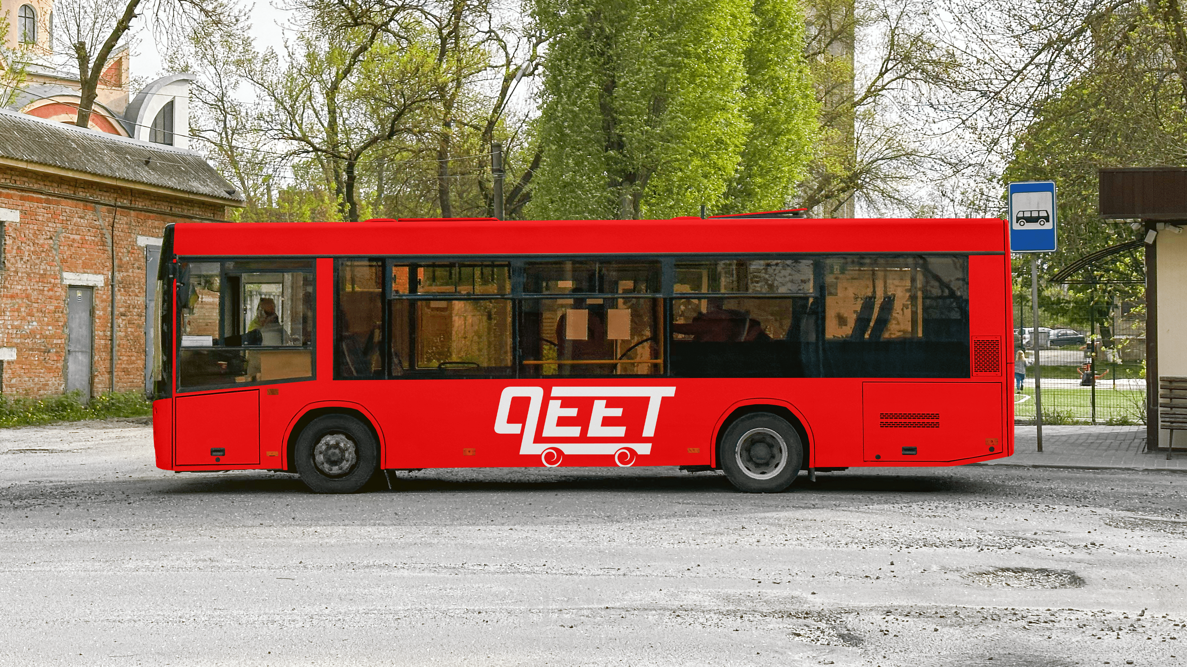
Bus Wrap Design:
Large-scale application focused on high contrast and visibility in urban environments.
Billboards & Outdoor Ads:
Designed for impact, featuring bold messaging and cohesive visuals.
Digital Mockups:
Responsive, modern, and consistent across UI/UX elements.
Each touchpoint reinforces the brand’s core attributes—clarity, speed, and reliability—while staying true to the minimalist design system.
brand identity Brand Design branding Graphic Designer Logo Design Logotype logo typography adobe illustrator ILLUSTRATION
? Design Thinking
This project focused on:
Stripping the identity to essentials, for clarity and fast recognition.
Using iconography and typography to reflect the nature of motion and transit.
Ensuring scalability and cohesion from mobile interfaces to large physical spaces.
brand identity Brand Design branding Graphic Designer Logo Design Logotype logo typography adobe illustrator ILLUSTRATION
Final Thoughts
QEET’s identity is an exercise in bold simplicity. The design system emphasizes movement without clutter, delivering a brand that feels fast, reliable, and modern.