icy jumps brand identity
تفاصيل العمل
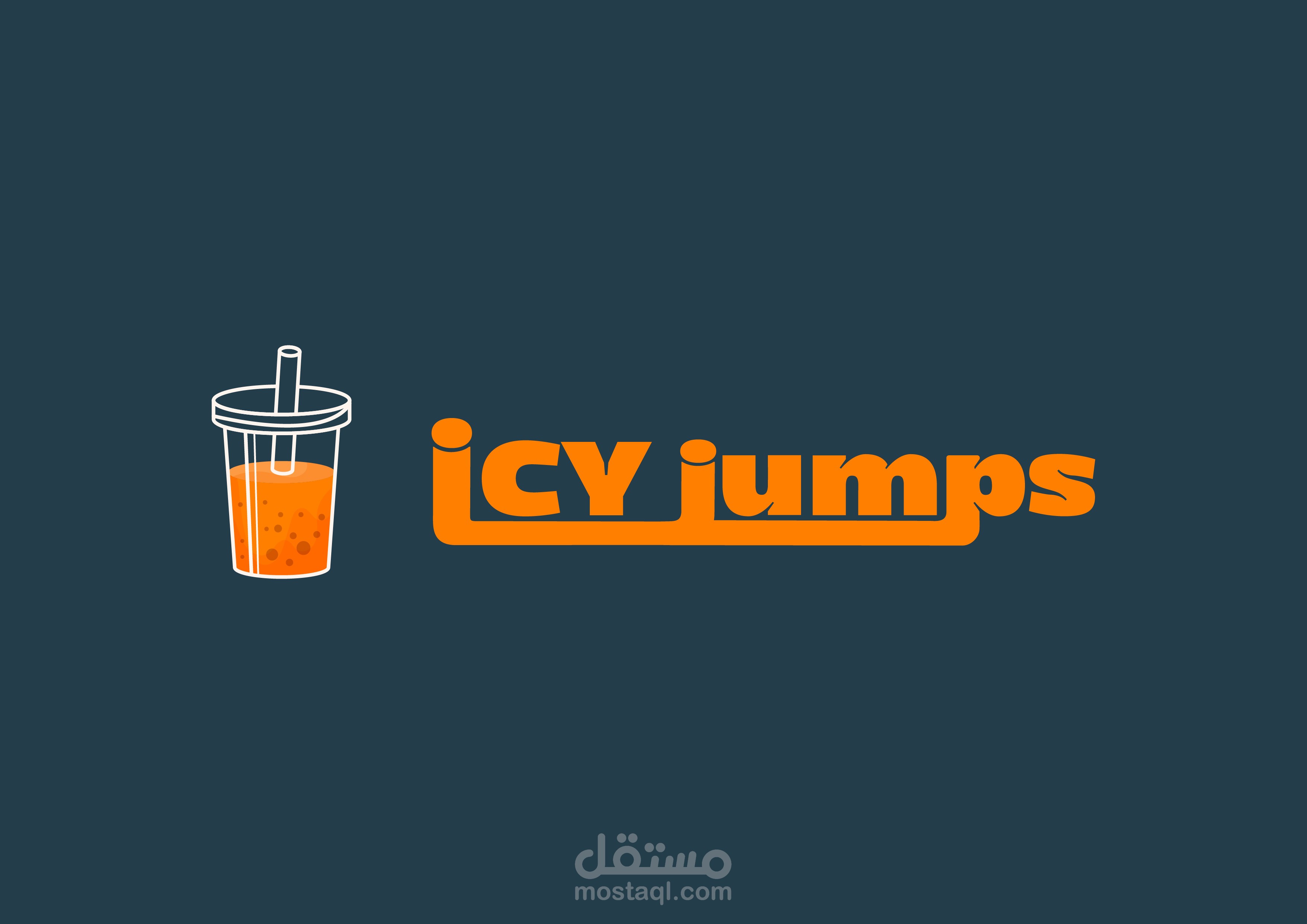
ICY Jumps – Brand Identity Design
Project Overview
ICY Jumps is a bold, energetic beverage brand aimed at a young, vibrant audience that values flavor, fun, and a strong visual vibe. This identity project was about capturing the dynamic spirit of a new-generation bubble tea brand that’s refreshing, social, and full of personality.
Target Audience
Young adults and teens (16–30), trend-conscious and design-aware, who appreciate great taste and visual storytelling. They’re urban, digital natives who love sharing aesthetically appealing moments—especially their favorite drinks.
Design Concept & Visual Language
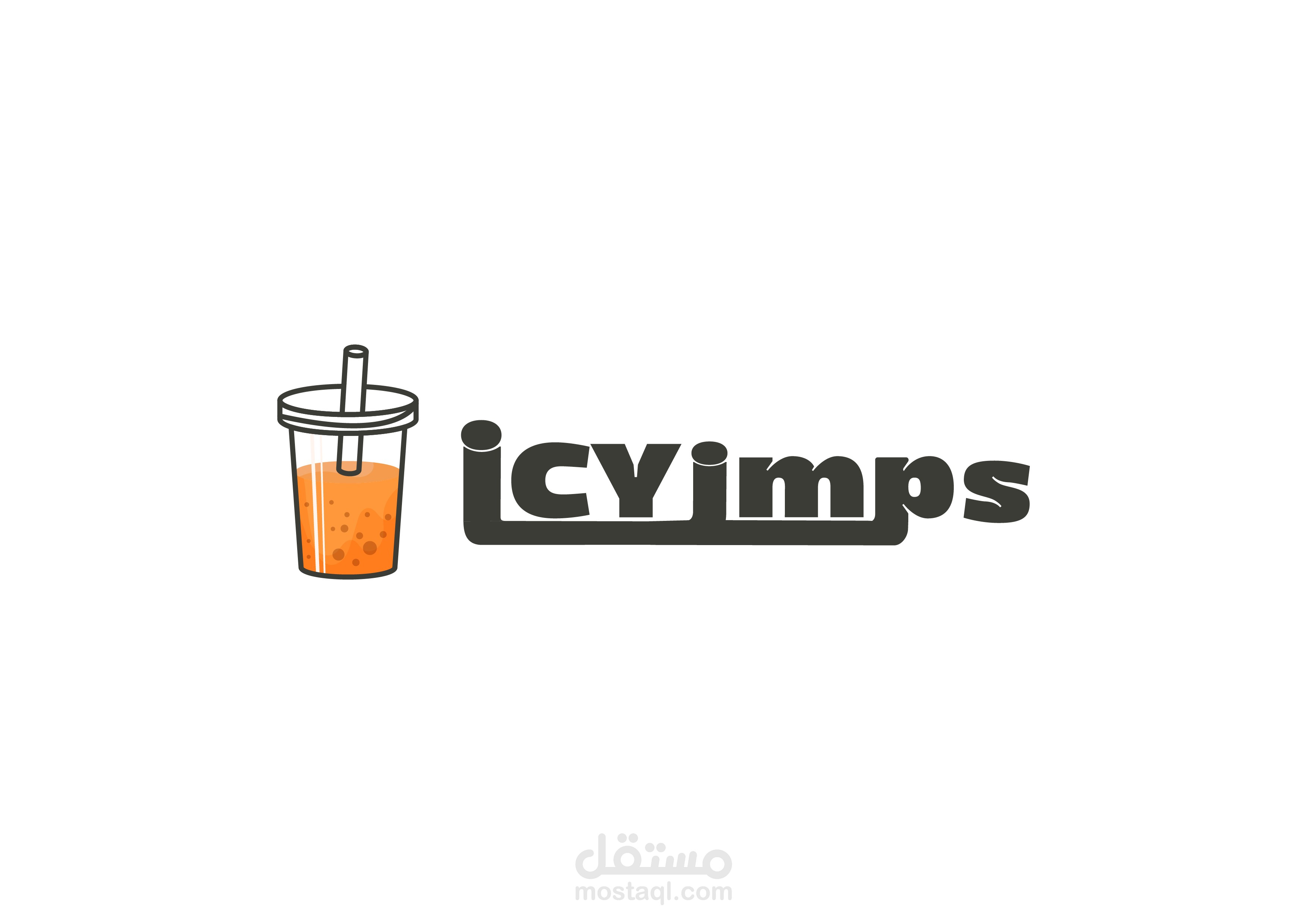
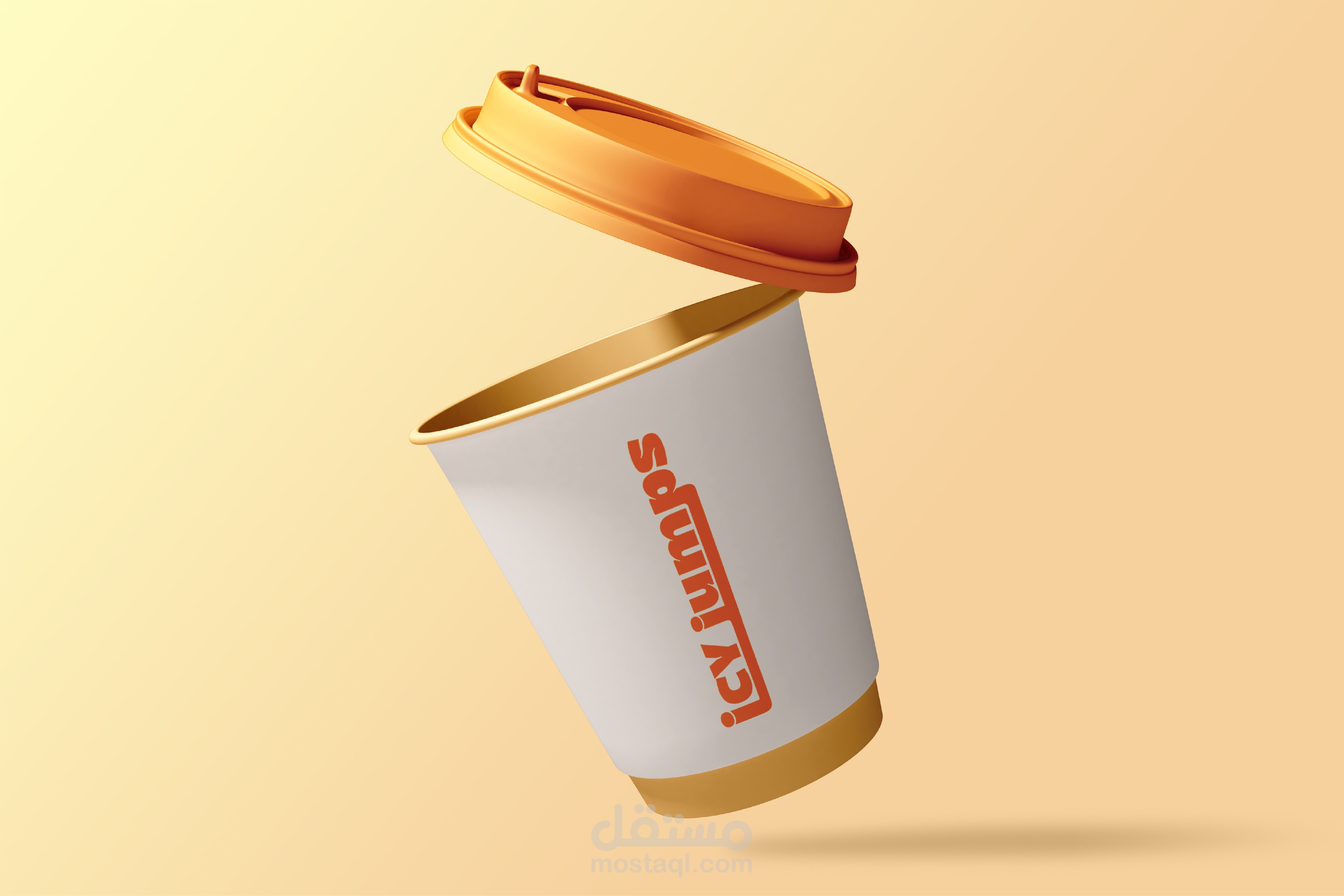
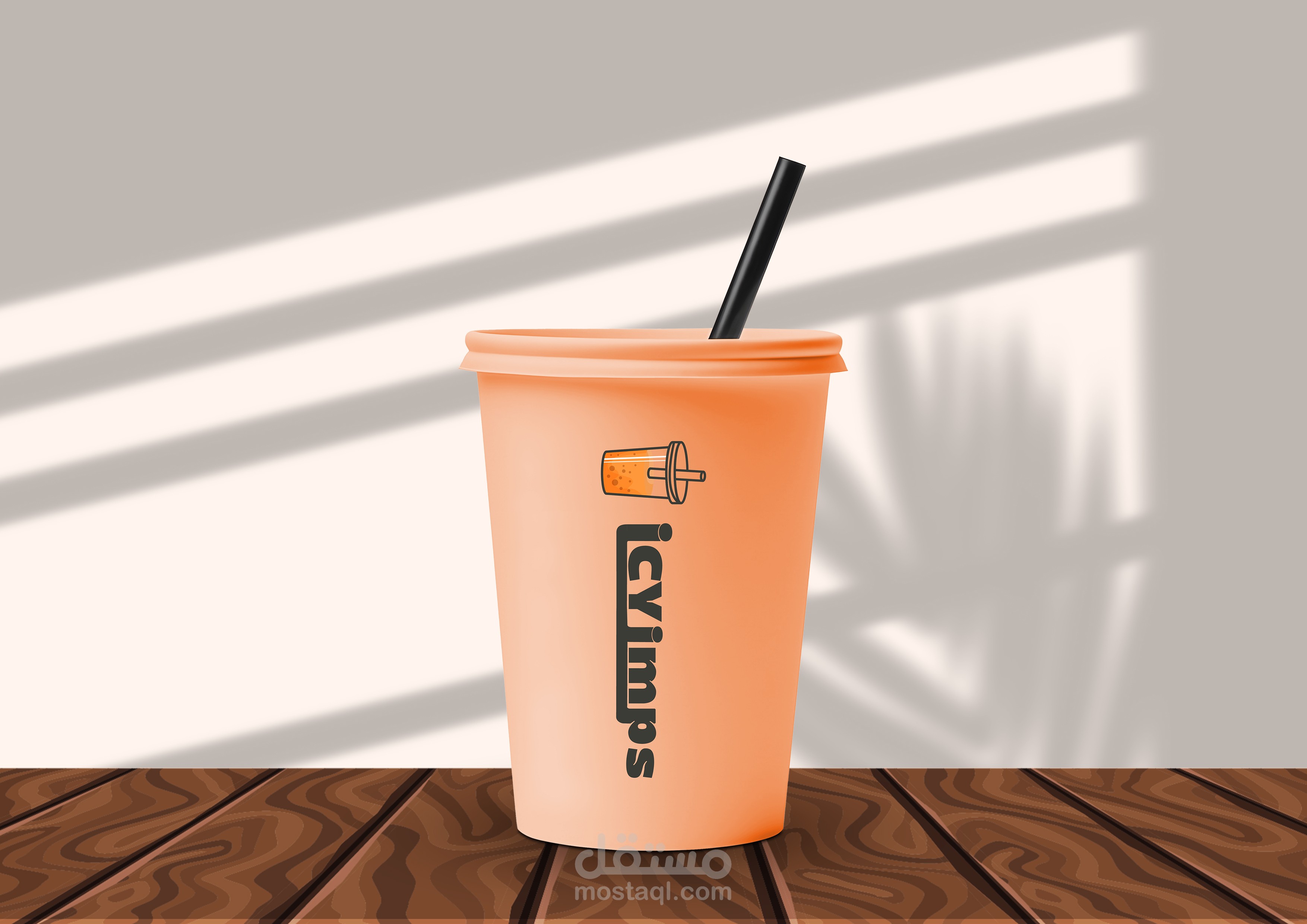
The brand identity centers on a playful-yet-confident wordmark paired with an illustrated cup icon, symbolizing refreshment and motion. The typeface is strong and slightly rounded, projecting warmth and friendliness, while maintaining a modern edge.
Color Palette
We chose a punchy orange as the hero color—fresh, energetic, and attention-grabbing—paired with deep charcoal and clean white for contrast and versatility across digital and physical platforms.
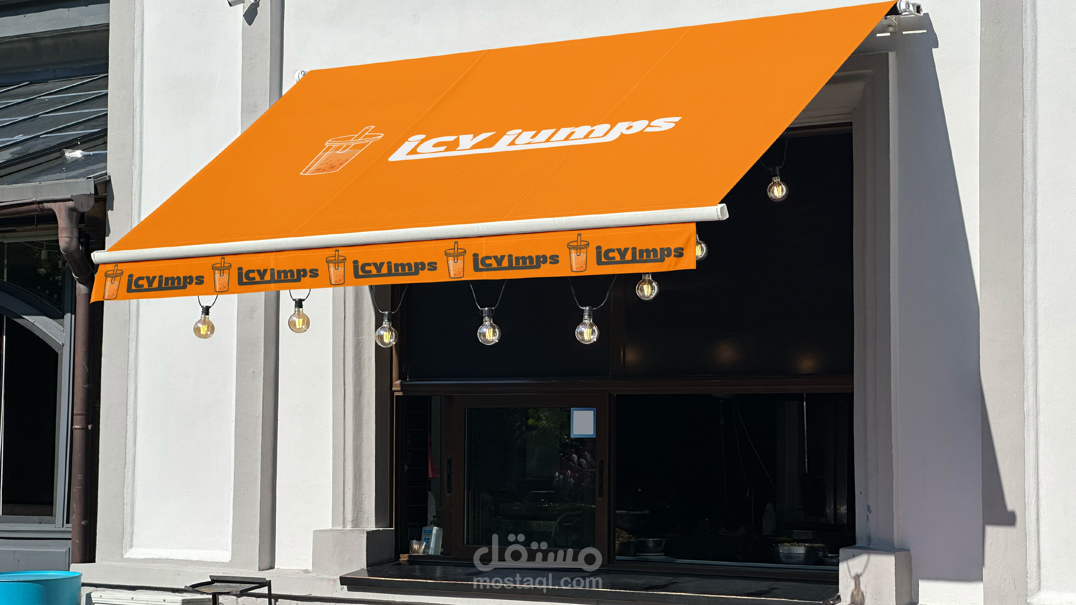
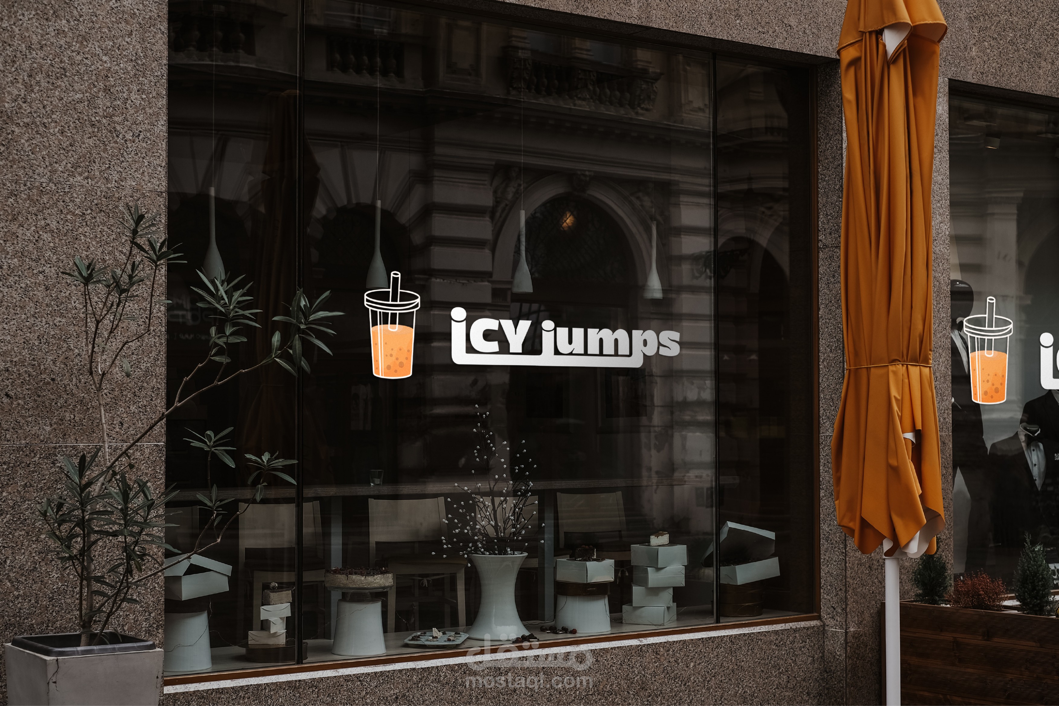
Applications
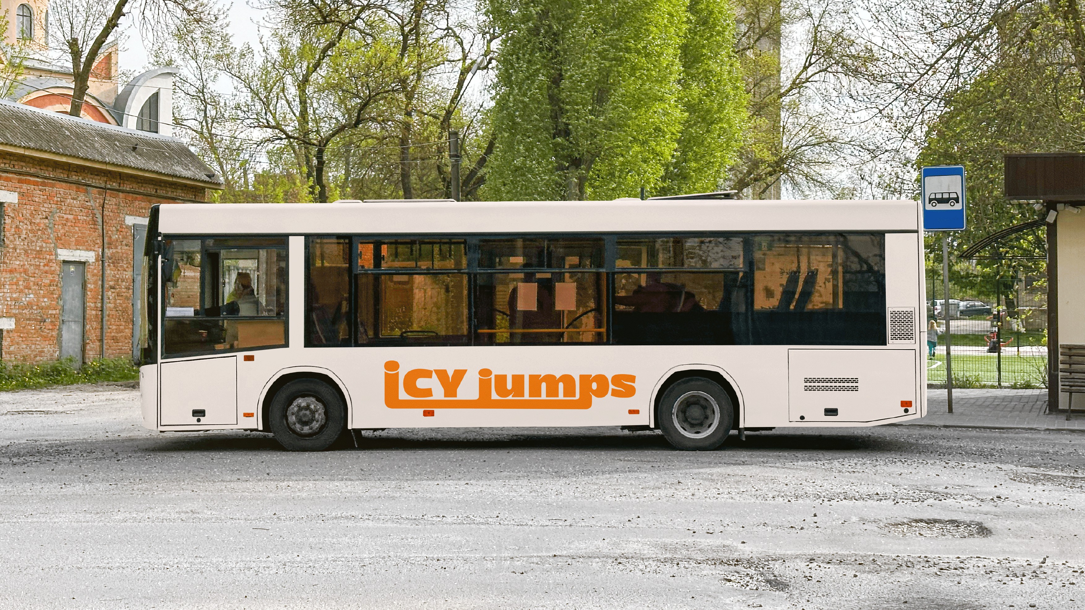
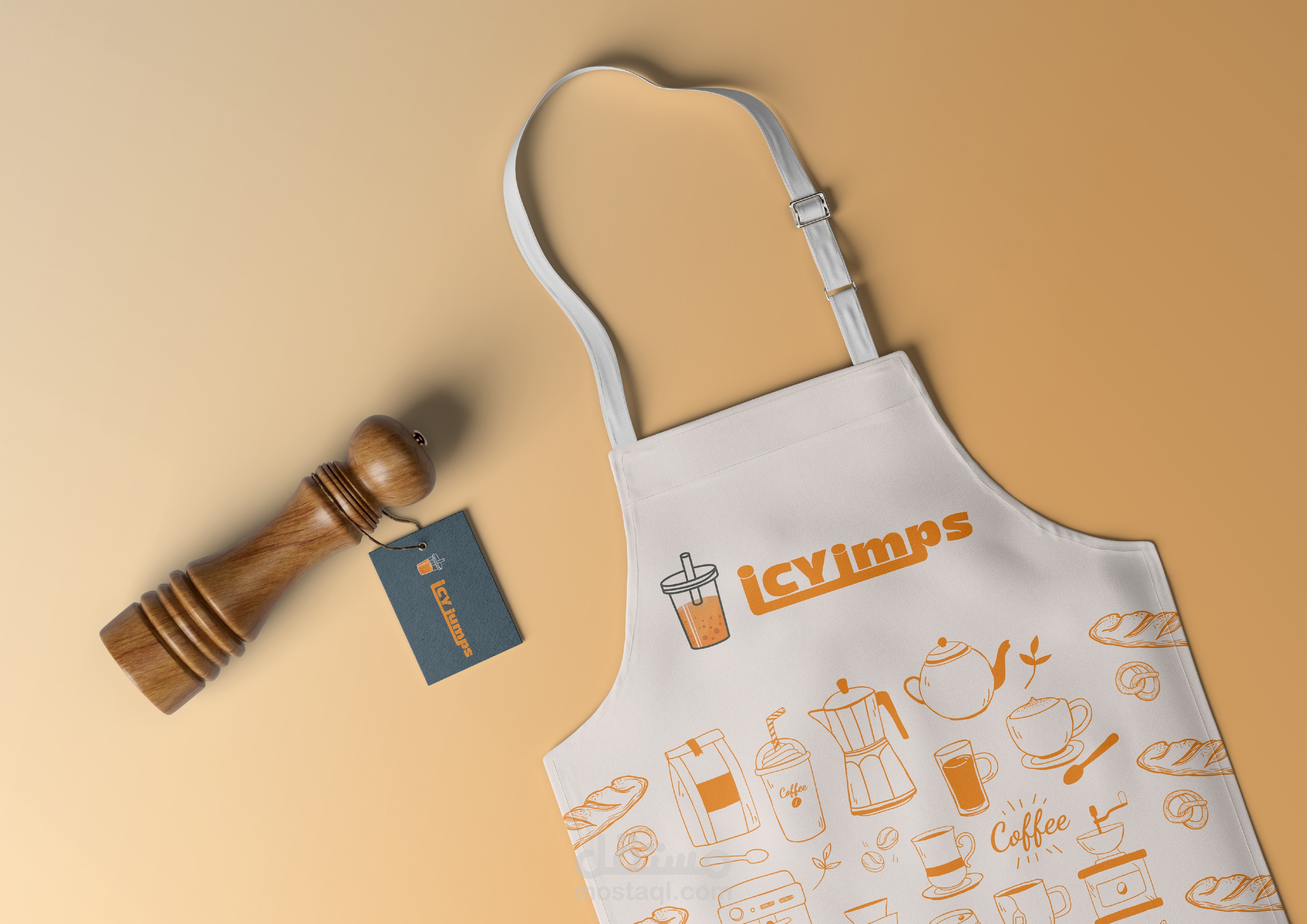
From storefront signage and takeaway cups to delivery trucks and apparel, the identity is built for impact at every customer touchpoint. The consistent use of iconography and bold type makes the brand instantly recognizable wherever it appears.
Design Approach
This was a blend of minimal layout strategy and bold character. I aimed to create something scalable, flexible, and visually magnetic—something that literally jumps out in any environment. The branding was built to feel cohesive but not rigid, allowing room for playful applications while retaining strong brand recall.