Coffee Shop Sales
تفاصيل العمل
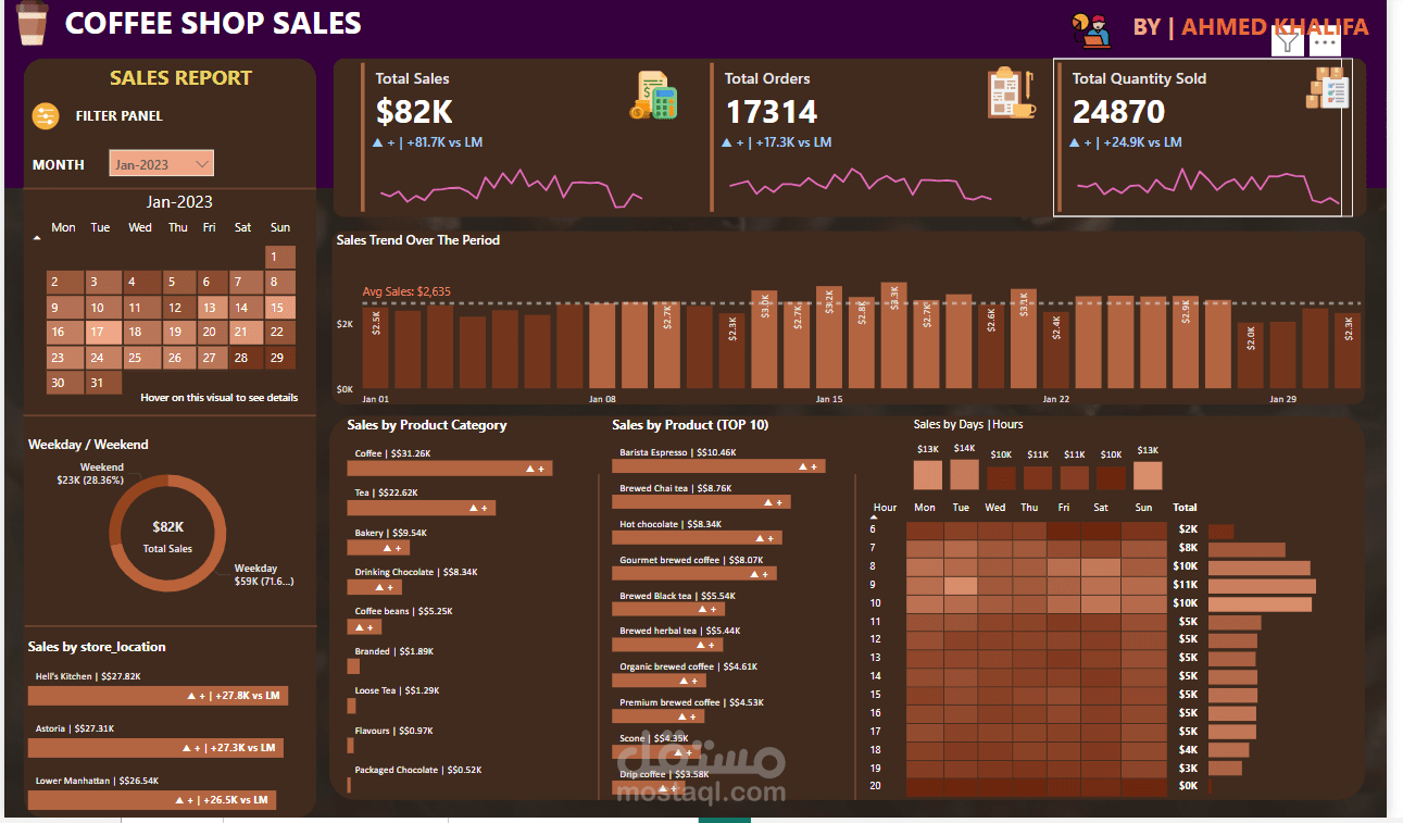

Here’s what’s inside:
Calendar heatmap to detect sales spikes
Weekday vs Weekend comparison (Spoiler: Fridays are wild!)
Sales by hour — now I know exactly when caffeine hits hardest
MoM growth with trend arrows + differences
Store and product category breakdowns
Under the hood:
· Cleaned raw data with Power Query
· Built KPIs with DAX
· Used slicers, conditional formatting, and dynamic tooltips
KPI Analysis Covered:
· Total Sales, Orders & Quantity Sold
· MoM % growth & difference vs previous month
Dashboard is fully dynamic — change the month, and watch the whole story update.
️ No baristas were harmed in the making of this dashboard