Item Price Trends in January 2022
تفاصيل العمل

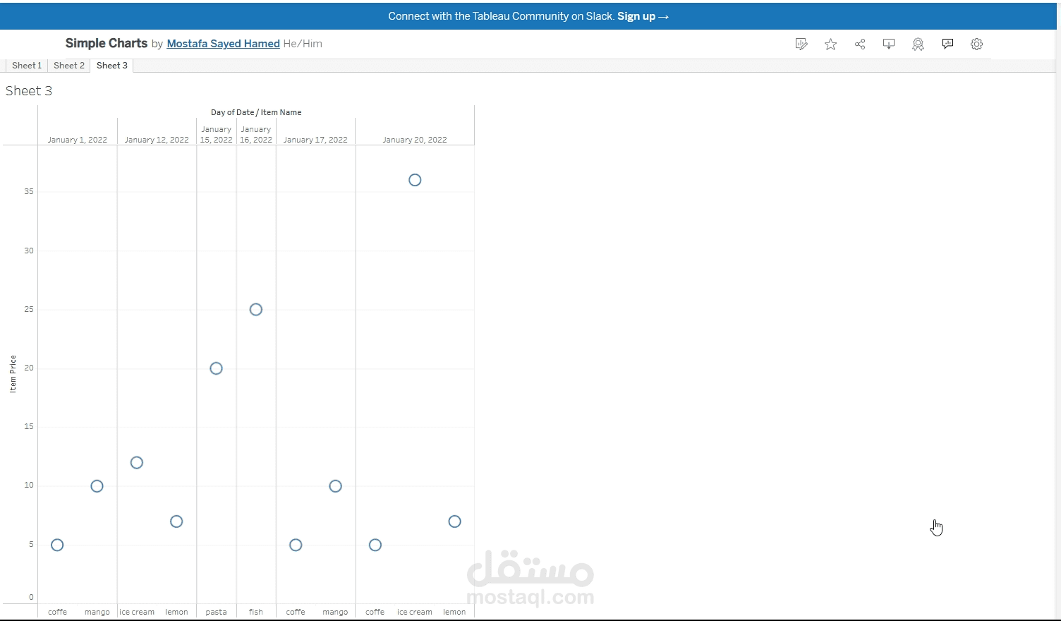
This chart is a scatter plot illustrating the price trends of various items—coffee, mango, ice cream, lemon, pasta, and fish—across specific dates in January 2022. The x-axis represents the dates (e.g., January 1, 12, 15, 16, 17, and 20), while the y-axis indicates the item prices ranging from 0 to 35 units. Each data point corresponds to the price of a specific item on a given date, with multiple items tracked over time. The plot effectively visualizes price fluctuations, showing, for instance, higher prices for ice