Papa Potato
تفاصيل العمل
Concept & Meaning
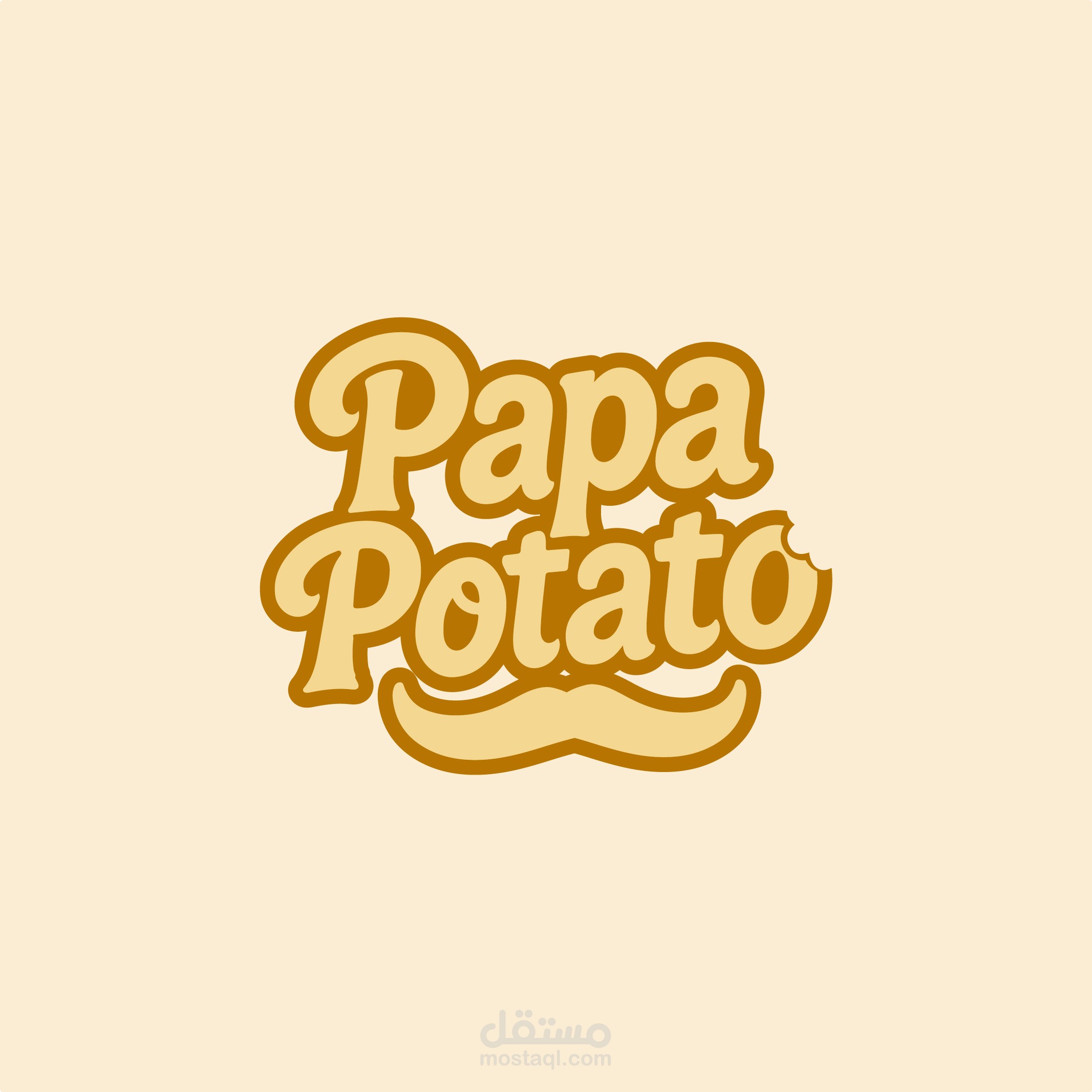
The Papa Potato logo is designed to evoke fun, joy, and a welcoming atmosphere. The potato character, with its charming mustache and chef’s hat, represents a warm and friendly food brand. The dynamic peel slide concept symbolizes freshness, movement, and the playful nature of the restaurant. The bowl of ketchup adds a bold food connection, making the logo visually appealing and instantly recognizable.
Visual Identity & Style
Character Design: A lively potato mascot that adds personality and memorability to the brand.
Motion & Fun: The peel slide effect creates a sense of movement, making the logo feel energetic.
Typography: Bold, rounded letters with a slightly bubbly, warm feel, reflecting the brand's playful nature.
Color Palette & Symbolism
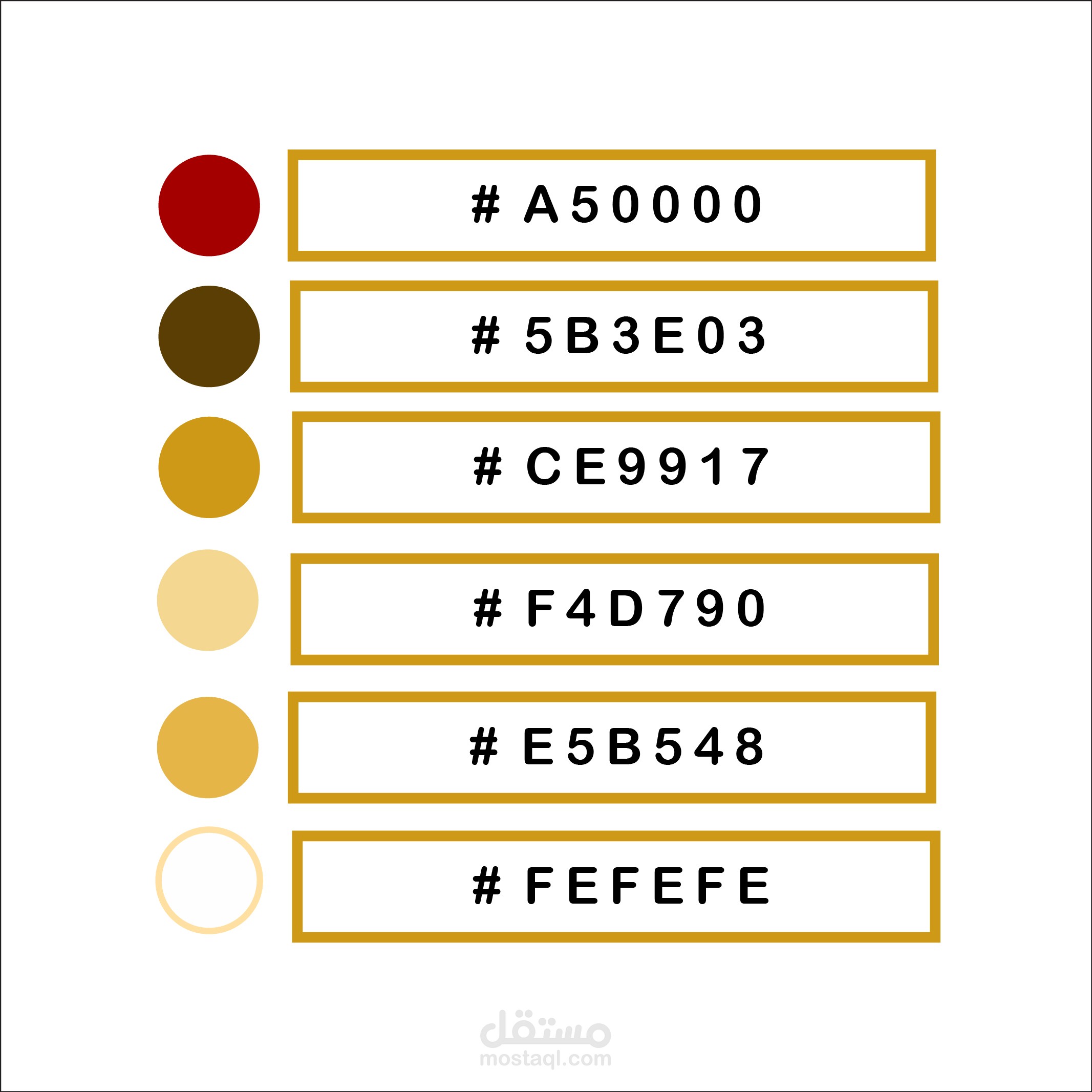
Rich Golden Brown (#E5B548) → Represents the crispy, appetizing potato texture.
Bold Deep Red (#A50000) → Evokes the richness of ketchup or a savory sauce, enhancing the food appeal.
Earthy Dark Brown (#5B3E03) → Reflects the natural, hearty essence of potatoes and their skin.
Warm Golden Yellow (#CE9917) → Adds a touch of vibrancy, representing warmth and freshness.
Soft Butter Yellow (#F4D790) → Highlights the creamy and smooth textures associated with potatoes.
Crisp Off-White (#FEFEFE) → Ensures clarity, contrast, and a clean, inviting presentation.
Versatility & Usability
Works well in digital and print formats (menus, signs, packaging).
Can be adapted for monochrome versions without losing its charm.
Easily scalable for different branding needs.