تحليل بيانات باستخدام البايثون
تفاصيل العمل
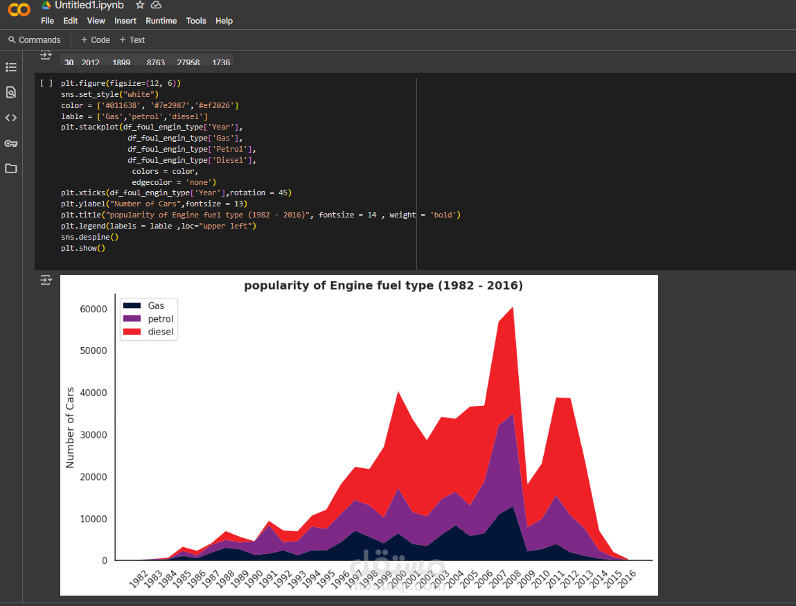
The chart visualizes the popularity of different engine fuel types—Gas, Petrol, and Diesel—between 1982 and 2016. Using a stacked area plot, it shows the number of cars for each fuel type over time. Diesel cars, represented in red, show a significant increase in popularity starting in the early 1990s, peaking around 2007. Petrol (purple) and gas (dark blue) cars have smaller but steady trends throughout the years. The overall number of cars rises consistently until around 2007, followed by a sharp decline. This graph effectively highlights changes in consumer preference and market trends in automotive fuel types over the decades.