Basata Logo designe and Brand Manual
تفاصيل العمل


My Role
I developed this project from the ground up — starting with the core idea, building the creative concept, and leading the full execution of the brand identity. I handled everything from visual research and logo design to the complete development of the visual identity system and brand guidelines. All design work was executed using Adobe Photoshop, Illustrator, and InDesign.
Concept Overview
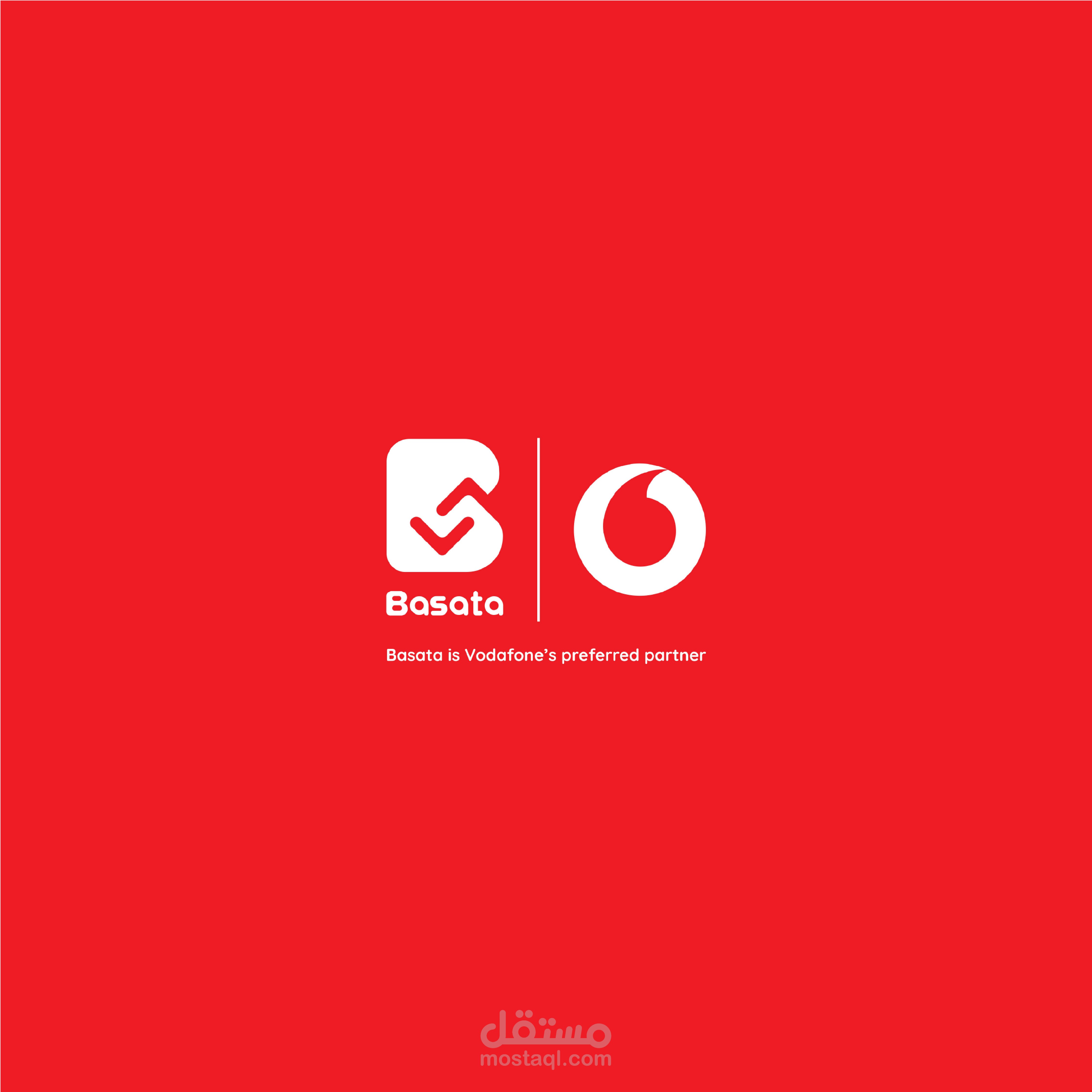
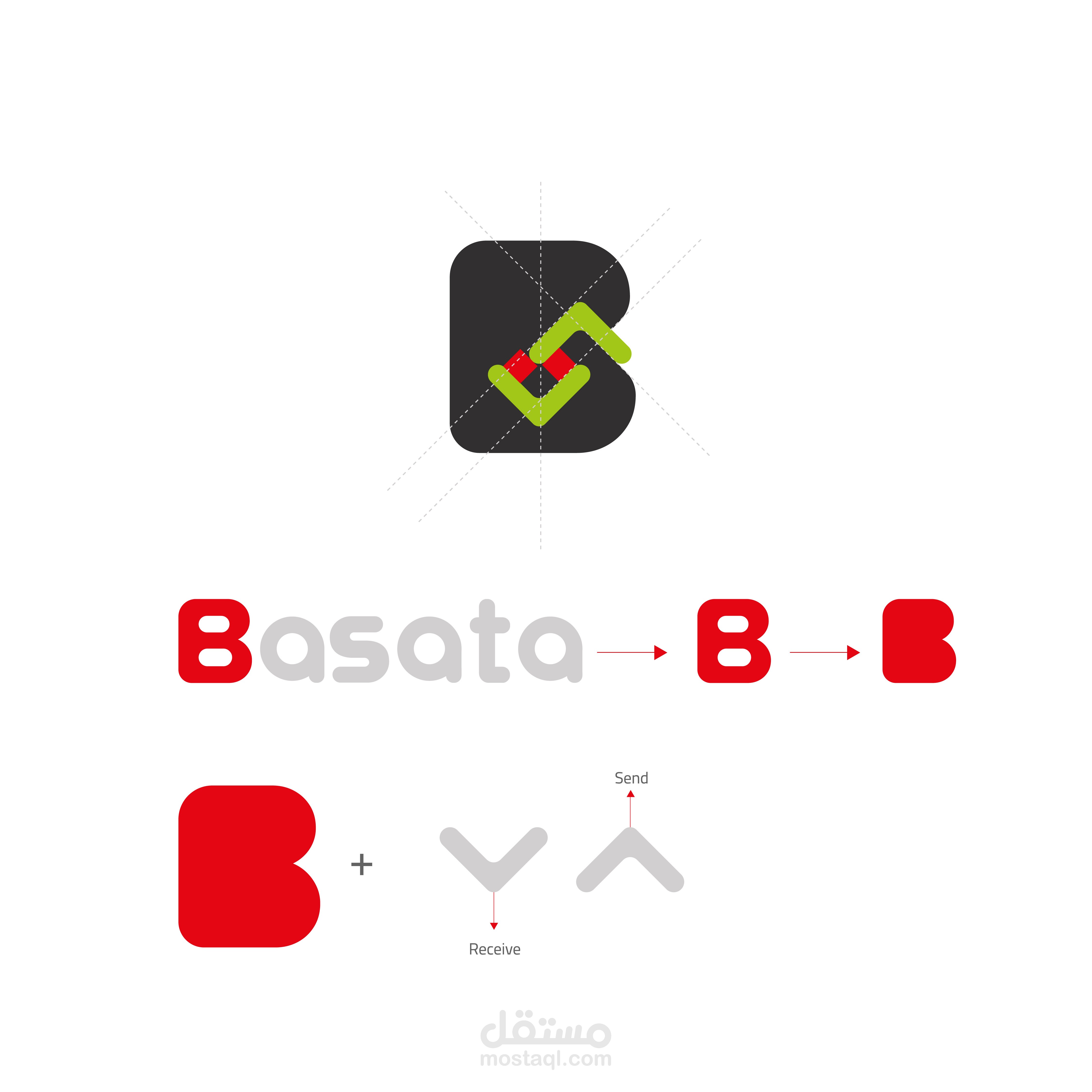
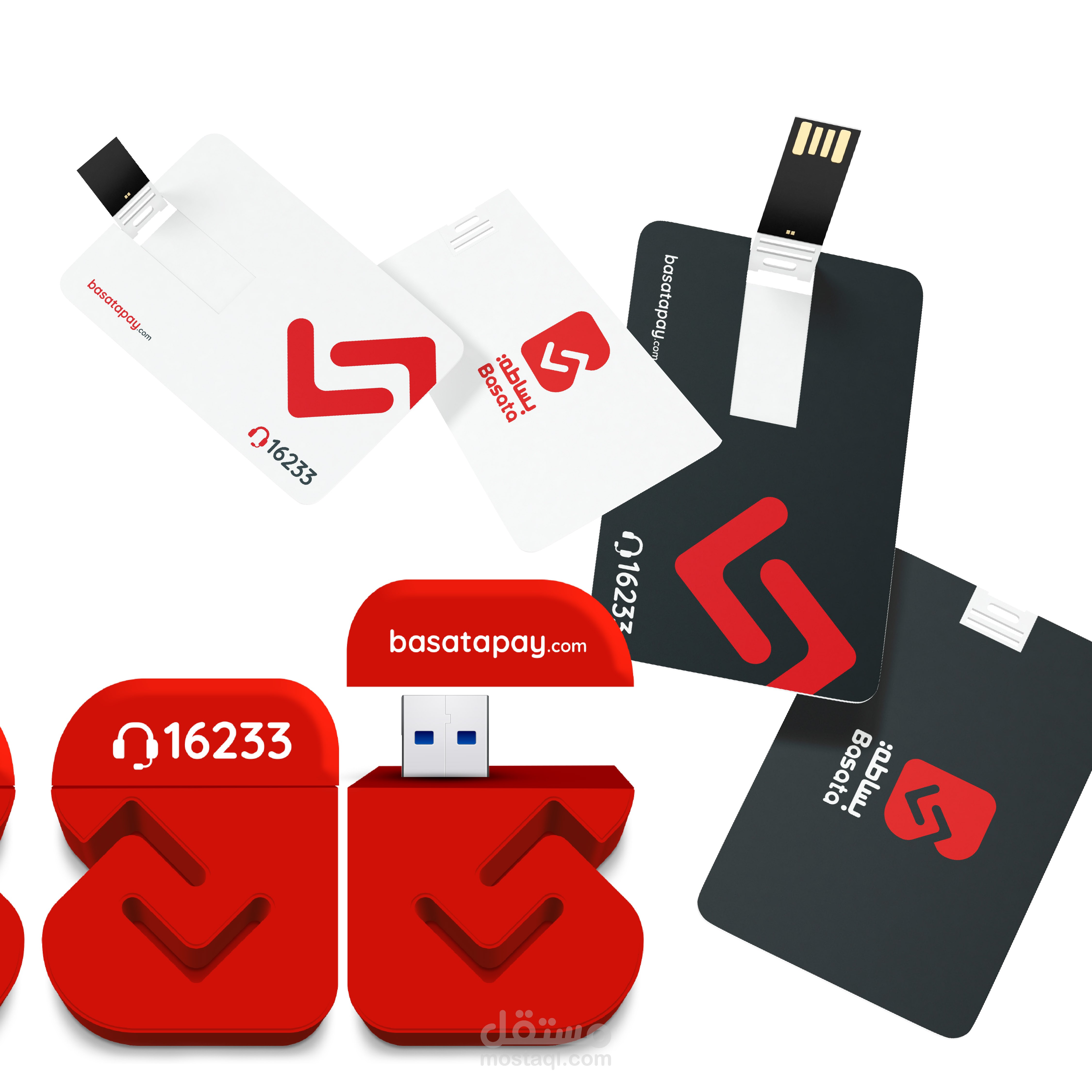
The "Basata" logo reflects the core value of simplicity through clear, smart visual language that conveys the nature of the digital service.
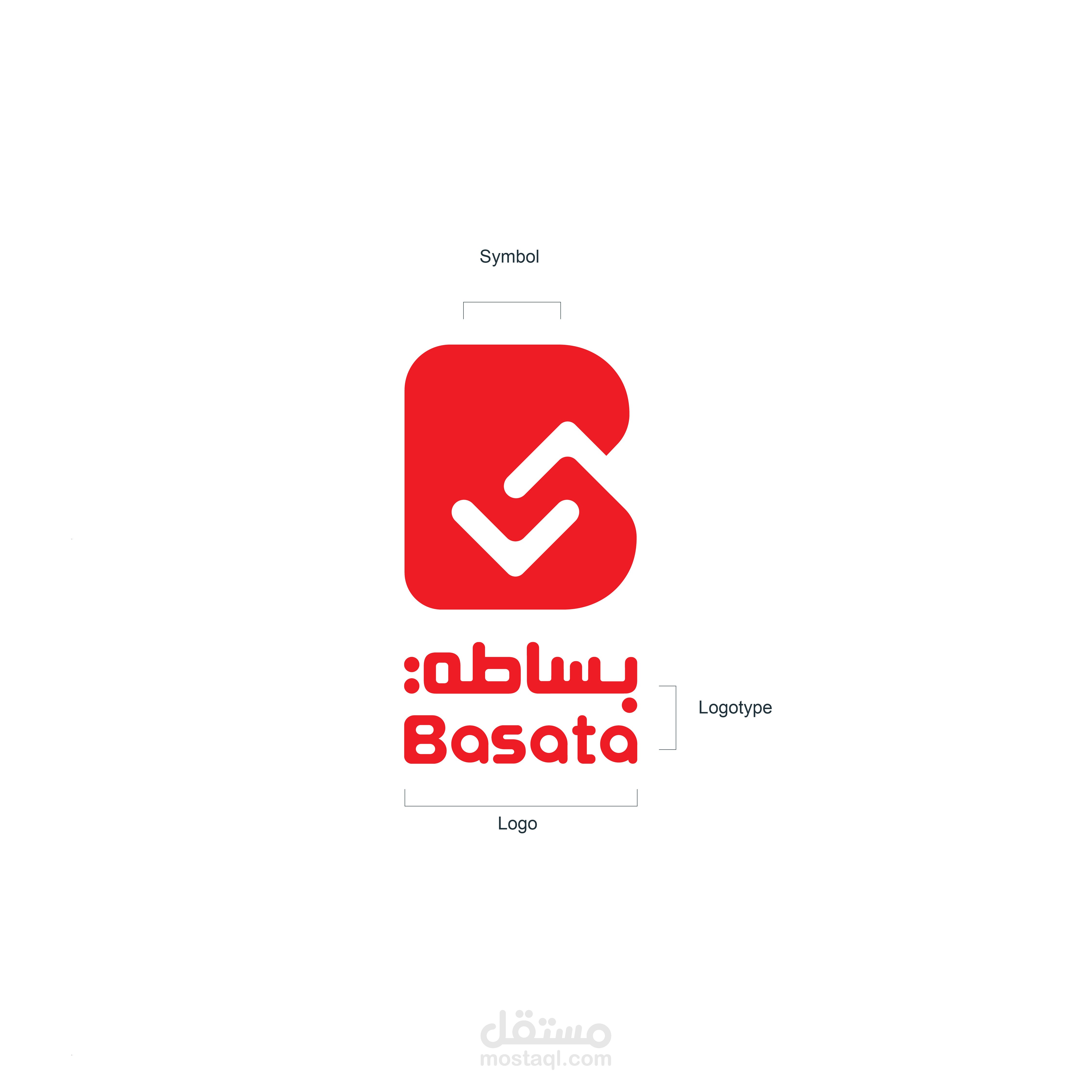
The design centers around the first letter “B” from the word “Basata”, simplified into a soft, rounded geometric form that represents ease and functionality.
Inside the “B”, two opposing arrows — one pointing downward (receive) and one upward (send) — symbolize continuous interaction and mutual exchange.
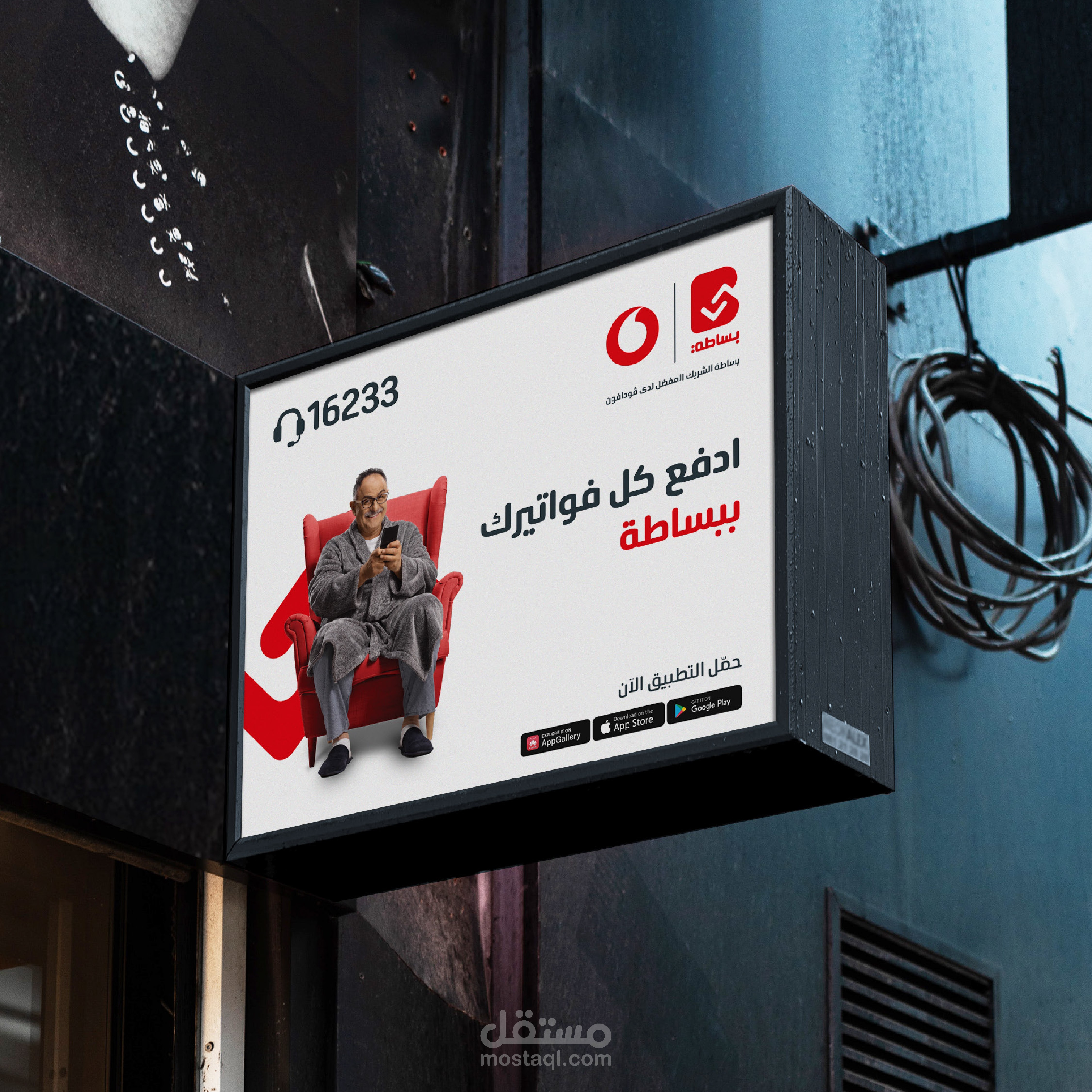
The use of red as the primary color directly ties the identity to Vodafone, reinforcing brand association and mental recall.
Creative Direction
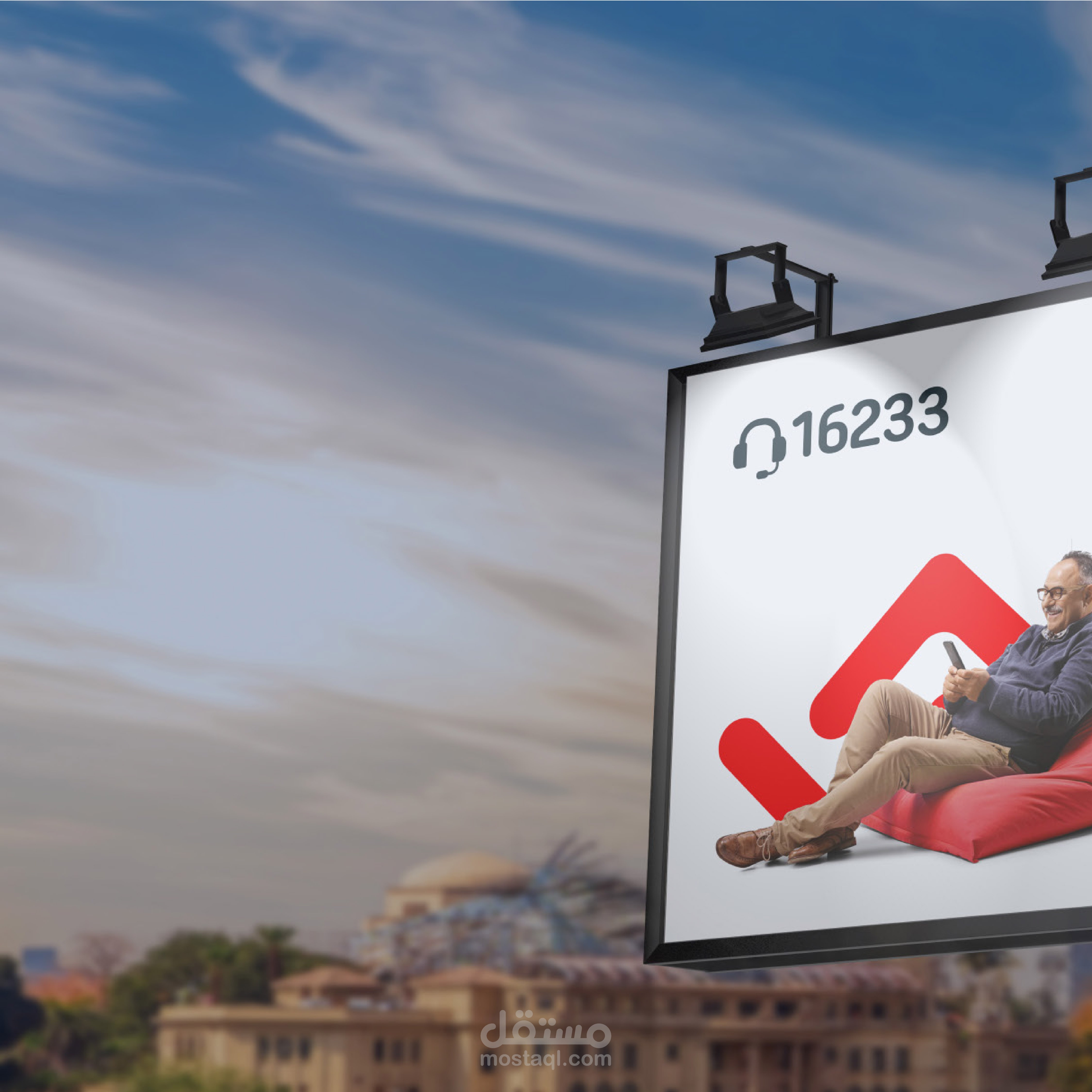
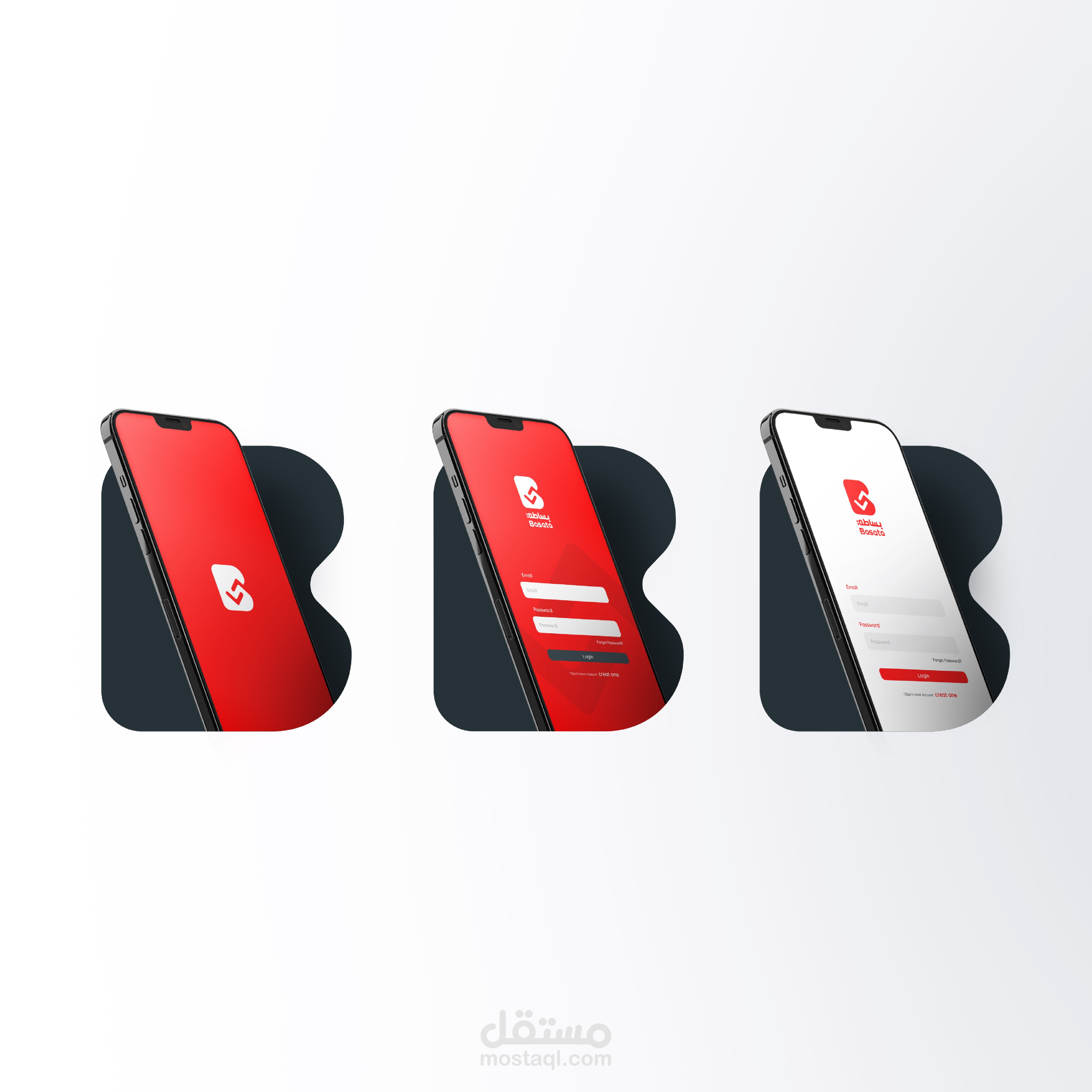
The design approach focused on transforming the word into a standalone visual symbol that can be easily applied across digital platforms and print materials.
The final shape balances symbolic meaning with strong visual presence, emphasizing usability and reliability — values that align with Vodafone’s philosophy of delivering streamlined, efficient services.