Divvy Bike Sharing Dashboard – Top Station Analysis 2019 (Built in Tableau)
تفاصيل العمل
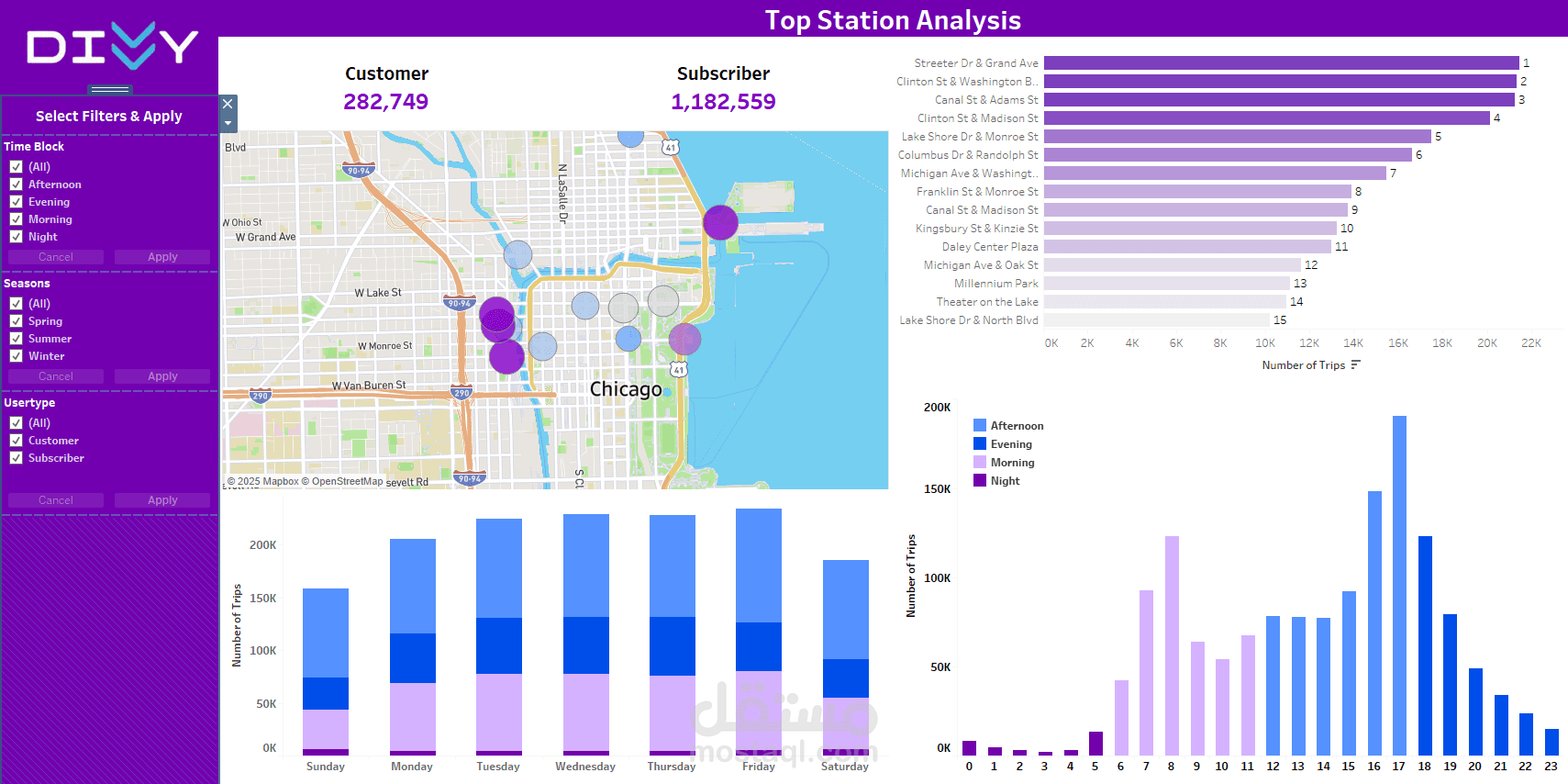

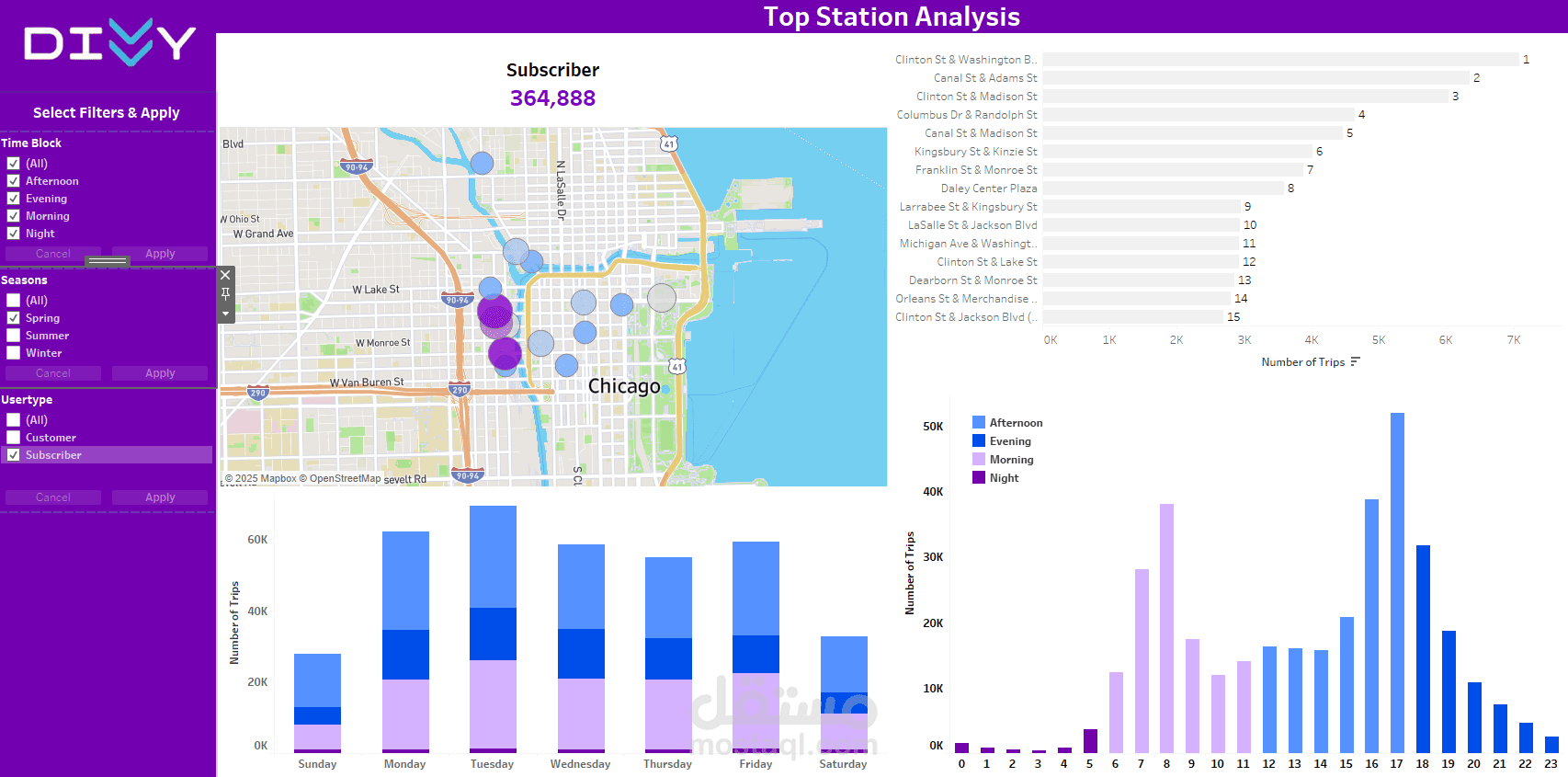
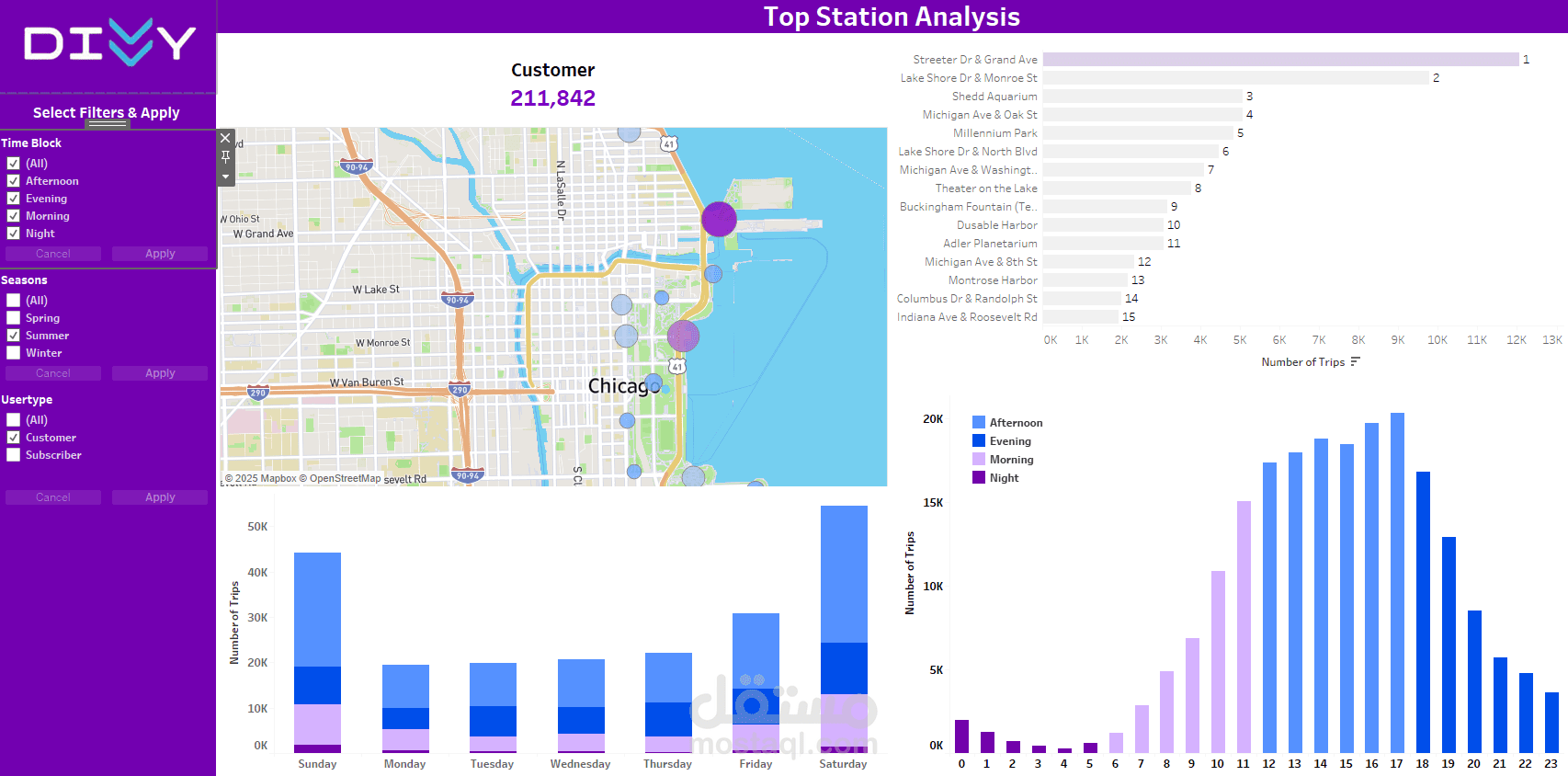
Project Question:
What are the top-performing bike stations in Chicago based on the number of trips across different time blocks, seasons, and user types?
Overview:
This interactive Tableau dashboard analyzes Divvy bike trip data to uncover:
The top 15 most popular bike stations by trip volume
Total trips by user type: Customer vs. Subscriber
Trip distribution by day of the week
Most active hours of the day
Impact of time block and seasonal trends on ridership
? Key Features:
Fully dynamic filters for Time Block, Season, and Usertype
Visual station mapping with proportional bubble sizes
Hover-friendly bar charts showing trip trends
Clean, vibrant, and readable UI for storytelling and business insight
Purpose:
To support Divvy’s business decisions by identifying high-traffic stations, peak hours, and behavioral patterns of different rider types, which can be useful for bike redistribution planning, marketing strategies, or infrastructure improvements.