pandemic ridership trends across MTA
تفاصيل العمل

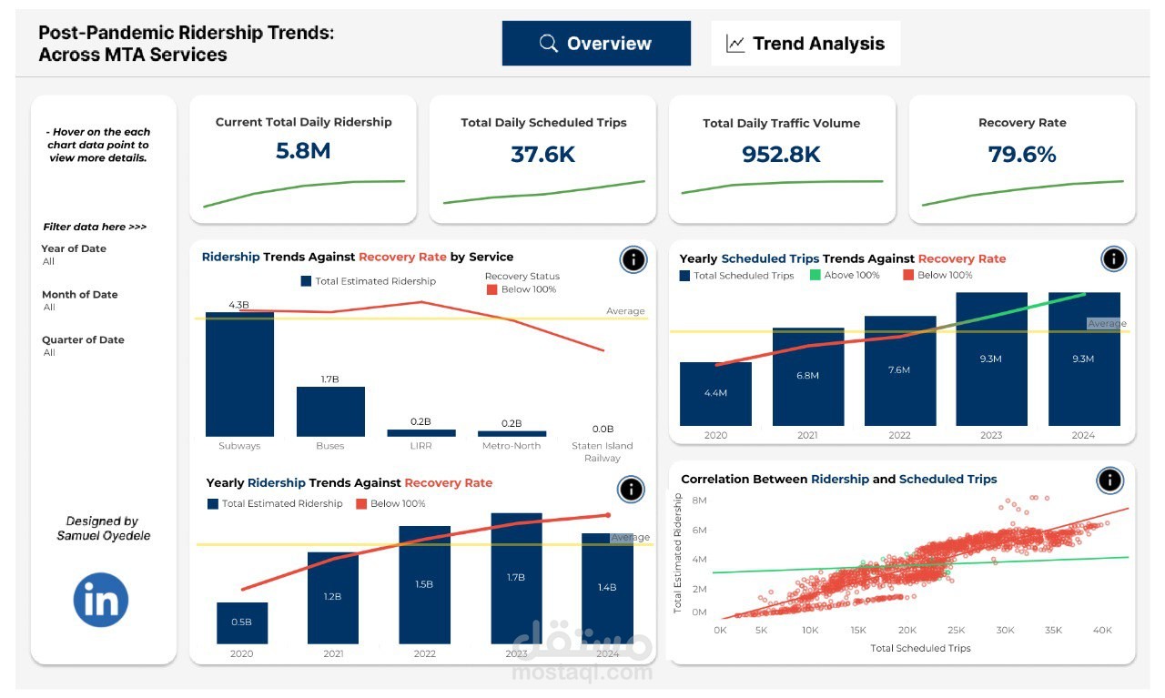
This project is an interactive dashboard that analyzes post-pandemic ridership trends across MTA (Metropolitan Transportation Authority) services. It aims to visually present how ridership is recovering compared to pre-pandemic levels using clear metrics and charts.
Key components of the dashboard:
Current Total Daily Ridership: 5.8 million
Total Daily Scheduled Trips: 37.6K
Total Daily Traffic Volume: 952.8K
Recovery Rate: 79.6% (percentage of pre-pandemic ridership level)
Bar chart comparing ridership across services (e.g., Subways, Buses, LIRR, Metro-North)
Yearly Scheduled Trips vs. Recovery Rate (2020–2024)
Yearly Ridership Trends from 2020 to 2024
Scatter plot showing the correlation between ridership and scheduled trips
The dashboard is designed by Samuel Oyedele and uses visual analytics to give insights into public transit usage trends after COVID-19.