تصميم هوية بصرية لمحل دوناتس
تفاصيل العمل
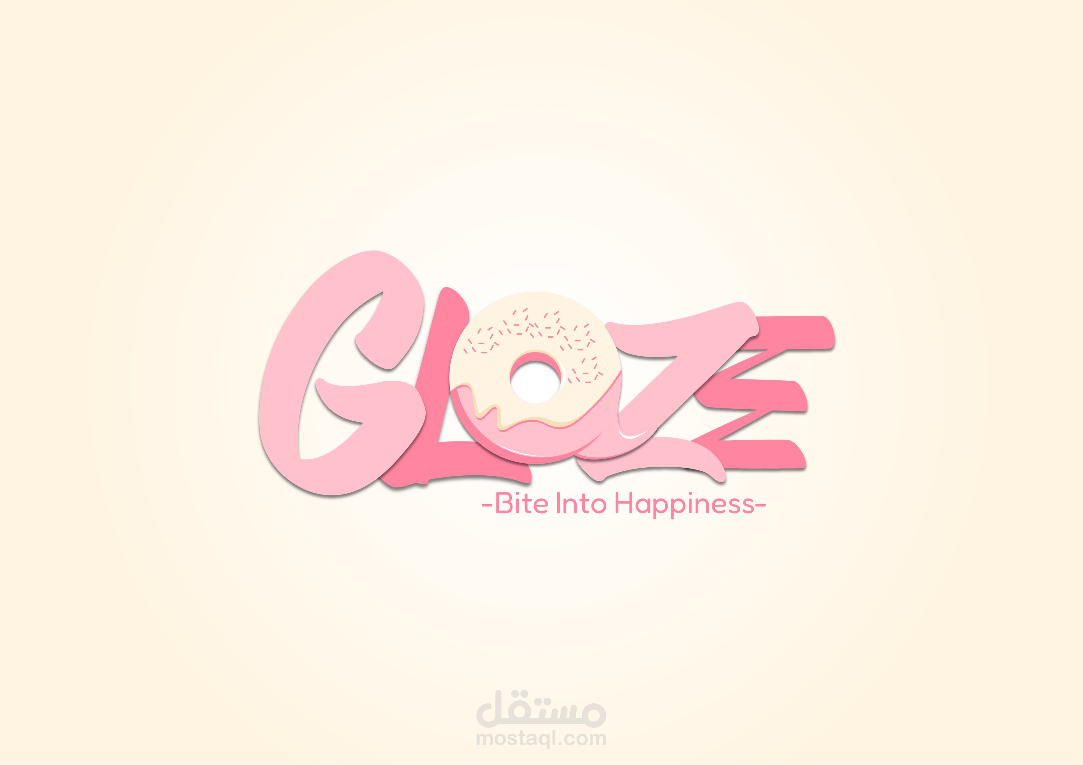

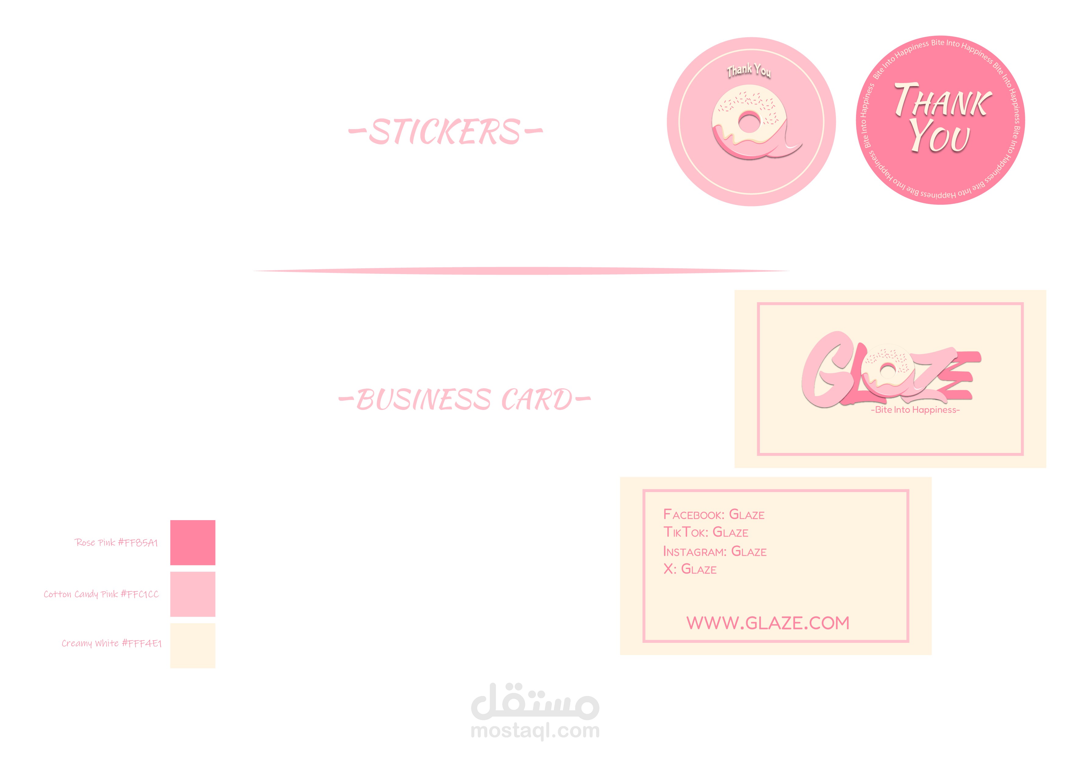

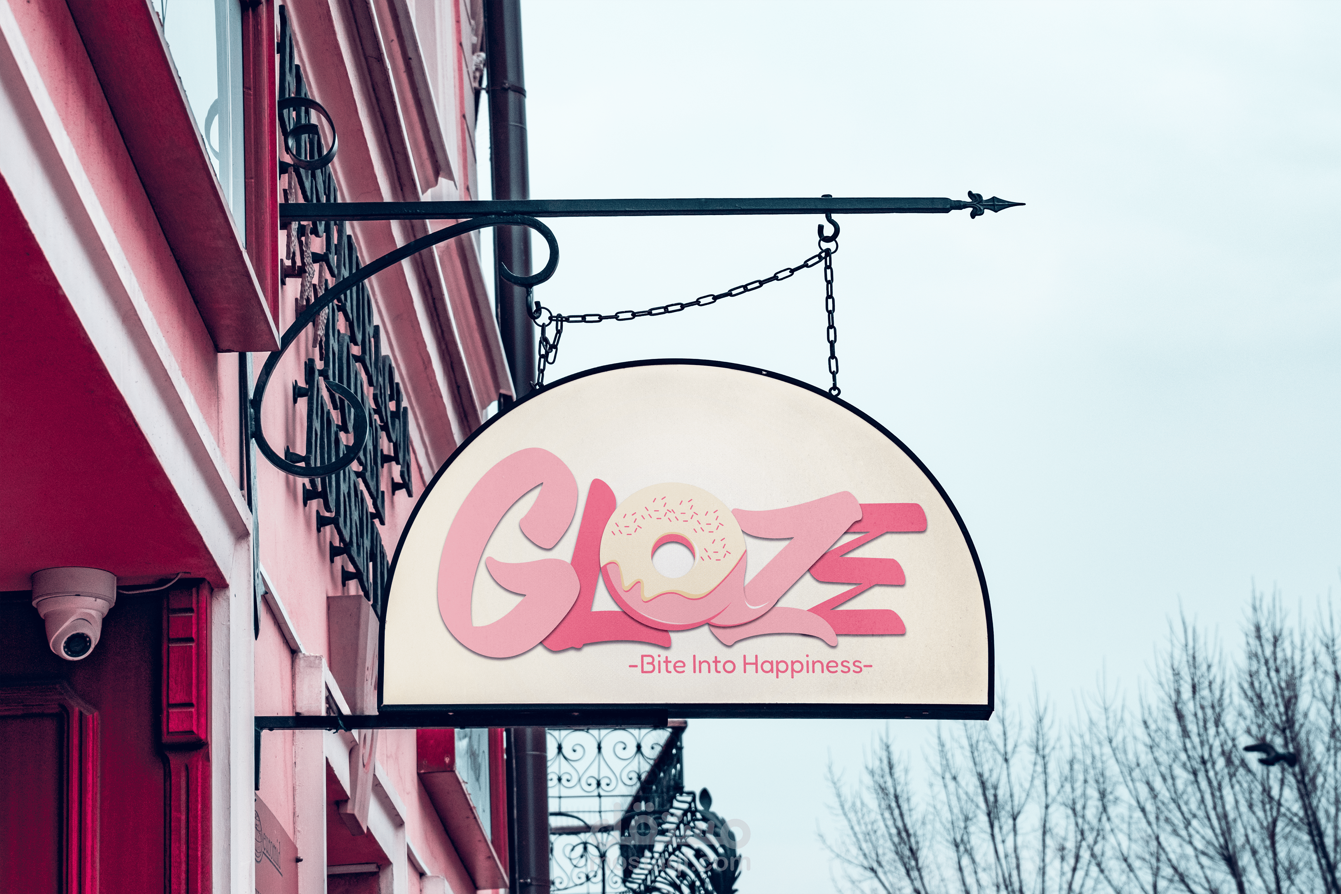


This logo for "Glaze" is playful and vibrant with a dominant pink theme. Here's the breakdown:
Text Design: The word "Glaze" is written in a soft, bubble-like font with smooth curves, giving it a fun and inviting look.
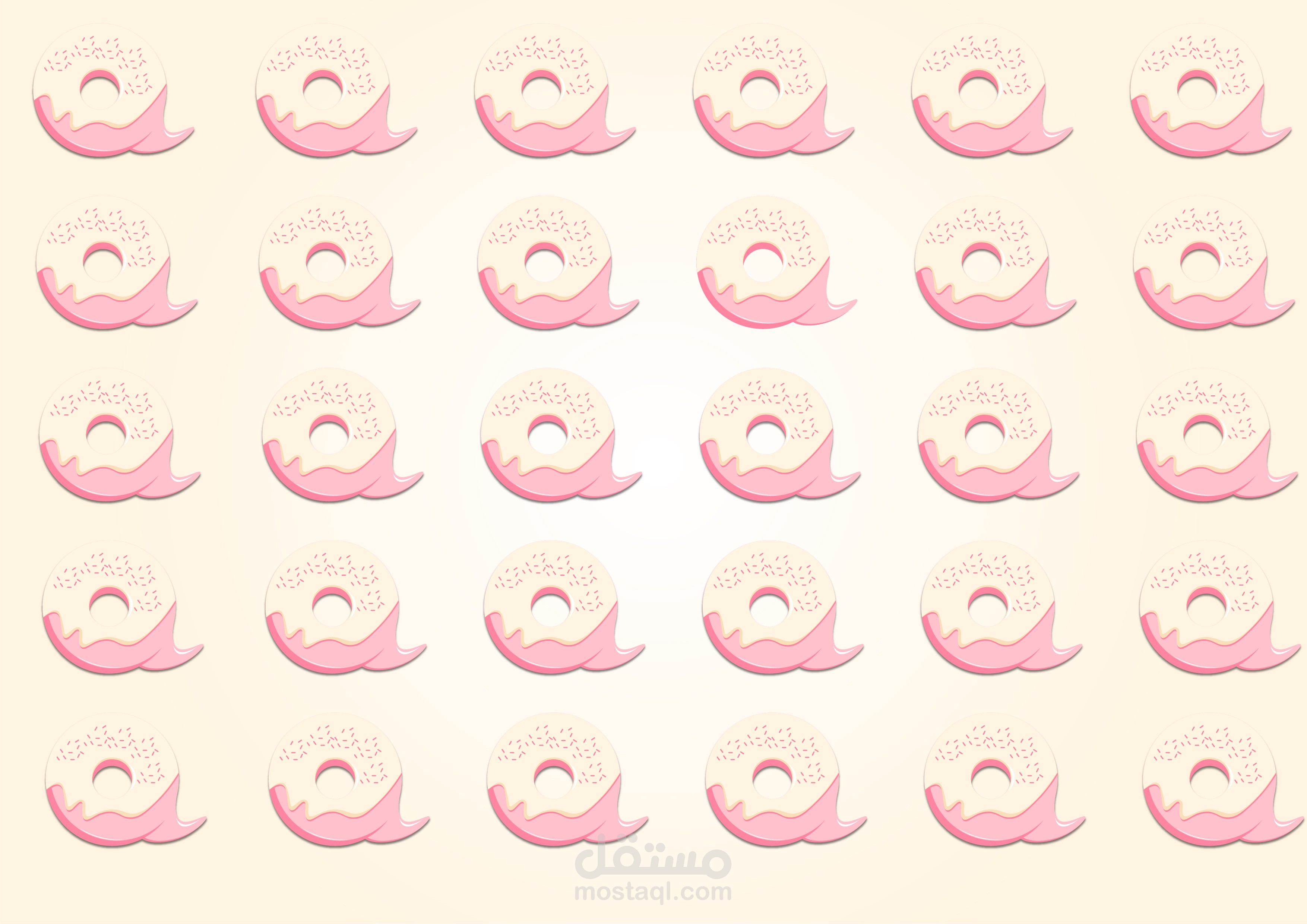
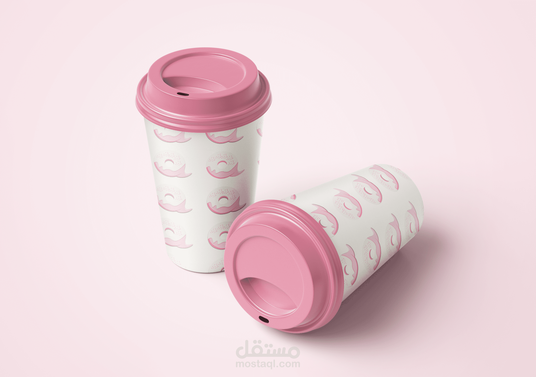
Donut Detail: The "A" in "Glaze" is cleverly replaced by a donut with a creamy pink glaze and pink sprinkles, adding a clear visual reference to the shop’s theme.
Tagline: Below the main text is the tagline "Bite Into Happiness", written in a simple, sans-serif pink font that reinforces the brand's cheerful, indulgent vibe.
Color Theme: The use of multiple shades of pink creates depth and dimension, while the soft background provides a warm and cozy feel.
Design Flourishes: There’s a subtle shadow and layered effect that adds extra pop and makes the text and donut stand out.
Overall, the logo conveys sweetness, joy, and deliciousness—perfect for a donut shop!