sales dashboard
تفاصيل العمل
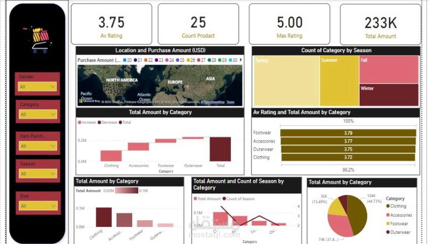
Key Metrics Displayed:
Average Rating (Av Rating): Displays the average customer rating for products. The example shows a rating of 3.75.
Product Count (Count Product): Indicates the total number of products available, which is 25.
Maximum Rating (Max Rating): Highlights the highest rating received by any product (5.00 in this case).
Total Sales Amount (Total Amount): Shows the total revenue generated from sales, displayed as 233K.
Visual Components:
Location and Purchase Amount (Map Visualization):
Displays purchase distribution geographically across different regions (North America, Europe, Asia, etc.).
Helps analyze customer demand in different locations.
Category Distribution by Season (Tree Map):
Represents the count of product categories sold in different seasons (Spring, Summer, Fall, Winter).
Provides insights into seasonal sales trends.
Total Amount by Category (Bar Charts):
Displays total sales by product categories (Clothing, Accessories, Footwear, Outerwear).
Differentiates between increased and decreased sales trends.
Average Rating vs. Total Amount by Category (Horizontal Bar Chart):
Compares average product ratings with sales revenue for different categories.
Categories include Footwear (3.79), Accessories (3.77), Outerwear (3.75), and Clothing (3.72).
Total Amount and Season-wise Product Count (Line & Bar Chart):
Combines total sales amount with the count of seasonal product purchases.
Helps understand seasonal demand variations.
Total Sales by Category (Pie Chart):
Displays the percentage breakdown of sales among different product categories.
Example: Clothing (44.73%), Accessories (31.8%), Footwear (15.49%).
Filters Available:
Gender: Allows filtering sales data by customer gender.
Category: Enables selection of specific product categories.
Item Purchased: Filters sales based on purchased items.
Season: Analyzes seasonal sales impact.
Size: Allows filtering based on product sizes.