Dashboard by Tableau
تفاصيل العمل
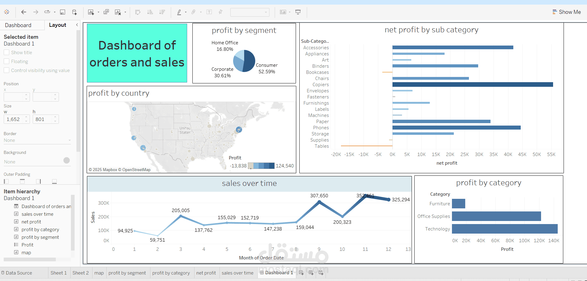
The Tableau dashboard "Dashboard of Orders and Sales" visualizes sales and profit data using multiple charts:
Profit by Segment (Pie Chart): Consumer (52.59%), Corporate (30.61%), Home Office (16.80%).
Net Profit by Sub-Category (Bar Chart): Displays profit/loss for various product categories.
Profit by Country (Map): Shows profit distribution across U.S. regions.
Sales Over Time (Line Chart): Tracks sales trends across months.
Profit by Category (Bar Chart): Technology has the highest profit, followed by Office Supplies and Furniture.