Data visualisation
تفاصيل العمل
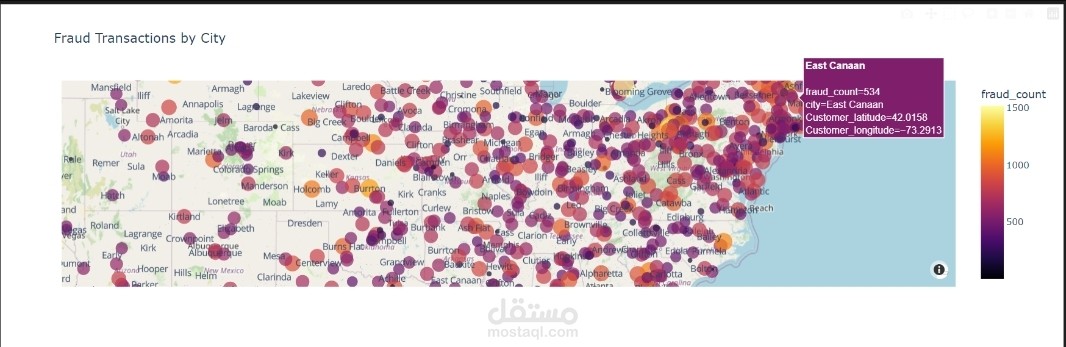
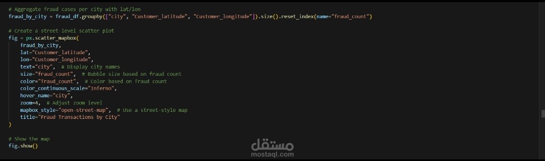
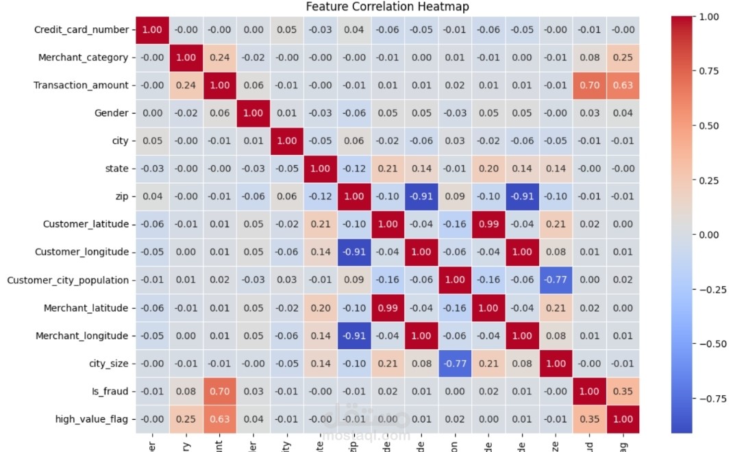
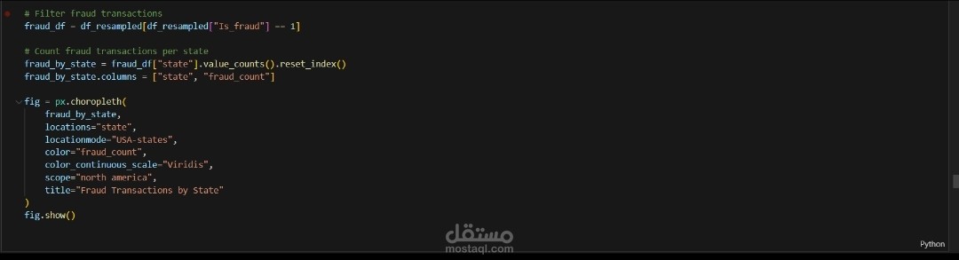
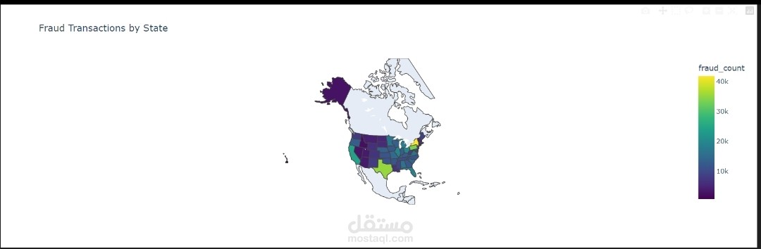
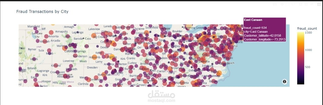
These visualizations help identify any strong correlations that could point to suspicious behavior. Additionally, I’ve incorporated geographic maps to highlight regional variations in fraud rates, with color gradients representing areas with higher or lower levels of fraud. By combining these visualizations, I’ve been able to gain a deeper understanding of both the data’s underlying patterns and how fraud is distributed across different locations, which has been crucial for improving fraud detection accuracy and targeting preventive measures.