NAT GEO Magazine Design
تفاصيل العمل
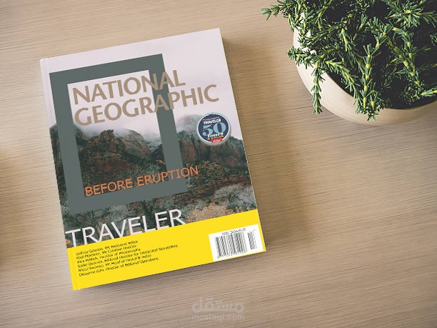
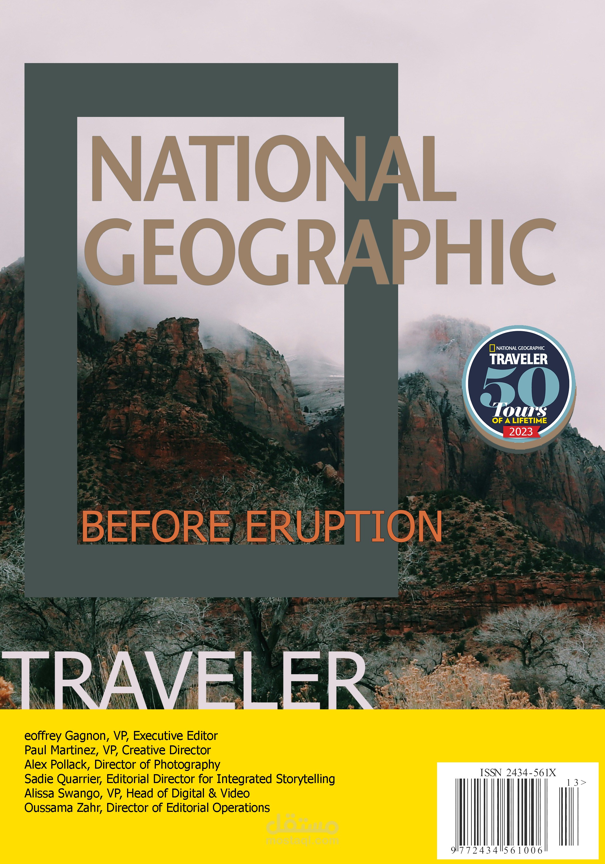
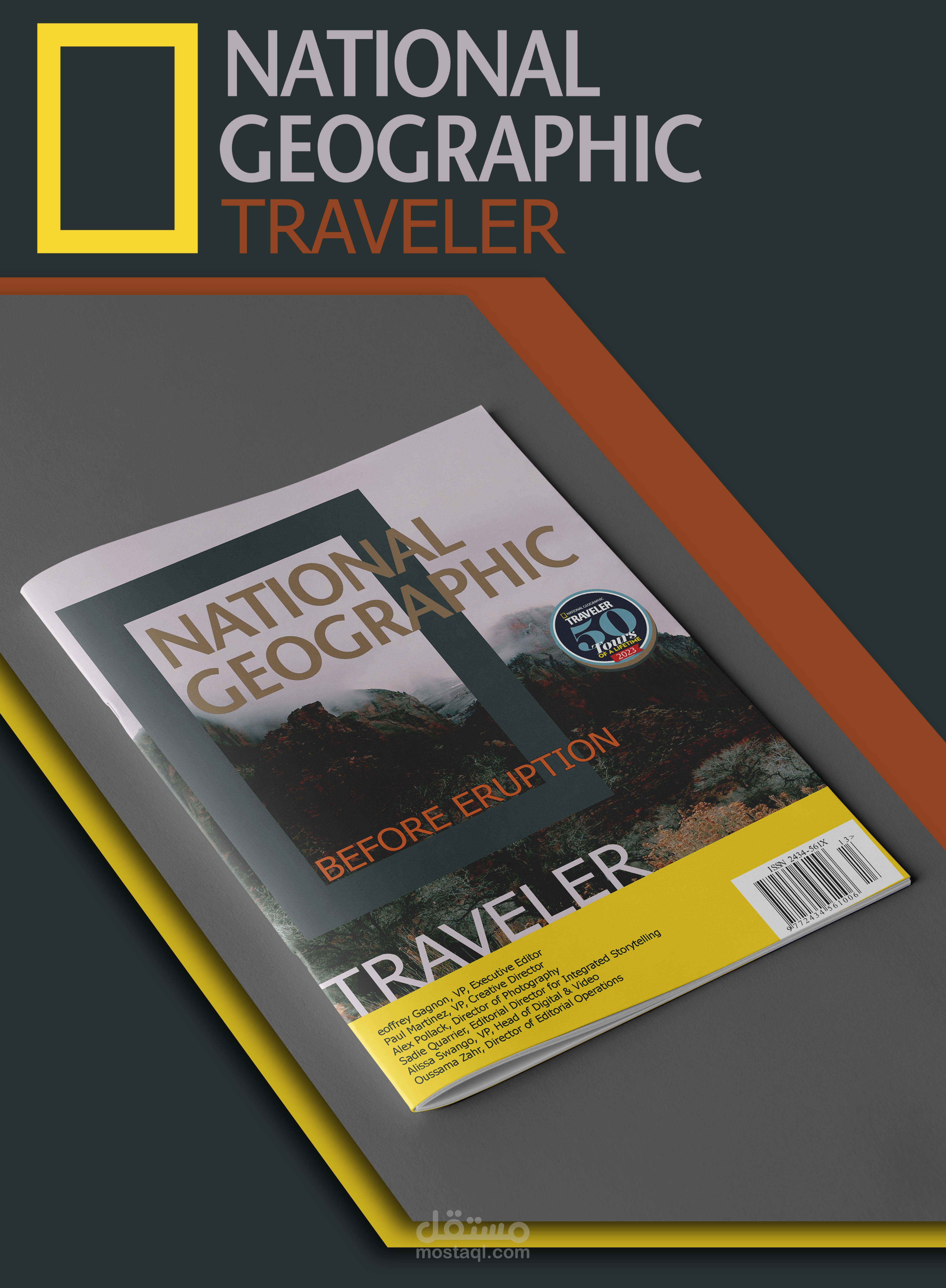
The National Geographic magazine design is known for its professional and captivating aesthetic, reflecting the magazine’s focus on science, exploration, and nature. The design prominently features high-quality images that dominate the cover and internal pages, drawing readers in and enhancing engagement with the content.
Key Design Elements:
Bold and Cohesive Color Palette: The magazine’s iconic yellow border is often complemented by natural colors like green, blue, and brown to emphasize environmental and wildlife themes.
Structured and Readable Layout: A well-organized grid layout ensures a balanced arrangement of text and images, making the content easy to follow without overwhelming the reader.
Elegant and Clear Typography: The magazine combines modern, bold fonts for headlines with simple, readable fonts for body text, enhancing both aesthetics and readability.
Strong Focus on Photography: Stunning photography is at the heart of the design, showcasing landscapes, wildlife, and scientific discoveries in a visually immersive way.
The overall design seamlessly blends informative content with striking visuals, creating an engaging and enriching reading experience.