supply chain dashboard (Power BI)
تفاصيل العمل

I made a supply chain project, where I harnessed the power of data analysis to uncover impactful insights that drive efficiency.
-The Journey Begins: Data Exploration
I kicked off this endeavor by diving deep into our data.
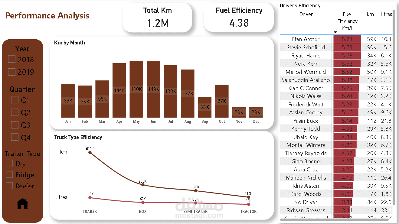
-Identifying Key Performance Indicators (KPIs) such as:
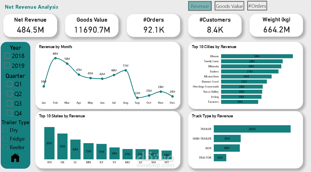
• Revenue
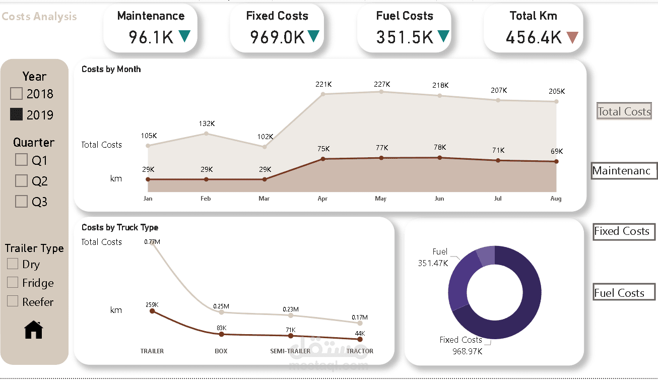
• Maintenance Costs
• Fixed Costs
• Fuel Cost
• Goods Value
• Number of Orders
• Number of Customers
• Total KM
• Fuel Efficiency
• Truck Efficiency
• Driver Efficiency
-Crafting a Dashboard Mockup
Next, I transformed these insights into a captivating dashboard mockup using Sketch.
-Next Steps: Data Transformation & Analysis
We're now ready to initiate the ETL process in Power Query, establish data model relationships, and perform DAX calculations.
-Dynamic Dashboard Integration
I've successfully integrated all these components to create a dynamic and interactive dashboard that reveals valuable trends.
-Some Key Insights & Observations
1. Seasonal Revenue Trends: In January of both years, we observed a concerning dip in revenue corresponding with lower goods value, but a promising rebound in February.
2. Quarterly Challenges: Our analysis identified issues in April, May, June, and August 2018, but thanks to our efforts, we turned around those challenges and boosted revenue.
3. City-Specific Insights: Mineola City had the highest revenue in 2018, but unfortunately fell to 7th place in 2019—an area we need to address.
4. Cost Efficiency Analysis: Our findings reveal that the Box Truck has the lowest total cost, while the Trailer Truck ranks second. However, for long-distance hauls, I recommend the Trailer Truck as it has traveled 614k km compared to the Box Truck’s 256k km, with only a marginal cost difference.