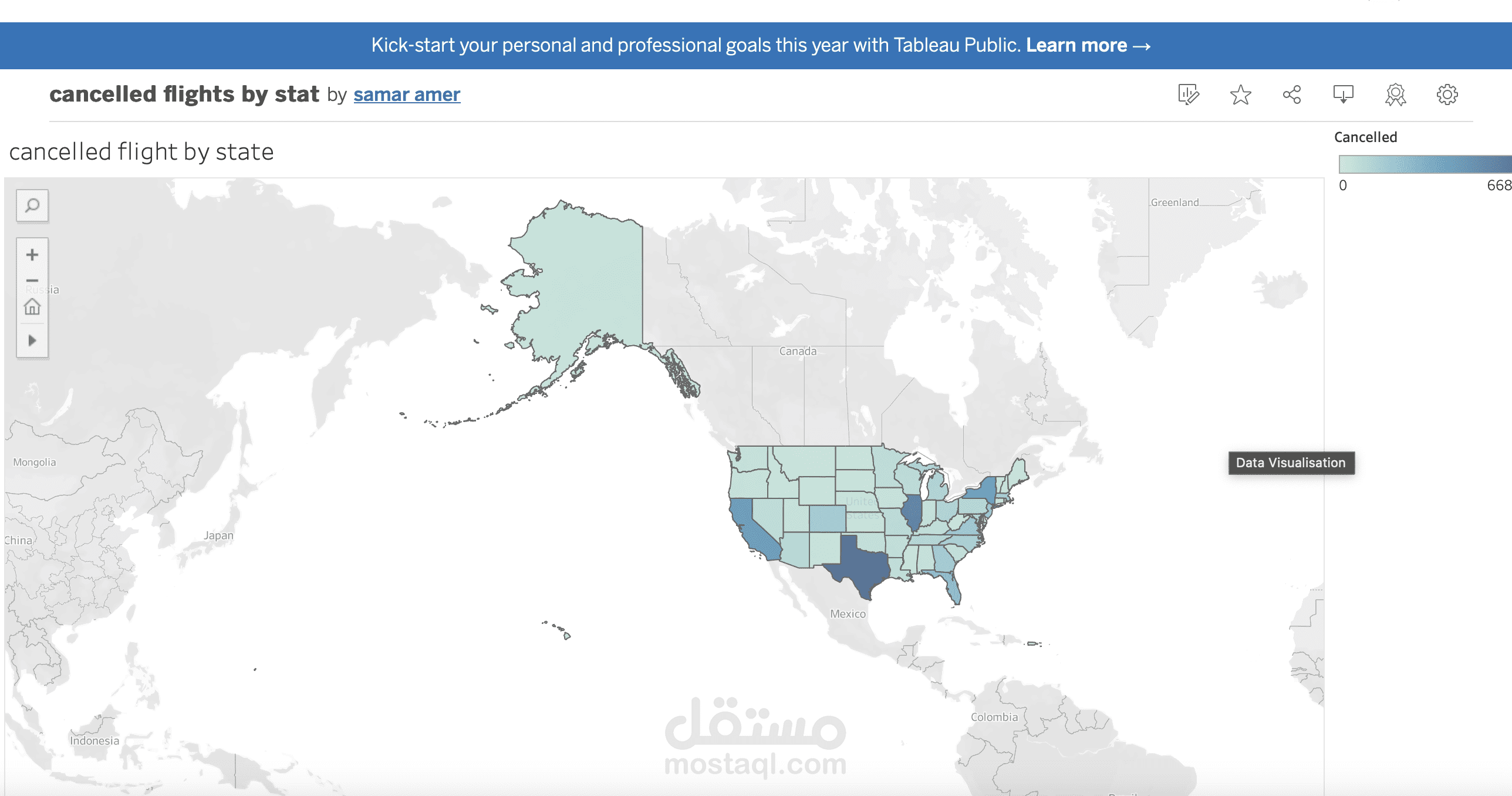
(using tableau to analyze and visualize data of (Flights delays data
تفاصيل العمل
At this visualization I used the bar chart to showAirline Performance: Completed Flights vs Cancellation RatesI use a bar chart to compare the total completed flights across airlines (bar height) while using the degree of blue to show cancellation rates. Lighter blue means fewer cancellations (better reliability), and darker blue
means higher cancellations. This combo makes it easy to see both performance and reliability in one chart!
I used a circle chart because it’s a simple, effective way to show relationships between categories and their values. Circles make it easy to spot patterns, trends, and outliers.