sales dashboard (Power BI)
تفاصيل العمل

I had a Sales Project, where I utilized data analysis to uncover key insights that drive operational efficiency.
- The Journey Begins with Data Exploration:
I started by thoroughly examining our data and pinpointing essential Key Performance Indicators (KPIs), including:
• Revenue
• Profit
• Cost
• GM%
• AOV
• Number of Orders
• Number of Customers
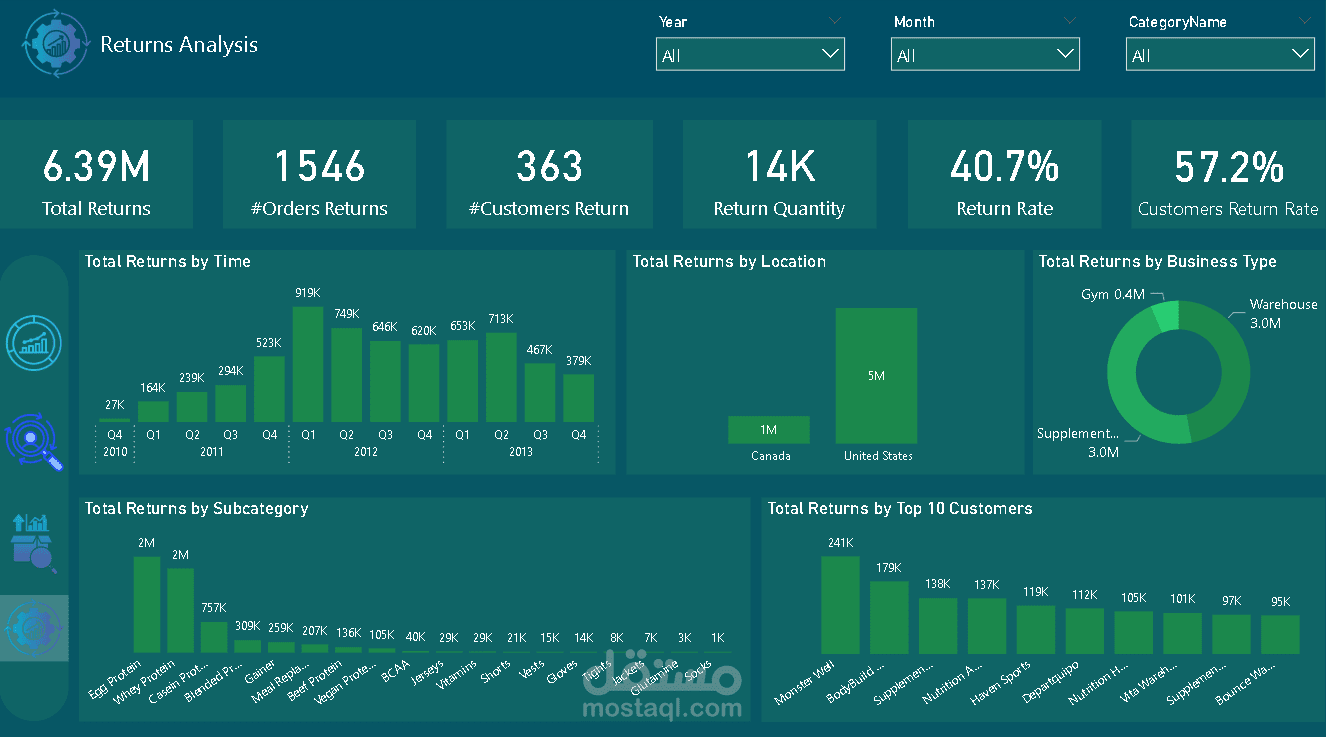
• Total Returns
• Return Rate
• Customer Return Rate
-Creating a Dashboard Mockup:
I then translated these insights into an engaging dashboard mockup using Sketch.
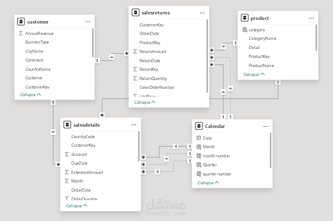
-Next Steps: Data Transformation & Analysis:
We are now set to kick off the ETL process in Power Query, define relationships within our data model, and carry out DAX calculations.
-Dynamic Dashboard Integration:
I’ve successfully merged all elements to craft a dynamic, interactive dashboard that uncovers valuable trends.
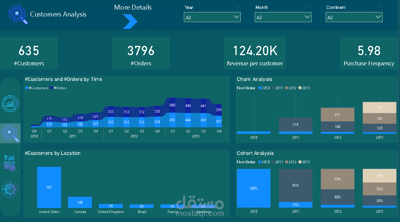
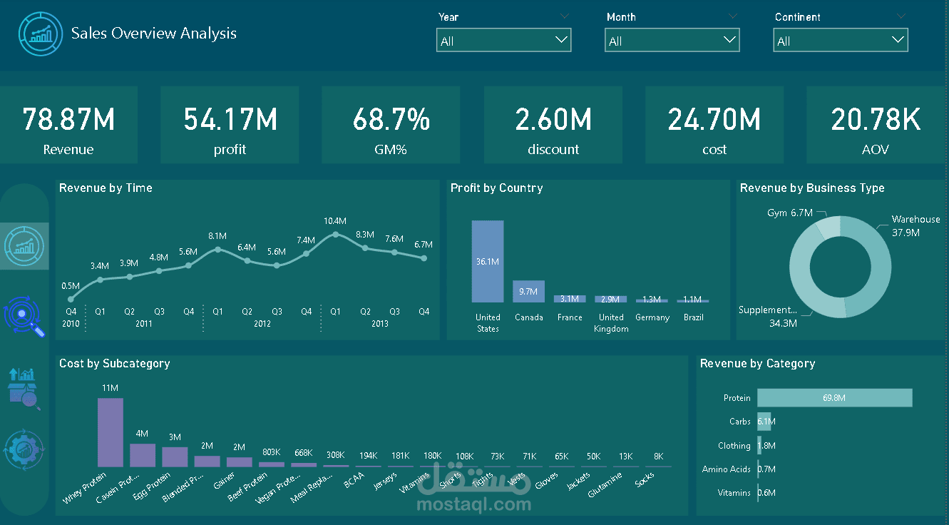
-Some Key Insights & Observations:
• Q1 emerges as the best quarter for revenue
• Continuous revenue growth observed over the years
• Revenue dips in Q2 and Q3
• Best GM% recorded in Q1 2011
• Notable loss of old customers
◦ Year-over-year decline in new customers
◦ Highest purchase frequency identified with Monster Progress
◦ Peak in total returns in Q1 2012
• Customer return rate stands at a high 57.2%