sales dashboard
تفاصيل العمل
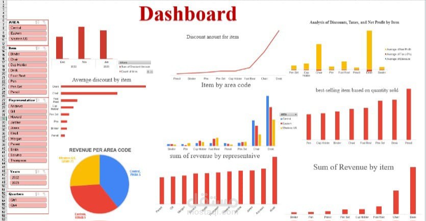
Here’s a summarized version of the steps to create the dashboard using Excel, Pivot Tables, and Power Query:
Data Preparation with Power Query:
Imported and cleaned raw data, removing duplicates and handling missing values.
Transformed data into a usable format and merged/appended multiple sources if needed.
Data Analysis with Pivot Tables:
Created Pivot Tables to analyze key metrics:
Calculated discount amounts and average discounts by item.
Grouped data by area code to analyze revenue distribution.
Summarized total revenue by sales representative and by item.
Dashboard Creation in Excel:
Designed an interactive dashboard using Excel’s visualization tools:
Added charts (e.g., bar charts, pie charts) for discounts, revenue by area code, and revenue by representative.
Used slicers/filters for interactivity.
Organized the layout to display insights like net profit, taxes, and revenue trends.
Final Touches:
Applied formatting (e.g., conditional formatting, color coding) for readability.
Ensured the dashboard updates dynamically with data changes.