Bike Shop Analysis
تفاصيل العمل
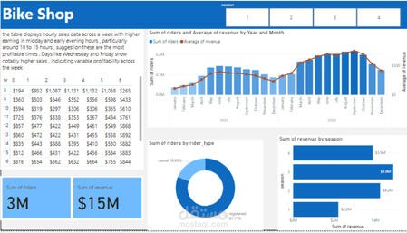
Data was collected using SQL, cleaned to remove inconsistencies, and formatted for analysis. After uploading to Power BI, visualizations such as tables, bar charts, and pie charts were created to highlight trends and patterns. The dashboard identifies peak sales hours, seasonal performance, and rider segmentation, turning raw sales data into actionable insights for decision-making.